- Power BI forums
- Updates
- News & Announcements
- Get Help with Power BI
- Desktop
- Service
- Report Server
- Power Query
- Mobile Apps
- Developer
- DAX Commands and Tips
- Custom Visuals Development Discussion
- Health and Life Sciences
- Power BI Spanish forums
- Translated Spanish Desktop
- Power Platform Integration - Better Together!
- Power Platform Integrations (Read-only)
- Power Platform and Dynamics 365 Integrations (Read-only)
- Training and Consulting
- Instructor Led Training
- Dashboard in a Day for Women, by Women
- Galleries
- Community Connections & How-To Videos
- COVID-19 Data Stories Gallery
- Themes Gallery
- Data Stories Gallery
- R Script Showcase
- Webinars and Video Gallery
- Quick Measures Gallery
- 2021 MSBizAppsSummit Gallery
- 2020 MSBizAppsSummit Gallery
- 2019 MSBizAppsSummit Gallery
- Events
- Ideas
- Custom Visuals Ideas
- Issues
- Issues
- Events
- Upcoming Events
- Community Blog
- Power BI Community Blog
- Custom Visuals Community Blog
- Community Support
- Community Accounts & Registration
- Using the Community
- Community Feedback
Register now to learn Fabric in free live sessions led by the best Microsoft experts. From Apr 16 to May 9, in English and Spanish.
- Power BI forums
- Forums
- Get Help with Power BI
- Desktop
- Bar Chart by month with items with no data
- Subscribe to RSS Feed
- Mark Topic as New
- Mark Topic as Read
- Float this Topic for Current User
- Bookmark
- Subscribe
- Printer Friendly Page
- Mark as New
- Bookmark
- Subscribe
- Mute
- Subscribe to RSS Feed
- Permalink
- Report Inappropriate Content
Bar Chart by month with items with no data
Hello,
I am trying to create a stacked bar chart where the x-axix is a date. I want to show a count by month over the last 12 calendar months, and show the months where there is no data (count = 0) on the axis. Here is a sample data set.
| Date | Site |
| 01Dec16 | C |
| 01Mar17 | A |
| 01Mar17 | B |
| 01Jun17 | A |
| 01Jul17 | A |
| 01Sep17 | A |
| 01Oct17 | A |
| 01Nov17 | B |
| 01Jan18 | C |
I want the stacked bar chart to have a x-axis that goes from January 2017 to December 2017, and show the months where the count is 0 (Jan17, Feb17, Apr17, May17, Aug17 and Dec17).
I am able to get a chart that shows March 2017 to November 2017, but does show Jan, Feb and Dec. [Date in "Date" format; Visual Level Filter - Date is in the last 12 calendar month]
I am also able to get one that shows January 2016 to December 2018. [Date in "Date Hierarchy" format; Visual Level Filter - Date is in the last 12 calendar month].
But I am unable to get one that starts in January 2017 and ends in December 2017.
Any help would be appreciated!
Thank you,
Hugues.
Solved! Go to Solution.
- Mark as New
- Bookmark
- Subscribe
- Mute
- Subscribe to RSS Feed
- Permalink
- Report Inappropriate Content
Hi @huguest,
In that case, you can choose "months" rather than "calendar months" as shown in below screenshot.
Regards,
Yuliana Gu
If this post helps, then please consider Accept it as the solution to help the other members find it more quickly.
- Mark as New
- Bookmark
- Subscribe
- Mute
- Subscribe to RSS Feed
- Permalink
- Report Inappropriate Content
Hi @huguest,
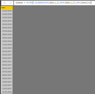
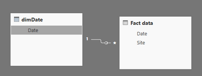
Create a calendar table which lists unique date values. And you should establish a one to many relationship from 'dimDate' to 'Fact date' based on [date] column.
dimDate =
FILTER (
    CALENDAR ( DATE ( 2016, 1, 1 ), DATE ( 2018, 1, 1 ) ),
    DAY ( [Date] ) = 1
)
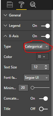
Then, create the stacked column chart, please pay attention to the hilighted part in below screenshots.
Best regards,
Yuliana Gu
If this post helps, then please consider Accept it as the solution to help the other members find it more quickly.
- Mark as New
- Bookmark
- Subscribe
- Mute
- Subscribe to RSS Feed
- Permalink
- Report Inappropriate Content
Hello, thank you for your suggestion. It did work to add the leading balnk months to my chart (i.e. january and February), but December is still not showing.
- Mark as New
- Bookmark
- Subscribe
- Mute
- Subscribe to RSS Feed
- Permalink
- Report Inappropriate Content
Hi @huguest,
Based on the steps mentioned in my original post, please change the axis type to "Categorical". Then, change [Date] field to "Hierarchy".
Best regards,
Yuliana Gu
If this post helps, then please consider Accept it as the solution to help the other members find it more quickly.
- Mark as New
- Bookmark
- Subscribe
- Mute
- Subscribe to RSS Feed
- Permalink
- Report Inappropriate Content
Thank you, the solution is working (for now). I have under the impressiont that it will no longer work when I get into February and have to report on Feb2017 to Jan2018. As the x-axis shows only themonth an not the year, I will end up with Jan2018 as my first bar, then Feb through Dec2017...
- Mark as New
- Bookmark
- Subscribe
- Mute
- Subscribe to RSS Feed
- Permalink
- Report Inappropriate Content
Hi @huguest,
In that case, you can choose "months" rather than "calendar months" as shown in below screenshot.
Regards,
Yuliana Gu
If this post helps, then please consider Accept it as the solution to help the other members find it more quickly.
Helpful resources

Microsoft Fabric Learn Together
Covering the world! 9:00-10:30 AM Sydney, 4:00-5:30 PM CET (Paris/Berlin), 7:00-8:30 PM Mexico City

Power BI Monthly Update - April 2024
Check out the April 2024 Power BI update to learn about new features.

| User | Count |
|---|---|
| 115 | |
| 100 | |
| 88 | |
| 68 | |
| 61 |
| User | Count |
|---|---|
| 150 | |
| 120 | |
| 100 | |
| 87 | |
| 68 |


