- Power BI forums
- Updates
- News & Announcements
- Get Help with Power BI
- Desktop
- Service
- Report Server
- Power Query
- Mobile Apps
- Developer
- DAX Commands and Tips
- Custom Visuals Development Discussion
- Health and Life Sciences
- Power BI Spanish forums
- Translated Spanish Desktop
- Power Platform Integration - Better Together!
- Power Platform Integrations (Read-only)
- Power Platform and Dynamics 365 Integrations (Read-only)
- Training and Consulting
- Instructor Led Training
- Dashboard in a Day for Women, by Women
- Galleries
- Community Connections & How-To Videos
- COVID-19 Data Stories Gallery
- Themes Gallery
- Data Stories Gallery
- R Script Showcase
- Webinars and Video Gallery
- Quick Measures Gallery
- 2021 MSBizAppsSummit Gallery
- 2020 MSBizAppsSummit Gallery
- 2019 MSBizAppsSummit Gallery
- Events
- Ideas
- Custom Visuals Ideas
- Issues
- Issues
- Events
- Upcoming Events
- Community Blog
- Power BI Community Blog
- Custom Visuals Community Blog
- Community Support
- Community Accounts & Registration
- Using the Community
- Community Feedback
Register now to learn Fabric in free live sessions led by the best Microsoft experts. From Apr 16 to May 9, in English and Spanish.
- Power BI forums
- Forums
- Get Help with Power BI
- Desktop
- Re: Bar Char Visual formatting
- Subscribe to RSS Feed
- Mark Topic as New
- Mark Topic as Read
- Float this Topic for Current User
- Bookmark
- Subscribe
- Printer Friendly Page
- Mark as New
- Bookmark
- Subscribe
- Mute
- Subscribe to RSS Feed
- Permalink
- Report Inappropriate Content
Bar Char Visual formatting
Hello,
I am still learning the Power BI and how I can take the most out of the visuals available.
At the moment I do have a table that contain two different columns as seems below. Both columns have the same values available but it can have different value per code in each column.
| Code | Rating 1 | Rating 2 |
2244 | Effective | Not Effective |
| 2425 | Needs Improvement | Needs Improvement |
| 5233 | Needs Improvement | Effective |
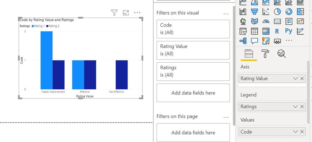
My end goal is to produce a bar chart that in the axis will contain the different rating values (e.g. effective, Needs Improvement, Not Effective) and it will have two columns to count the codes for each rating (see example below)
Is it possible to produce the specific graph? Ideally, I would prefer NOT to produce it with measures because I am using a table below that shows more information regarding the codes, that means that when the user will select the column or the x axis value the table will show the information regarding the codes. With a measure I will not be able to do that.
Thanks
Kostas
Solved! Go to Solution.
- Mark as New
- Bookmark
- Subscribe
- Mute
- Subscribe to RSS Feed
- Permalink
- Report Inappropriate Content
Hi @Kostas ,
You will need to unpivot your columns.
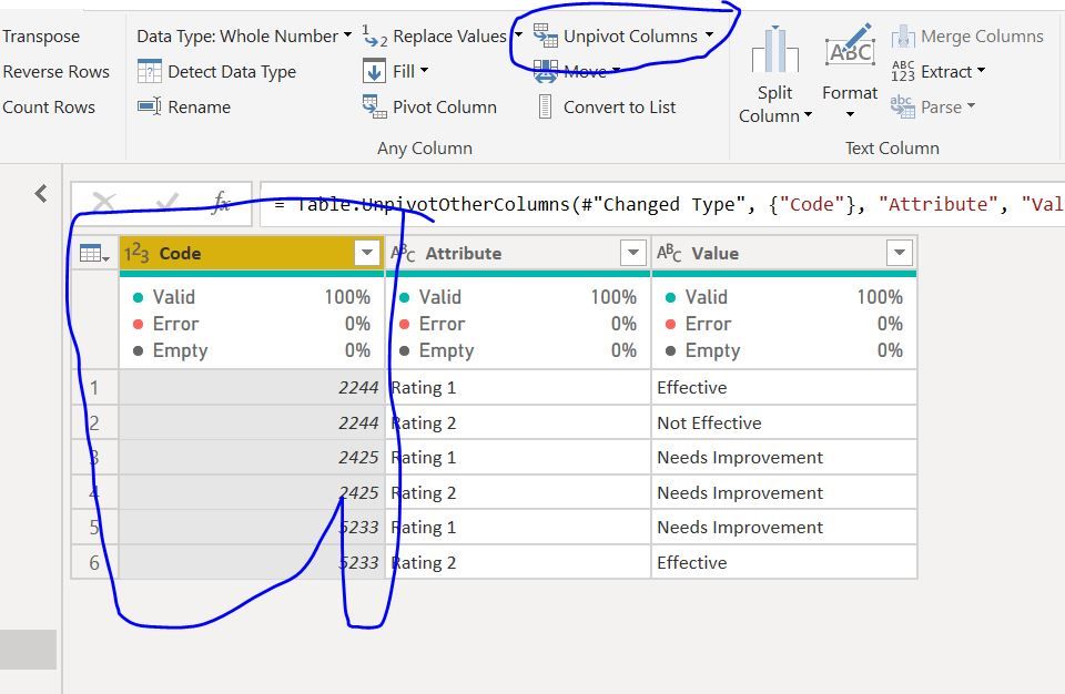
Select the code Column and then click on Unpivot Other Columns
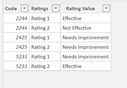
Youl will get the following table
Then drag the columns to get the output.
Regards,
Harsh Nathani
Appreciate with a Kudos!! (Click the Thumbs Up Button)
Did I answer your question? Mark my post as a solution!
- Mark as New
- Bookmark
- Subscribe
- Mute
- Subscribe to RSS Feed
- Permalink
- Report Inappropriate Content
Helloo @harshnathani,
It worked perfectly, seems like an easy solution just needed some out of the box thinking.
I got one more question, is it possible to specify the columns colour for each value in the x axis with a specific colour rather than specify only the type of the rating?
For example the two columns generated for effective to be green, the two colours for needs improvement yellow etc.
Thank you in advance.
If there is no way of doing that I will accept your previous answer as solution and close the topic.
Thanks
Kostas
- Mark as New
- Bookmark
- Subscribe
- Mute
- Subscribe to RSS Feed
- Permalink
- Report Inappropriate Content
Hi @Kostas ,
I do not think you can havecolous of of Bar changed based on Axis Values.
Regards,
Harsh Nathani
Helpful resources

Microsoft Fabric Learn Together
Covering the world! 9:00-10:30 AM Sydney, 4:00-5:30 PM CET (Paris/Berlin), 7:00-8:30 PM Mexico City

Power BI Monthly Update - April 2024
Check out the April 2024 Power BI update to learn about new features.

| User | Count |
|---|---|
| 107 | |
| 98 | |
| 77 | |
| 66 | |
| 53 |
| User | Count |
|---|---|
| 144 | |
| 104 | |
| 100 | |
| 86 | |
| 64 |


