- Power BI forums
- Updates
- News & Announcements
- Get Help with Power BI
- Desktop
- Service
- Report Server
- Power Query
- Mobile Apps
- Developer
- DAX Commands and Tips
- Custom Visuals Development Discussion
- Health and Life Sciences
- Power BI Spanish forums
- Translated Spanish Desktop
- Power Platform Integration - Better Together!
- Power Platform Integrations (Read-only)
- Power Platform and Dynamics 365 Integrations (Read-only)
- Training and Consulting
- Instructor Led Training
- Dashboard in a Day for Women, by Women
- Galleries
- Community Connections & How-To Videos
- COVID-19 Data Stories Gallery
- Themes Gallery
- Data Stories Gallery
- R Script Showcase
- Webinars and Video Gallery
- Quick Measures Gallery
- 2021 MSBizAppsSummit Gallery
- 2020 MSBizAppsSummit Gallery
- 2019 MSBizAppsSummit Gallery
- Events
- Ideas
- Custom Visuals Ideas
- Issues
- Issues
- Events
- Upcoming Events
- Community Blog
- Power BI Community Blog
- Custom Visuals Community Blog
- Community Support
- Community Accounts & Registration
- Using the Community
- Community Feedback
Register now to learn Fabric in free live sessions led by the best Microsoft experts. From Apr 16 to May 9, in English and Spanish.
- Power BI forums
- Forums
- Get Help with Power BI
- Desktop
- Average/goal line on column chart, calculate with ...
- Subscribe to RSS Feed
- Mark Topic as New
- Mark Topic as Read
- Float this Topic for Current User
- Bookmark
- Subscribe
- Printer Friendly Page
- Mark as New
- Bookmark
- Subscribe
- Mute
- Subscribe to RSS Feed
- Permalink
- Report Inappropriate Content
Average/goal line on column chart, calculate with multiple filters
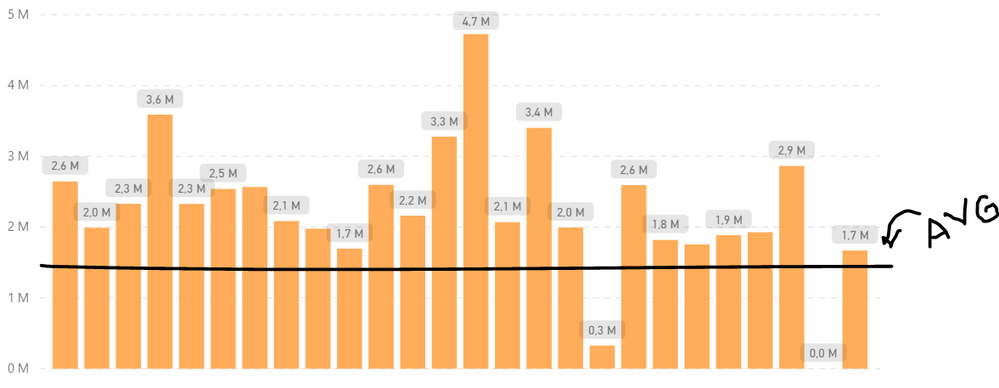
Hey everyone! I need your help. This is what I'm trying to achieve:
In this case, the Y axis represents values and the X axis represents the store units in a chain.
My query looks sort of like this (except it includes many more months than just January 2018):
| Unit | Date | Item | Value | Type |
| A | 01/01/2018 | Total profits | 2600000 | Revenue |
| B | 01/01/2018 | Total profits | 2000000 | Revenue |
| C | 01/01/2018 | Total profits | 2300000 | Revenue |
| D | 01/01/2018 | Total profits | 3600000 | Revenue |
| E | 01/01/2018 | Total profits | 2300000 | Revenue |
| F | 01/01/2018 | Total profits | 2500000 | Revenue |
| G | 01/01/2018 | Total profits | 2100000 | Revenue |
| A | 01/01/2018 | Materials | 928663 | Expenses |
| B | 01/01/2018 | Materials | 500099 | Expenses |
| C | 01/01/2018 | Materials | 771053 | Expenses |
| D | 01/01/2018 | Materials | 773643 | Expenses |
| E | 01/01/2018 | Materials | 665997 | Expenses |
| F | 01/01/2018 | Materials | 905812 | Expenses |
| G | 01/01/2018 | Materials | 704711 | Expenses |
| A | 01/01/2018 | Taxes | 244094 | Expenses |
| B | 01/01/2018 | Taxes | 286262 | Expenses |
| C | 01/01/2018 | Taxes | 165851 | Expenses |
| D | 01/01/2018 | Taxes | 290773 | Expenses |
| E | 01/01/2018 | Taxes | 285362 | Expenses |
| F | 01/01/2018 | Taxes | 133670 | Expenses |
| G | 01/01/2018 | Taxes | 202245 | Expenses |
In my report, I want to give the user the option to sort between Revenue and Expenses, keeping the same visuals. In the case of this chart, my report is filtered by Type = Revenue and Date = January 2018. I would like the chart to display a horizontal line corresponding to the average of all Revenue (meaning, average of "Total Profits") for the month of January. Is there any easy way to obtain this? I've tried many solutions but the average value always comes up wrong. I would love some fresh opinions.
P.S.: This query I've "sampled" above has already been filtered. The "Total Profits" values, for example, are actually the sum of many smaller values which have been hidden since they do not matter to the report at hand.
Solved! Go to Solution.
- Mark as New
- Bookmark
- Subscribe
- Mute
- Subscribe to RSS Feed
- Permalink
- Report Inappropriate Content
Hi @Clara
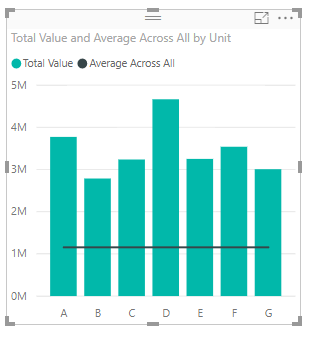
You can use a combo column/line chart, and for the line value you are going to compute the average across all units
Average Across All = CALCULATE(AVERAGE(Financials[Value]), ALL(Financials[Unit]))
//NOTE - if the number of units on the axis may change due to a slicer, change ALL to ALLSELECTED
Hope this helps
David
- Mark as New
- Bookmark
- Subscribe
- Mute
- Subscribe to RSS Feed
- Permalink
- Report Inappropriate Content
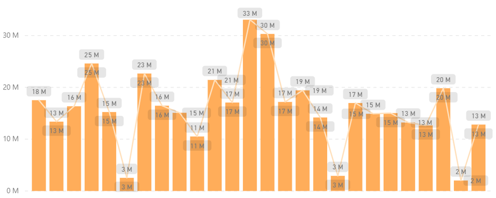
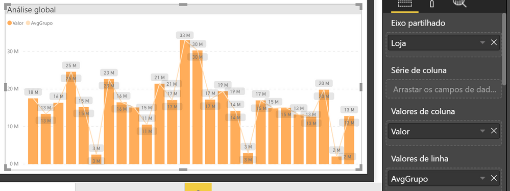
Thanks for the reply, David! Unfortunately I'm getting a different result:
I wish I knew what I was doing wrong 😞
- Mark as New
- Bookmark
- Subscribe
- Mute
- Subscribe to RSS Feed
- Permalink
- Report Inappropriate Content
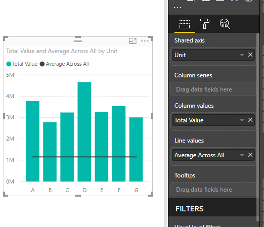
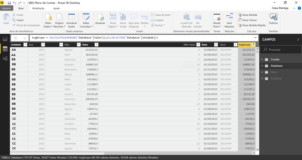
Can you share how your chart is built and how your specific measures are coded? Also your data model if there are multiple tables involved.
- Mark as New
- Bookmark
- Subscribe
- Mute
- Subscribe to RSS Feed
- Permalink
- Report Inappropriate Content
Here you go. (I had to filter some stuff out but I hope it will still make sense.)
- Mark as New
- Bookmark
- Subscribe
- Mute
- Subscribe to RSS Feed
- Permalink
- Report Inappropriate Content
- Mark as New
- Bookmark
- Subscribe
- Mute
- Subscribe to RSS Feed
- Permalink
- Report Inappropriate Content
Thanks for the reply, Victor! Unfortunately trying it with a measure got me the same results as before... it shows the correct average in a card visual, for example, but in the chart it varies along the x axis.
- Mark as New
- Bookmark
- Subscribe
- Mute
- Subscribe to RSS Feed
- Permalink
- Report Inappropriate Content
Hi @Clara -
The field inside ALLSELECTED should be the same field as is on your X-axis. From the look of it, your X-axis is "Loja", but you are averaging over all selected Unidade. Either Unidade needs to be the X axis or Loja needs to go inside ALLSELECTED.
Hope this helps
David
- Mark as New
- Bookmark
- Subscribe
- Mute
- Subscribe to RSS Feed
- Permalink
- Report Inappropriate Content
Oops, you're right! My data has dozens of fields so I ended up getting them all mixed up, haha. Thanks!
Helpful resources

Microsoft Fabric Learn Together
Covering the world! 9:00-10:30 AM Sydney, 4:00-5:30 PM CET (Paris/Berlin), 7:00-8:30 PM Mexico City

Power BI Monthly Update - April 2024
Check out the April 2024 Power BI update to learn about new features.

| User | Count |
|---|---|
| 109 | |
| 98 | |
| 77 | |
| 66 | |
| 54 |
| User | Count |
|---|---|
| 144 | |
| 104 | |
| 100 | |
| 86 | |
| 64 |
