- Power BI forums
- Updates
- News & Announcements
- Get Help with Power BI
- Desktop
- Service
- Report Server
- Power Query
- Mobile Apps
- Developer
- DAX Commands and Tips
- Custom Visuals Development Discussion
- Health and Life Sciences
- Power BI Spanish forums
- Translated Spanish Desktop
- Power Platform Integration - Better Together!
- Power Platform Integrations (Read-only)
- Power Platform and Dynamics 365 Integrations (Read-only)
- Training and Consulting
- Instructor Led Training
- Dashboard in a Day for Women, by Women
- Galleries
- Community Connections & How-To Videos
- COVID-19 Data Stories Gallery
- Themes Gallery
- Data Stories Gallery
- R Script Showcase
- Webinars and Video Gallery
- Quick Measures Gallery
- 2021 MSBizAppsSummit Gallery
- 2020 MSBizAppsSummit Gallery
- 2019 MSBizAppsSummit Gallery
- Events
- Ideas
- Custom Visuals Ideas
- Issues
- Issues
- Events
- Upcoming Events
- Community Blog
- Power BI Community Blog
- Custom Visuals Community Blog
- Community Support
- Community Accounts & Registration
- Using the Community
- Community Feedback
Register now to learn Fabric in free live sessions led by the best Microsoft experts. From Apr 16 to May 9, in English and Spanish.
- Power BI forums
- Forums
- Get Help with Power BI
- Desktop
- Automatically adjust formatting of the y axis (% v...
- Subscribe to RSS Feed
- Mark Topic as New
- Mark Topic as Read
- Float this Topic for Current User
- Bookmark
- Subscribe
- Printer Friendly Page
- Mark as New
- Bookmark
- Subscribe
- Mute
- Subscribe to RSS Feed
- Permalink
- Report Inappropriate Content
Automatically adjust formatting of the y axis (% vs M)
Hello everyone!
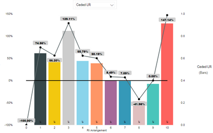
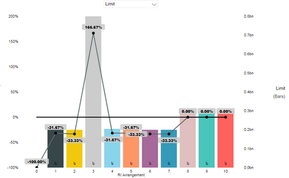
I have a page with a chart that allows the user to change the value of the columns (the line is a measure that calculates the difference to the base value). The values that the column can take includes both absolute values (millions) and percentages. Is there a way to make the formatting dynamic? Meaning that the format of the y axis labels change to % when the value is between 0 and 1 for example?
Note: I can not change the format in the data ta ble that the chart feed from since it is unpivoted and all the values are in one column, which means its got to have only one format.
Thanks for any input, I really appreciate it!
Best,
Rasul Kireev
- Mark as New
- Bookmark
- Subscribe
- Mute
- Subscribe to RSS Feed
- Permalink
- Report Inappropriate Content
Hi @Anonymous
Could you show an example data for analysis?
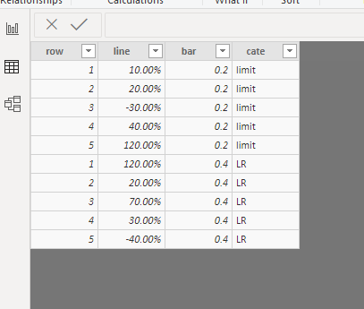
I test with the following data, but can't reproduce your problem.
PS:
for this question,
"Note: I can not change the format in the data ta ble that the chart feed from since it is unpivoted and all the values are in one column, which means its got to have only one format."
your understanding is correct, one column can't have two kinds of format at the same time.
Best Regards
Maggie
Community Support Team _ Maggie Li
If this post helps, then please consider Accept it as the solution to help the other members find it more quickly.
- Mark as New
- Bookmark
- Subscribe
- Mute
- Subscribe to RSS Feed
- Permalink
- Report Inappropriate Content
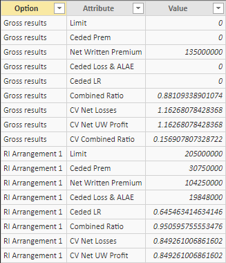
So as you can see in the picture above I have a "Unpivoted" table with repeating values for Option and Attribute, but a combination of each is unique and has a uniqie value. What I want is for all the Absolute values (e.g. Net Written Premium, Cede Loss) to stay as they are, but for the 0 to 1 values (e.g Ceded LR, Combined Ratio, etc) to display on the graph as percents.
Thanks a lot for your help!
- Mark as New
- Bookmark
- Subscribe
- Mute
- Subscribe to RSS Feed
- Permalink
- Report Inappropriate Content
Hi @Anonymous
We can use "FORMAT" funtion to have two data format in one measure.
But it change the measure to type Text instead of number.
this only makes changes to the measure (data label) instead of the y axis label.
Best Regards
Maggie
Community Support Team _ Maggie Li
If this post helps, then please consider Accept it as the solution to help the other members find it more quickly.
Helpful resources

Microsoft Fabric Learn Together
Covering the world! 9:00-10:30 AM Sydney, 4:00-5:30 PM CET (Paris/Berlin), 7:00-8:30 PM Mexico City

Power BI Monthly Update - April 2024
Check out the April 2024 Power BI update to learn about new features.

| User | Count |
|---|---|
| 113 | |
| 100 | |
| 78 | |
| 76 | |
| 52 |
| User | Count |
|---|---|
| 144 | |
| 109 | |
| 108 | |
| 88 | |
| 61 |


