- Power BI forums
- Updates
- News & Announcements
- Get Help with Power BI
- Desktop
- Service
- Report Server
- Power Query
- Mobile Apps
- Developer
- DAX Commands and Tips
- Custom Visuals Development Discussion
- Health and Life Sciences
- Power BI Spanish forums
- Translated Spanish Desktop
- Power Platform Integration - Better Together!
- Power Platform Integrations (Read-only)
- Power Platform and Dynamics 365 Integrations (Read-only)
- Training and Consulting
- Instructor Led Training
- Dashboard in a Day for Women, by Women
- Galleries
- Community Connections & How-To Videos
- COVID-19 Data Stories Gallery
- Themes Gallery
- Data Stories Gallery
- R Script Showcase
- Webinars and Video Gallery
- Quick Measures Gallery
- 2021 MSBizAppsSummit Gallery
- 2020 MSBizAppsSummit Gallery
- 2019 MSBizAppsSummit Gallery
- Events
- Ideas
- Custom Visuals Ideas
- Issues
- Issues
- Events
- Upcoming Events
- Community Blog
- Power BI Community Blog
- Custom Visuals Community Blog
- Community Support
- Community Accounts & Registration
- Using the Community
- Community Feedback
Register now to learn Fabric in free live sessions led by the best Microsoft experts. From Apr 16 to May 9, in English and Spanish.
- Power BI forums
- Forums
- Get Help with Power BI
- Desktop
- Automatic creation of charts when the database is ...
- Subscribe to RSS Feed
- Mark Topic as New
- Mark Topic as Read
- Float this Topic for Current User
- Bookmark
- Subscribe
- Printer Friendly Page
- Mark as New
- Bookmark
- Subscribe
- Mute
- Subscribe to RSS Feed
- Permalink
- Report Inappropriate Content
Automatic creation of charts when the database is updated.
Hi all,
I have a question about a possible automation of a task on PBI.
I have a table like this :
Entity | App | Number of users 2020 | Number of users 2021 | Number of users 2022 |
Entity 1 | App 1 | 12 | 34 | 45 |
Entity 1 | App 2 | 23 | 21 | 32 |
Entity 1 | App 3 | 19 | 15 | 11 |
I decide to make a Bar Chart of the number of users in 2021 concerning the app 1.
Then I receive a second Excel file and merge the two tables on PBI, the file looks like this :
| Entity | App | Number of users 2020 | Number of users 2021 | Number of users 2022 |
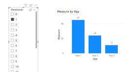
| Entity 2 | App 1 | 28 | 45 | 22 |
| Entity 2 | App 2 | 12 | 11 | 32 |
| Entity 2 | App 3 | 19 | 24 | 21 |
So I have to do exactly the same Bar Chart but concerning Entity 2 this time.
Having a lot of entity to deal with, the tasks being simple but time-consuming. Is there a way to automate the creation of different Bar Charts when I update the table with the new data ?
Thank you in advance for your answers.
Solved! Go to Solution.
- Mark as New
- Bookmark
- Subscribe
- Mute
- Subscribe to RSS Feed
- Permalink
- Report Inappropriate Content
Hi @Anonymous ,
There is no way to automate the creation of different Bar Charts when you upload a second table to Desktop and still want to use the chart created by the fields of the first table. But you can use parameters in Power BI Desktop to do this which still need you to select the parameters manually. Here are steps.
1, In PowerBI Desktop, under the "Modeling" tab, click "New Parameter".
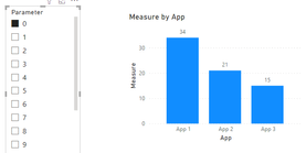
For example, the parameter created according to the above default value is to establish a sequence of integers from 0 to 20: 0, 1, 2, 3... 20, click OK, a slicer will appear on the canvas, because when creating a new parameter, there is a default option in the lower left corner: add a slicer to this page, you can adjust the value of the parameter by sliding the slicer.
2,After you upload the second table, you can create a measure to control the display of the chart.
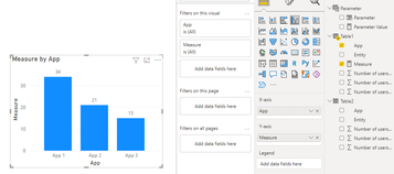
Measure =
IF (
    SELECTEDVALUE ( Parameter[Parameter] ) = 0,
    MAX ( 'Table1'[Number of users 2021] ),
    IF (
        SELECTEDVALUE ( Parameter[Parameter] ) = 1,
        MAX ( 'Table2'[Number of users 2021] )
    )
)
3, Put "App" and "Measure" into a chart.
4, Then you can get the chart you want accoding to the selected value of the slicer as below.
If you have more EXCEL files, you can add conditions in IF function.
I attach my sample below for your reference.
Best Regards,
Community Support Team _ xiaosun
If this post helps, then please consider Accept it as the solution to help the other members find it more quickly.
- Mark as New
- Bookmark
- Subscribe
- Mute
- Subscribe to RSS Feed
- Permalink
- Report Inappropriate Content
Thank you, it helped me greatly so that I didn't repeat the same tasks over and over again!
Helpful resources

Microsoft Fabric Learn Together
Covering the world! 9:00-10:30 AM Sydney, 4:00-5:30 PM CET (Paris/Berlin), 7:00-8:30 PM Mexico City

Power BI Monthly Update - April 2024
Check out the April 2024 Power BI update to learn about new features.

| User | Count |
|---|---|
| 112 | |
| 100 | |
| 76 | |
| 74 | |
| 49 |
| User | Count |
|---|---|
| 146 | |
| 108 | |
| 106 | |
| 90 | |
| 62 |


