- Power BI forums
- Updates
- News & Announcements
- Get Help with Power BI
- Desktop
- Service
- Report Server
- Power Query
- Mobile Apps
- Developer
- DAX Commands and Tips
- Custom Visuals Development Discussion
- Health and Life Sciences
- Power BI Spanish forums
- Translated Spanish Desktop
- Power Platform Integration - Better Together!
- Power Platform Integrations (Read-only)
- Power Platform and Dynamics 365 Integrations (Read-only)
- Training and Consulting
- Instructor Led Training
- Dashboard in a Day for Women, by Women
- Galleries
- Community Connections & How-To Videos
- COVID-19 Data Stories Gallery
- Themes Gallery
- Data Stories Gallery
- R Script Showcase
- Webinars and Video Gallery
- Quick Measures Gallery
- 2021 MSBizAppsSummit Gallery
- 2020 MSBizAppsSummit Gallery
- 2019 MSBizAppsSummit Gallery
- Events
- Ideas
- Custom Visuals Ideas
- Issues
- Issues
- Events
- Upcoming Events
- Community Blog
- Power BI Community Blog
- Custom Visuals Community Blog
- Community Support
- Community Accounts & Registration
- Using the Community
- Community Feedback
Register now to learn Fabric in free live sessions led by the best Microsoft experts. From Apr 16 to May 9, in English and Spanish.
- Power BI forums
- Forums
- Get Help with Power BI
- Desktop
- Re: Assistance with a suitableType Of Visualisatio...
- Subscribe to RSS Feed
- Mark Topic as New
- Mark Topic as Read
- Float this Topic for Current User
- Bookmark
- Subscribe
- Printer Friendly Page
- Mark as New
- Bookmark
- Subscribe
- Mute
- Subscribe to RSS Feed
- Permalink
- Report Inappropriate Content
Assistance with a suitableType Of Visualisation
A. I have been using and implementing PowerBI for the last couple of months and I am sort of familiar with the product. I have a requirement from one of my clients to produce a report that shows the Branches on the colums and Some calculated measures on the rows. I have tried the matrix ,table visualisations but its not bringing what I am looking. Anyone please assist for me to produce a visualisation like the one attached.
B.
| Branch | Branch A | Branch B | Branch C |
| YTD Sales | 2000 | 5000 | 8000 |
| YTD Target | 800 | 1500 | 3500 |
| SHortfall | 1200 | 3500 | 4500 |
| Measure 1 | 300 | 500 | 6000 |
| Measure 2 | 200 | 150 | 8777 |
Thank you in advance
Solved! Go to Solution.
- Mark as New
- Bookmark
- Subscribe
- Mute
- Subscribe to RSS Feed
- Permalink
- Report Inappropriate Content
Hi, @nkaruwo
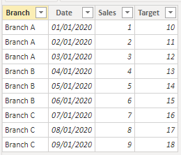
Based on your description, I created data to reproduce your scenario. The pbix file is attached in the end.
Table:
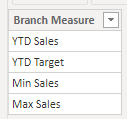
Test:
Calendar(a calculated table):
Calendar = CALENDARAUTO()
There is a relationship between 'Calendar' and 'Table'. You may create measures as below.
Result =
var tab =
ADDCOLUMNS(
    CROSSJOIN(
        DISTINCT('Table'[Branch]),
        DISTINCT(Test[Branch Measure])
    ),
    "Result",
    SWITCH(
        [Branch Measure],
        "YTD Sales",
        CALCULATE(
            SUM('Table'[Sales]),
            DATESYTD('Calendar'[Date])
        ),
        "YTD Target",
        CALCULATE(
            SUM('Table'[Target]),
            DATESYTD('Calendar'[Date])
        ),
        "Min Sales",
        CALCULATE(
            MIN('Table'[Sales]),
            FILTER(
                ALL('Table'),
                'Table'[Branch]=EARLIER('Table'[Branch])
            )
        ),
        "Max Sales",
        CALCULATE(
            MAX('Table'[Sales]),
            FILTER(
                ALL('Table'),
                'Table'[Branch]=EARLIER('Table'[Branch])
            )
        )
    )
)
return
SUMX(
    tab,
    [Result]
)
Result:
Best Regards
Allan
If this post helps, then please consider Accept it as the solution to help the other members find it more quickly.
- Mark as New
- Bookmark
- Subscribe
- Mute
- Subscribe to RSS Feed
- Permalink
- Report Inappropriate Content
Hi @nkaruwo,
I had a similar requirement from a client. This is how I achieved it.
Let's say your data looks like below.
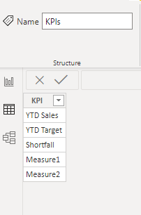
Create a new table (Enter Data) and mention all the measure names that you want to display as rows.
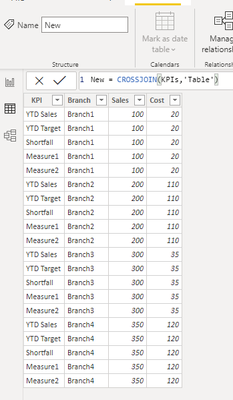
Create a new table by doing cross join of the above two tables.
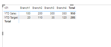
Now, create a matrix with Rows as 'KPI' from the new table and Columns as 'Branch' from the new table and create a measure using SWITCH like below.
And use this measure in your matrix.
Output:
Best Regards
Simran Tuli
- Mark as New
- Bookmark
- Subscribe
- Mute
- Subscribe to RSS Feed
- Permalink
- Report Inappropriate Content
Hi @nkaruwo
I would pivot the table which has the branch column and select what calculation I need.
https://www.youtube.com/watch?v=OYM26ZytimM
Hope it resolves your issue? Did I answer your question? Mark my post as a solution! Appreciate your Kudos, Press the thumbs up button!! Linkedin Profile |
- Mark as New
- Bookmark
- Subscribe
- Mute
- Subscribe to RSS Feed
- Permalink
- Report Inappropriate Content
Thank you for the reposse. Am however looking for an additional way of showing multiple measures across diffrent branches on the rows The option seems to work with only one measure.
Helpful resources

Microsoft Fabric Learn Together
Covering the world! 9:00-10:30 AM Sydney, 4:00-5:30 PM CET (Paris/Berlin), 7:00-8:30 PM Mexico City

Power BI Monthly Update - April 2024
Check out the April 2024 Power BI update to learn about new features.

| User | Count |
|---|---|
| 107 | |
| 93 | |
| 77 | |
| 65 | |
| 53 |
| User | Count |
|---|---|
| 147 | |
| 106 | |
| 104 | |
| 87 | |
| 61 |
