- Power BI forums
- Updates
- News & Announcements
- Get Help with Power BI
- Desktop
- Service
- Report Server
- Power Query
- Mobile Apps
- Developer
- DAX Commands and Tips
- Custom Visuals Development Discussion
- Health and Life Sciences
- Power BI Spanish forums
- Translated Spanish Desktop
- Power Platform Integration - Better Together!
- Power Platform Integrations (Read-only)
- Power Platform and Dynamics 365 Integrations (Read-only)
- Training and Consulting
- Instructor Led Training
- Dashboard in a Day for Women, by Women
- Galleries
- Community Connections & How-To Videos
- COVID-19 Data Stories Gallery
- Themes Gallery
- Data Stories Gallery
- R Script Showcase
- Webinars and Video Gallery
- Quick Measures Gallery
- 2021 MSBizAppsSummit Gallery
- 2020 MSBizAppsSummit Gallery
- 2019 MSBizAppsSummit Gallery
- Events
- Ideas
- Custom Visuals Ideas
- Issues
- Issues
- Events
- Upcoming Events
- Community Blog
- Power BI Community Blog
- Custom Visuals Community Blog
- Community Support
- Community Accounts & Registration
- Using the Community
- Community Feedback
Register now to learn Fabric in free live sessions led by the best Microsoft experts. From Apr 16 to May 9, in English and Spanish.
- Power BI forums
- Forums
- Get Help with Power BI
- Desktop
- Arranging Data for an Bar Chart
- Subscribe to RSS Feed
- Mark Topic as New
- Mark Topic as Read
- Float this Topic for Current User
- Bookmark
- Subscribe
- Printer Friendly Page
- Mark as New
- Bookmark
- Subscribe
- Mute
- Subscribe to RSS Feed
- Permalink
- Report Inappropriate Content
Arranging Data for an Bar Chart
Hi All,
I need to arrange the below data so that I get a Bar Chart that has the X-Axis as each 'Task' and then on the Y-Axis a % Completion.
If anyone could help I would greatly appreciate it.
The dataset is below, if you could provide an example of how you would arrange it so I can achieve the above, that would be great:
| Part Number | Description | Task 1 | Task 2 | Task 3 | Task 4 | Task 5 |
| 1 | A | Complete | Complete | Complete | Complete | In-Progress |
| 2 | B | Complete | Complete | Complete | Complete | In-Progress |
| 3 | C | Complete | Complete | Complete | Complete | Incomplete |
| 4 | D | Complete | Complete | Complete | Complete | Incomplete |
| 5 | E | Complete | Complete | Complete | Complete | Incomplete |
| 6 | F | Complete | Complete | Complete | Incomplete | Incomplete |
| 7 | G | Complete | Complete | Complete | Complete | Incomplete |
| 8 | H | Complete | Complete | Complete | Incomplete | Incomplete |
| 9 | I | Complete | Complete | Complete | Incomplete | In-Progress |
| 10 | J | Complete | Complete | Complete | Complete | Incomplete |
| 11 | K | Complete | Complete | Complete | Complete | Incomplete |
| 12 | L | Complete | Complete | Complete | Complete | Incomplete |
Solved! Go to Solution.
- Mark as New
- Bookmark
- Subscribe
- Mute
- Subscribe to RSS Feed
- Permalink
- Report Inappropriate Content
Hi @Anonymous
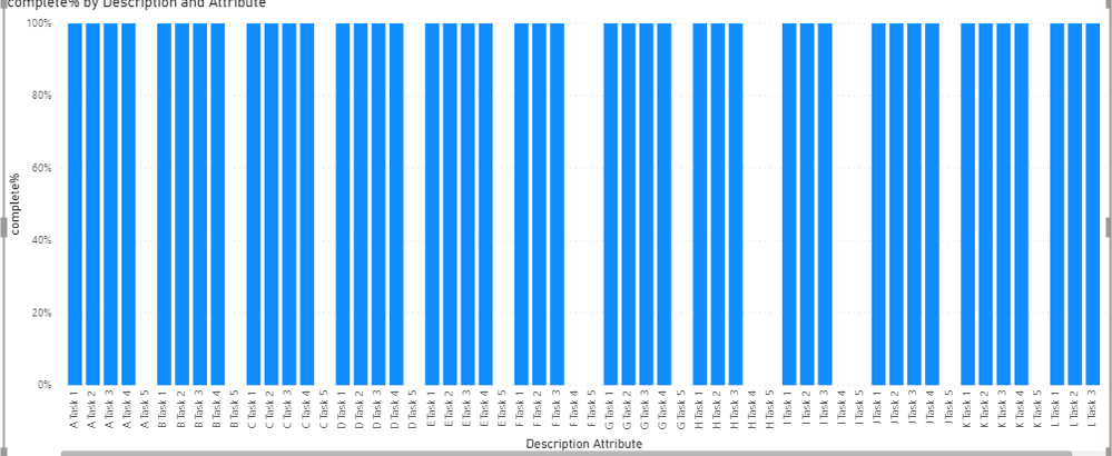
In addition to ryan_mayu 's reply, after unpivote the Task columns , you can build a 100% stacked column chart directly.
Add Attribute(Task Name) in X axis, Value(Status) in Legend, and add Value(Status) in Values(use count funtction in this visual)
Result is as below.
You can download the pbix file from this link: Arranging Data for an Bar Chart
Best Regards,
Rico Zhou
If this post helps, then please consider Accept it as the solution to help the other members find it more quickly.
- Mark as New
- Bookmark
- Subscribe
- Mute
- Subscribe to RSS Feed
- Permalink
- Report Inappropriate Content
@Anonymous
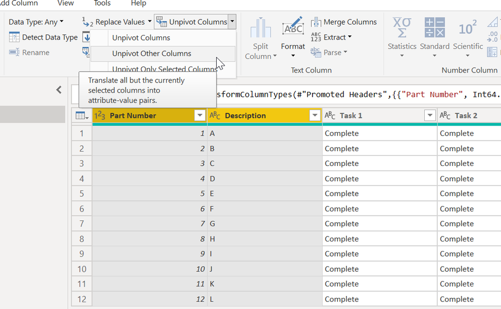
1. select partnumber and description columns and unpivot other columns in the PQ
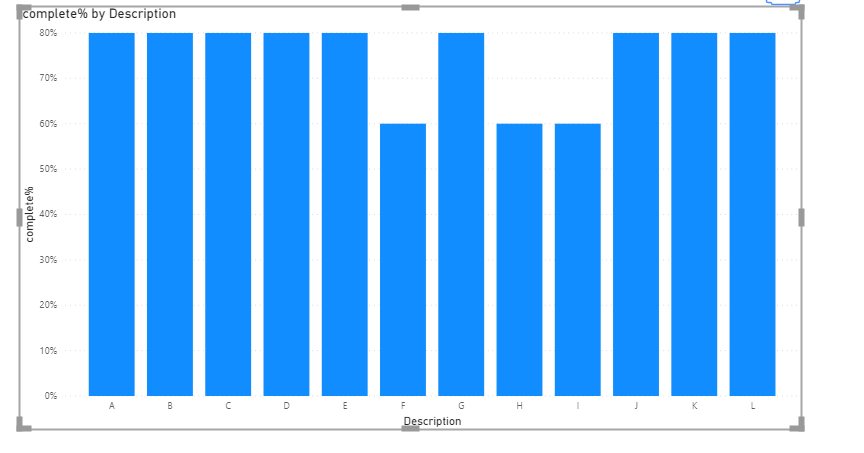
2. create a measure
complete% = CALCULATE(COUNTROWS('Table'),FILTER('Table','Table'[Value]="Complete"))/COUNTROWS('Table')below is the pbix file for your reference
Did I answer your question? Mark my post as a solution!
Proud to be a Super User!
- Mark as New
- Bookmark
- Subscribe
- Mute
- Subscribe to RSS Feed
- Permalink
- Report Inappropriate Content
Hi Ryan,
Appreciate your help, however I'd ideally want the X-Axis to have to various tasks. Is this possible?
- Mark as New
- Bookmark
- Subscribe
- Mute
- Subscribe to RSS Feed
- Permalink
- Report Inappropriate Content
Helpful resources

Microsoft Fabric Learn Together
Covering the world! 9:00-10:30 AM Sydney, 4:00-5:30 PM CET (Paris/Berlin), 7:00-8:30 PM Mexico City

Power BI Monthly Update - April 2024
Check out the April 2024 Power BI update to learn about new features.

| User | Count |
|---|---|
| 111 | |
| 97 | |
| 80 | |
| 69 | |
| 59 |
| User | Count |
|---|---|
| 150 | |
| 119 | |
| 104 | |
| 87 | |
| 67 |


