- Power BI forums
- Updates
- News & Announcements
- Get Help with Power BI
- Desktop
- Service
- Report Server
- Power Query
- Mobile Apps
- Developer
- DAX Commands and Tips
- Custom Visuals Development Discussion
- Health and Life Sciences
- Power BI Spanish forums
- Translated Spanish Desktop
- Power Platform Integration - Better Together!
- Power Platform Integrations (Read-only)
- Power Platform and Dynamics 365 Integrations (Read-only)
- Training and Consulting
- Instructor Led Training
- Dashboard in a Day for Women, by Women
- Galleries
- Community Connections & How-To Videos
- COVID-19 Data Stories Gallery
- Themes Gallery
- Data Stories Gallery
- R Script Showcase
- Webinars and Video Gallery
- Quick Measures Gallery
- 2021 MSBizAppsSummit Gallery
- 2020 MSBizAppsSummit Gallery
- 2019 MSBizAppsSummit Gallery
- Events
- Ideas
- Custom Visuals Ideas
- Issues
- Issues
- Events
- Upcoming Events
- Community Blog
- Power BI Community Blog
- Custom Visuals Community Blog
- Community Support
- Community Accounts & Registration
- Using the Community
- Community Feedback
Register now to learn Fabric in free live sessions led by the best Microsoft experts. From Apr 16 to May 9, in English and Spanish.
- Power BI forums
- Forums
- Get Help with Power BI
- Desktop
- Animation Filter that Shows Cumulative Data Over T...
- Subscribe to RSS Feed
- Mark Topic as New
- Mark Topic as Read
- Float this Topic for Current User
- Bookmark
- Subscribe
- Printer Friendly Page
- Mark as New
- Bookmark
- Subscribe
- Mute
- Subscribe to RSS Feed
- Permalink
- Report Inappropriate Content
Animation Filter that Shows Cumulative Data Over Time
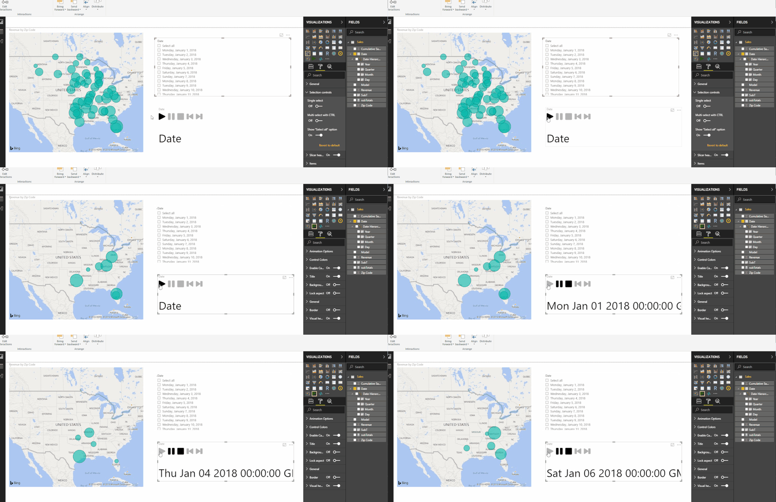
I am working on a map that shows sales per zip code across the USA. Currently I am using the map vizulatization and the play axis visualization. I have also tried using the drilldown player. I want to click play and see how sales accumulate across the map over time. Instead, when the Play Axis runs, it shows me one day, then the next, and the next; but it does not retain the data from the previous days.
Essentially my issue is that these animations are acting like a single slect filter; selecting one day, then deselecting that day and moving to the next day. I want a multi select filter animation, it selects the first day, then adds the second days data, and the thrids, etc.
Any ideas how to achieve this?
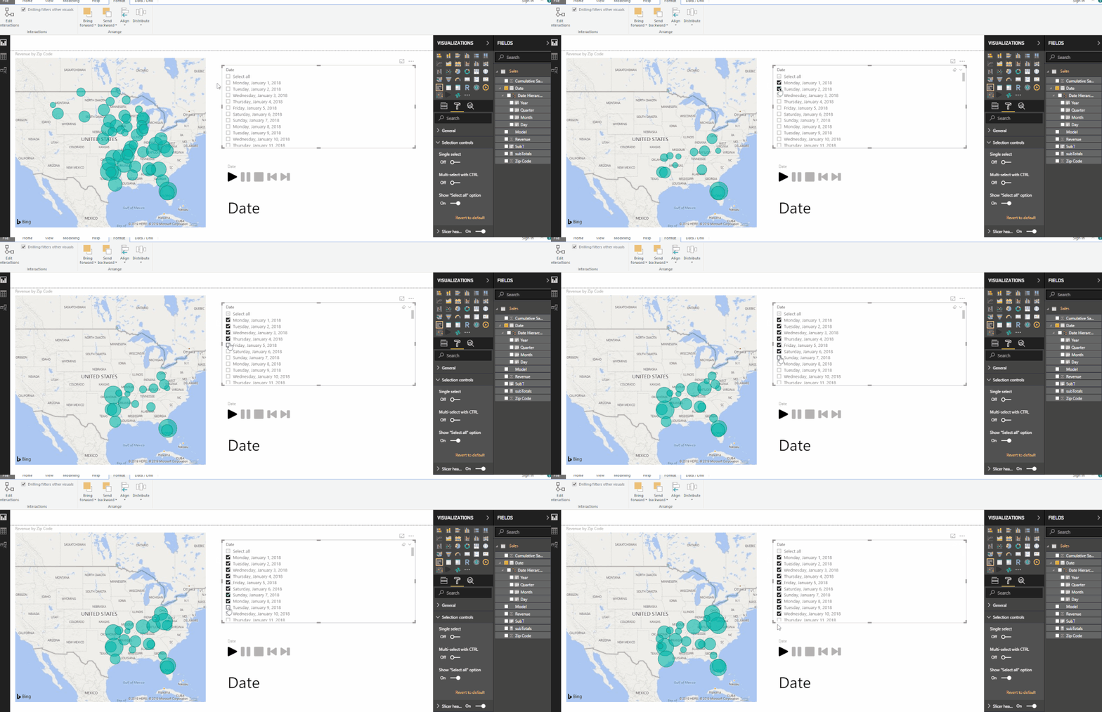
I want an animated version of what i am doing below:
Instead today when I run Play Axis I get this:
- Mark as New
- Bookmark
- Subscribe
- Mute
- Subscribe to RSS Feed
- Permalink
- Report Inappropriate Content
Hi I am currently trying to find a solution for this right now, anything worked? Thank you
- Mark as New
- Bookmark
- Subscribe
- Mute
- Subscribe to RSS Feed
- Permalink
- Report Inappropriate Content
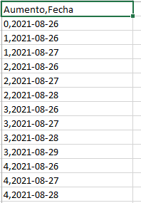
I had to import an excel file with a table of cumulative dates, like this one
It works perfectly
- Mark as New
- Bookmark
- Subscribe
- Mute
- Subscribe to RSS Feed
- Permalink
- Report Inappropriate Content
upvote +1. any solutions?
- Mark as New
- Bookmark
- Subscribe
- Mute
- Subscribe to RSS Feed
- Permalink
- Report Inappropriate Content
Hi,
Did you get a solution for this? I am facing the same challenge, kindly help.
- Mark as New
- Bookmark
- Subscribe
- Mute
- Subscribe to RSS Feed
- Permalink
- Report Inappropriate Content
@Alex1209 you need to create cummulative sales measure and use that for bubble then it will work as expected. Try following for cummulative sales
Running Sales =
CALCULATE( SUM( Table[Sales] ),
FILTER( ALL( Table ), Table[Date] <= MAX( Table[Date] )  )
)
Subscribe to the @PowerBIHowTo YT channel for an upcoming video on List and Record functions in Power Query!!
Learn Power BI and Fabric - subscribe to our YT channel - Click here: @PowerBIHowTo
If my solution proved useful, I'd be delighted to receive Kudos. When you put effort into asking a question, it's equally thoughtful to acknowledge and give Kudos to the individual who helped you solve the problem. It's a small gesture that shows appreciation and encouragement! ❤
Did I answer your question? Mark my post as a solution. Proud to be a Super User! Appreciate your Kudos 🙂
Feel free to email me with any of your BI needs.
- Mark as New
- Bookmark
- Subscribe
- Mute
- Subscribe to RSS Feed
- Permalink
- Report Inappropriate Content
Thanks for the reply!
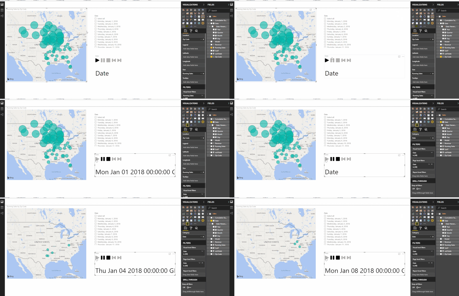
I tried entering your measure, and the measure worked but it did not produce the effect desired. Here is the measure I entered:
"Running Sales = CALCULATE(sum(Sales[Revenue]),filter(all(Sales),Sales[Date]<=max(Sales[Date])))"
And the behavior is still showing one day, then jump to the next, and the next; as seen below:
I believe it may have to due with how my data is set-up. I have one sales table with Date, Model, Zip Code and Revenue. On the Jan 1 there is a sale in zip code 43064. But on Jan 2 there is no sale in zip 43064. Therefore, when the animation is on Jan 2, the bubble over zip 43064 disappears. I want the data from Jan 1 to remain on the map, and add the data from Jan 2 to it when the animation runs.
Adding a cumulative sales meausre would only work if there were record for every zip code, every day, which there is not.
I am thinking about that correctly? I am still very new to PowerBI so feel free to tell me if I am totally off base.
- Mark as New
- Bookmark
- Subscribe
- Mute
- Subscribe to RSS Feed
- Permalink
- Report Inappropriate Content
@Alex1209 are you ok to share your pbix file using onedrive/google drive, remove sensitive informaiton
Subscribe to the @PowerBIHowTo YT channel for an upcoming video on List and Record functions in Power Query!!
Learn Power BI and Fabric - subscribe to our YT channel - Click here: @PowerBIHowTo
If my solution proved useful, I'd be delighted to receive Kudos. When you put effort into asking a question, it's equally thoughtful to acknowledge and give Kudos to the individual who helped you solve the problem. It's a small gesture that shows appreciation and encouragement! ❤
Did I answer your question? Mark my post as a solution. Proud to be a Super User! Appreciate your Kudos 🙂
Feel free to email me with any of your BI needs.
- Mark as New
- Bookmark
- Subscribe
- Mute
- Subscribe to RSS Feed
- Permalink
- Report Inappropriate Content
Yep, here is a link. Let me know if you have any issues downlaoding it. I removed the "Model" column for scrubbing reasons. Essentially each row is a record of a sale of a model in a certain zip code and the revenue from that sale.
https://drive.google.com/open?id=1PUQpCxBkHiDP-8twj6kaISpCB7gMnZo1
Thanks again.
- Mark as New
- Bookmark
- Subscribe
- Mute
- Subscribe to RSS Feed
- Permalink
- Report Inappropriate Content
Do you have any solution for this? Thanks
- Mark as New
- Bookmark
- Subscribe
- Mute
- Subscribe to RSS Feed
- Permalink
- Report Inappropriate Content
@Alex1209 Hey sorry for late reply I think I got the idea on how to resolve it, I need to do some data transformation in Power Query, could you please share the excel file you used in this report so that I can do Power Query steps. Cheers!!
Subscribe to the @PowerBIHowTo YT channel for an upcoming video on List and Record functions in Power Query!!
Learn Power BI and Fabric - subscribe to our YT channel - Click here: @PowerBIHowTo
If my solution proved useful, I'd be delighted to receive Kudos. When you put effort into asking a question, it's equally thoughtful to acknowledge and give Kudos to the individual who helped you solve the problem. It's a small gesture that shows appreciation and encouragement! ❤
Did I answer your question? Mark my post as a solution. Proud to be a Super User! Appreciate your Kudos 🙂
Feel free to email me with any of your BI needs.
Helpful resources

Microsoft Fabric Learn Together
Covering the world! 9:00-10:30 AM Sydney, 4:00-5:30 PM CET (Paris/Berlin), 7:00-8:30 PM Mexico City

Power BI Monthly Update - April 2024
Check out the April 2024 Power BI update to learn about new features.

| User | Count |
|---|---|
| 111 | |
| 95 | |
| 80 | |
| 68 | |
| 59 |
| User | Count |
|---|---|
| 150 | |
| 119 | |
| 104 | |
| 87 | |
| 67 |


