- Power BI forums
- Updates
- News & Announcements
- Get Help with Power BI
- Desktop
- Service
- Report Server
- Power Query
- Mobile Apps
- Developer
- DAX Commands and Tips
- Custom Visuals Development Discussion
- Health and Life Sciences
- Power BI Spanish forums
- Translated Spanish Desktop
- Power Platform Integration - Better Together!
- Power Platform Integrations (Read-only)
- Power Platform and Dynamics 365 Integrations (Read-only)
- Training and Consulting
- Instructor Led Training
- Dashboard in a Day for Women, by Women
- Galleries
- Community Connections & How-To Videos
- COVID-19 Data Stories Gallery
- Themes Gallery
- Data Stories Gallery
- R Script Showcase
- Webinars and Video Gallery
- Quick Measures Gallery
- 2021 MSBizAppsSummit Gallery
- 2020 MSBizAppsSummit Gallery
- 2019 MSBizAppsSummit Gallery
- Events
- Ideas
- Custom Visuals Ideas
- Issues
- Issues
- Events
- Upcoming Events
- Community Blog
- Power BI Community Blog
- Custom Visuals Community Blog
- Community Support
- Community Accounts & Registration
- Using the Community
- Community Feedback
Register now to learn Fabric in free live sessions led by the best Microsoft experts. From Apr 16 to May 9, in English and Spanish.
- Power BI forums
- Forums
- Get Help with Power BI
- Desktop
- Re: Alternatives to Native Line chart?
- Subscribe to RSS Feed
- Mark Topic as New
- Mark Topic as Read
- Float this Topic for Current User
- Bookmark
- Subscribe
- Printer Friendly Page
- Mark as New
- Bookmark
- Subscribe
- Mute
- Subscribe to RSS Feed
- Permalink
- Report Inappropriate Content
Alternatives to Native Line chart?
Hi,
I have tried using the native line chart but find several limitations. I am basically trying to plot temperature value (of various devices) against time (with readings as frequent as aevery other minute, but the plot would be for a week or multiple weeks).
Limitations which i notice in Power BI's line chart:
1. Can't have breaks/gaps in line - if I have no readings for weekends or weeknights it stills joins Friday's last reading to Monday's first reading ... would need to have breaks in lines when there is no reading - this is really misleading (and can't use zero as temperature value itself can be zero or negative)
2. Would like to have bands or at least constant lines (that can be change per category chosen). That is would like to show if the line/value is within an acceptable range or outside the range (the range would vary based on the device category chosen in the single select slicer). And I expect to plot multiple devices within the same (single chosen) device category.
3. If its stepped then allow for change in steps to be at the timestamp the change occurs not in between timestamps
Has anybody found and used any other line chart visual that can accomodate the above and all the native visual features? Or has a workaround for the above?
Want a line chart visual that does not required R.
Thanks
- Mark as New
- Bookmark
- Subscribe
- Mute
- Subscribe to RSS Feed
- Permalink
- Report Inappropriate Content
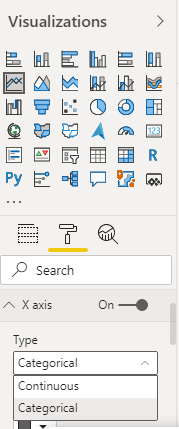
@cyclist007 , For the first one. If you change axis type to categorical, that should work. 2nd and 3rd are not clear to me
Microsoft Power BI Learning Resources, 2023 !!
Learn Power BI - Full Course with Dec-2022, with Window, Index, Offset, 100+ Topics !!
Did I answer your question? Mark my post as a solution! Appreciate your Kudos !! Proud to be a Super User! !!
- Mark as New
- Bookmark
- Subscribe
- Mute
- Subscribe to RSS Feed
- Permalink
- Report Inappropriate Content
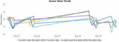
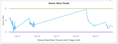
For #2 Would like to have combination of below two charts:
(also as you can see below there are no readings on sept 26th & 27th , so the lines join across from sept 25th to sept 28th)
With lower limit & upper limit:
- Mark as New
- Bookmark
- Subscribe
- Mute
- Subscribe to RSS Feed
- Permalink
- Report Inappropriate Content
Any other alternative to better represent/display time based data on a continuous line chart (without joining lines and avoiding misrepresention)?
- Mark as New
- Bookmark
- Subscribe
- Mute
- Subscribe to RSS Feed
- Permalink
- Report Inappropriate Content
Hi, @cyclist007
Maybe you can copy the date ,then try to change the new column "Text_date" type from "Date" to "Text".
If the axis sorting is not accurate, you may need to create an index column in query editor and make the new column"Text_date" sort by this index column.
You can check if the attached pbix file is helpful.
Best Regards,
Community Support Team _ Eason
- Mark as New
- Bookmark
- Subscribe
- Mute
- Subscribe to RSS Feed
- Permalink
- Report Inappropriate Content
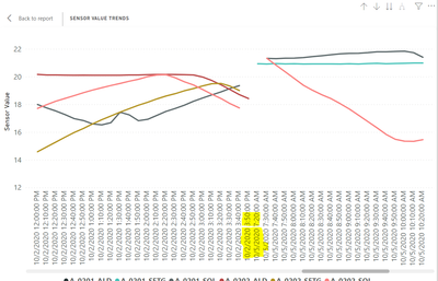
@v-easonf-msft Thanks for taking the time in creating an example to showcase. But on reviewing it I found that it converts the axis to a categorical axis when the x-axis field is a text field, which does not work well with date-time fields (especially at minute intervals) and also results in misleading gap periods. See below how it ends up looking in below screenshot ... text field/categorical axis does not provide the solution in this case (the huge scroll bar just does not allow for a single view analysis for different lengths of time that the continuous axis allowed for).
- Mark as New
- Bookmark
- Subscribe
- Mute
- Subscribe to RSS Feed
- Permalink
- Report Inappropriate Content
Hi, @cyclist007
Sorry,I did not find any other custom visual about Line char that meet your requirements .I can't solve it currently.
It is suggest to create a ticket to the support team .Maybe they will have better suggestions.
https://powerbi.microsoft.com/en-us/support/
Best Regards,
Community Support Team _ Eason
- Mark as New
- Bookmark
- Subscribe
- Mute
- Subscribe to RSS Feed
- Permalink
- Report Inappropriate Content
@amitchandak ... thanks for the response #1 The categorical axis does not help or is rather worse due to long scroll bar and not equi-distant reading timestamps. #2 - Would have liked to add a lower limit & upper limit line based on device category. But the native line chart does not allow additional fields in value or secondary axis if you populate a legend (possibly due to color assingment conflicts). Also the constant line in analytics would not be dynamic (based on category). So was wondering if anyone else has managed to address this in some other way or using some other custom visual.
Helpful resources

Microsoft Fabric Learn Together
Covering the world! 9:00-10:30 AM Sydney, 4:00-5:30 PM CET (Paris/Berlin), 7:00-8:30 PM Mexico City

Power BI Monthly Update - April 2024
Check out the April 2024 Power BI update to learn about new features.

| User | Count |
|---|---|
| 107 | |
| 93 | |
| 77 | |
| 65 | |
| 53 |
| User | Count |
|---|---|
| 147 | |
| 106 | |
| 104 | |
| 87 | |
| 61 |


