- Power BI forums
- Updates
- News & Announcements
- Get Help with Power BI
- Desktop
- Service
- Report Server
- Power Query
- Mobile Apps
- Developer
- DAX Commands and Tips
- Custom Visuals Development Discussion
- Health and Life Sciences
- Power BI Spanish forums
- Translated Spanish Desktop
- Power Platform Integration - Better Together!
- Power Platform Integrations (Read-only)
- Power Platform and Dynamics 365 Integrations (Read-only)
- Training and Consulting
- Instructor Led Training
- Dashboard in a Day for Women, by Women
- Galleries
- Community Connections & How-To Videos
- COVID-19 Data Stories Gallery
- Themes Gallery
- Data Stories Gallery
- R Script Showcase
- Webinars and Video Gallery
- Quick Measures Gallery
- 2021 MSBizAppsSummit Gallery
- 2020 MSBizAppsSummit Gallery
- 2019 MSBizAppsSummit Gallery
- Events
- Ideas
- Custom Visuals Ideas
- Issues
- Issues
- Events
- Upcoming Events
- Community Blog
- Power BI Community Blog
- Custom Visuals Community Blog
- Community Support
- Community Accounts & Registration
- Using the Community
- Community Feedback
Register now to learn Fabric in free live sessions led by the best Microsoft experts. From Apr 16 to May 9, in English and Spanish.
- Power BI forums
- Forums
- Get Help with Power BI
- Desktop
- Alternative solution to column chart with multiple...
- Subscribe to RSS Feed
- Mark Topic as New
- Mark Topic as Read
- Float this Topic for Current User
- Bookmark
- Subscribe
- Printer Friendly Page
- Mark as New
- Bookmark
- Subscribe
- Mute
- Subscribe to RSS Feed
- Permalink
- Report Inappropriate Content
Alternative solution to column chart with multiple lines
I believe the following is on Power BI's wishlist, so I'm looking to get answers on alternative solutions:
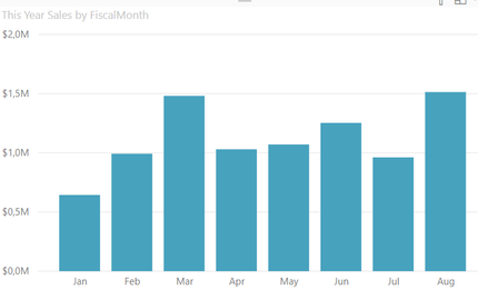
Let's say we have a column chart that displays months on the X axis, and the columns indicate the sales per month for a clothing store.
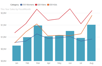
I then want to apply lines on top of this, to see how each of my clothing categories are performing:
Now, already here, this is to my knowledge not possible in Power BI. This 'chart' was created using a Line Chart and putting it on top of the column chart, and removing the Y and X axis. My first problem occurs when I drill down to see weeks and specific dates. Now, data in both charts extend past what their window can show, and I need to scroll in both charts hoping to align the data perfectly.
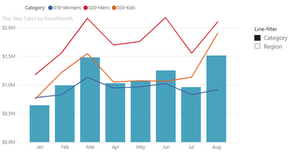
Additionally, I want to attach a custom-slicer to the Line Chart, to easily switch between different data:
This custom-slicer can be made creating a temp-table with crossjoins on the columns (Category and Region), and a switch-measure. Easy peasy.
Is what I'm trying to accomplish possible in any way in Power BI? Does Python or R have the capabilities to do this? Or are there any other ways to solve my issue?
- Mark as New
- Bookmark
- Subscribe
- Mute
- Subscribe to RSS Feed
- Permalink
- Report Inappropriate Content
Hi Preben,
I want to know whether the data of bar chart and line chart are from two different table, and whether they are not related.
If they have relationship , you could use line and column chart to achieve this goal. You could refer to my sample
Best Regards,
Zoe Zhi
If this post helps, then please consider Accept it as the solution to help the other members find it more quickly.
- Mark as New
- Bookmark
- Subscribe
- Mute
- Subscribe to RSS Feed
- Permalink
- Report Inappropriate Content
@dax hi, thank you for your reply.
Let's suppose the data is all in the same table. But what if in the slicer we want 50 options, with various amounts of suboptions/lines? There could be 10 categories, 28 regions, and so on, and the graph needs to tell me what each of them are. In your examplefile they're static and called line a and line b. Is this possible?
Helpful resources

Microsoft Fabric Learn Together
Covering the world! 9:00-10:30 AM Sydney, 4:00-5:30 PM CET (Paris/Berlin), 7:00-8:30 PM Mexico City

Power BI Monthly Update - April 2024
Check out the April 2024 Power BI update to learn about new features.

| User | Count |
|---|---|
| 107 | |
| 94 | |
| 77 | |
| 63 | |
| 50 |
| User | Count |
|---|---|
| 147 | |
| 106 | |
| 104 | |
| 87 | |
| 61 |


