- Power BI forums
- Updates
- News & Announcements
- Get Help with Power BI
- Desktop
- Service
- Report Server
- Power Query
- Mobile Apps
- Developer
- DAX Commands and Tips
- Custom Visuals Development Discussion
- Health and Life Sciences
- Power BI Spanish forums
- Translated Spanish Desktop
- Power Platform Integration - Better Together!
- Power Platform Integrations (Read-only)
- Power Platform and Dynamics 365 Integrations (Read-only)
- Training and Consulting
- Instructor Led Training
- Dashboard in a Day for Women, by Women
- Galleries
- Community Connections & How-To Videos
- COVID-19 Data Stories Gallery
- Themes Gallery
- Data Stories Gallery
- R Script Showcase
- Webinars and Video Gallery
- Quick Measures Gallery
- 2021 MSBizAppsSummit Gallery
- 2020 MSBizAppsSummit Gallery
- 2019 MSBizAppsSummit Gallery
- Events
- Ideas
- Custom Visuals Ideas
- Issues
- Issues
- Events
- Upcoming Events
- Community Blog
- Power BI Community Blog
- Custom Visuals Community Blog
- Community Support
- Community Accounts & Registration
- Using the Community
- Community Feedback
Register now to learn Fabric in free live sessions led by the best Microsoft experts. From Apr 16 to May 9, in English and Spanish.
- Power BI forums
- Forums
- Get Help with Power BI
- Desktop
- Re: Altering Line chart display
- Subscribe to RSS Feed
- Mark Topic as New
- Mark Topic as Read
- Float this Topic for Current User
- Bookmark
- Subscribe
- Printer Friendly Page
- Mark as New
- Bookmark
- Subscribe
- Mute
- Subscribe to RSS Feed
- Permalink
- Report Inappropriate Content
Altering Line chart display
Hi Team,
I am currently trying to display the table data based on the summation of amount of months based on year and type. The data is need to be displayed on Line chart. The chart is updated based on the filter "Type". But here i need to display the data in chart such a manner that when none is selected in filter or both the type is selected then the amount must be subtracted based on types and reflected on chart. When only one is selected then summation must be reflected based on Filter "Type". Below is sample data.
The chart is line chart and data to be displayed in this manner as shown below. It should have the verticle line too.
If giver is selected then summation of month is displayed for giver only. Similarly for Reciever also. But when none is selected or both is selected then the data should be displayed as (Summation of reciever) - (Summation of Giver).
Solved! Go to Solution.
- Mark as New
- Bookmark
- Subscribe
- Mute
- Subscribe to RSS Feed
- Permalink
- Report Inappropriate Content
Hi @VinayakKarne ,
I have created dummy data, below are my numbers from initial table

Below is the snapshot of data post Unpivot on Month Name Columns, Post Unpivot i have renamed Attribute column to Month.
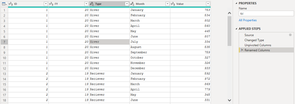
Created a measure as suggested earlier.

create a table with Month names and Index to sort your graph by Month for sorting purpose, create relationship between newely created table with data table on Month
| January | 1 |
| February | 2 |
| March | 3 |
| April | 4 |
| May | 5 |
| June | 6 |
| July | 7 |
| August | 8 |
| September | 9 |
| October | 10 |
| November | 11 |
| December | 12 |
below is the line chart with no selection on Type slicer

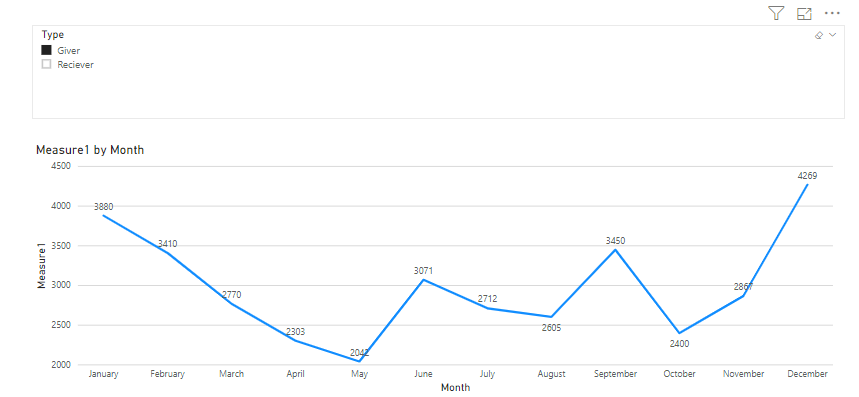
screenshot with Reciever selection on slicer.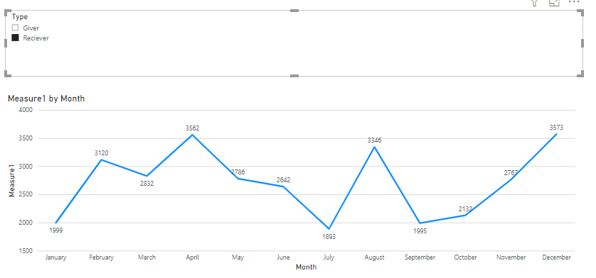
I hope this will help you in resolving your issue.
Thank You,
Washivale
- Mark as New
- Bookmark
- Subscribe
- Mute
- Subscribe to RSS Feed
- Permalink
- Report Inappropriate Content
Hi @VinayakKarne ,
To get both gridline you should turn on gridlines option under X axis and Y axis as well
for getting value of based on your selection create a measure as below (considering your value summation value would be in one column, for easier calculation):
- Mark as New
- Bookmark
- Subscribe
- Mute
- Subscribe to RSS Feed
- Permalink
- Report Inappropriate Content
Hi Washivale, There is no option under x axis for grid lines.
Also since there are 12 months so how couldi differentiate them while summation in one measure based on above method.
It would be easier for me if you could show me some examples.
Thanks for reply.
@Washivale wrote:Hi @VinayakKarne ,
To get both gridline you should turn on gridlines option under X axis and Y axis as well
for getting value of based on your selection create a measure as below (considering your value summation value would be in one column, for easier calculation):
Measure =var rec = CALCULATE(SUM('Table'[Column1]), 'Table'[Type] = "Reciever")var giv = CALCULATE(SUM('Table'[Column1]), 'Table'[Type] = "Giver")returnIf(SELECTEDVALUE('Table'[Type])="Giver",giv, IF(SELECTEDVALUE('Table'[Type])="Reciever", rec, rec-giv))let me know if it helps.Thank You,Washivale
- Mark as New
- Bookmark
- Subscribe
- Mute
- Subscribe to RSS Feed
- Permalink
- Report Inappropriate Content
Hi @VinayakKarne ,
Ahhh sorry, Vertical gridlines are not supported for text axis, it is supported for numerical axis only.
for getting your values in one column, you should unpivot your data using Unpivot option under edit query - transform section.
select all months and click unpivot option.
Regards,
Washivale
- Mark as New
- Bookmark
- Subscribe
- Mute
- Subscribe to RSS Feed
- Permalink
- Report Inappropriate Content
Hi Washivale,
Thanks for reply. Yes we can bring the data in single column but the problem is how we are going to make final table column data based on above measure i.e for individual month and displaying in the line chart. It would be more easy for me to understand if you could show me a sample of 2 or 3 entries.
Thanks
@Washivale wrote:Hi @VinayakKarne ,
Ahhh sorry, Vertical gridlines are not supported for text axis, it is supported for numerical axis only.
for getting your values in one column, you should unpivot your data using Unpivot option under edit query - transform section.
select all months and click unpivot option.
Regards,
Washivale
- Mark as New
- Bookmark
- Subscribe
- Mute
- Subscribe to RSS Feed
- Permalink
- Report Inappropriate Content
is it possible for you to attach sample records/file to use in power bi desktop
Regards,
Washivale
- Mark as New
- Bookmark
- Subscribe
- Mute
- Subscribe to RSS Feed
- Permalink
- Report Inappropriate Content
Hi Washivale,
I have alredy added the sample data in my query.
Thanks for reply
@Washivale wrote:
is it possible for you to attach sample records/file to use in power bi desktop
Regards,
Washivale
- Mark as New
- Bookmark
- Subscribe
- Mute
- Subscribe to RSS Feed
- Permalink
- Report Inappropriate Content
Hi @VinayakKarne ,
I have created dummy data, below are my numbers from initial table

Below is the snapshot of data post Unpivot on Month Name Columns, Post Unpivot i have renamed Attribute column to Month.

Created a measure as suggested earlier.

create a table with Month names and Index to sort your graph by Month for sorting purpose, create relationship between newely created table with data table on Month
| January | 1 |
| February | 2 |
| March | 3 |
| April | 4 |
| May | 5 |
| June | 6 |
| July | 7 |
| August | 8 |
| September | 9 |
| October | 10 |
| November | 11 |
| December | 12 |
below is the line chart with no selection on Type slicer


screenshot with Reciever selection on slicer.
I hope this will help you in resolving your issue.
Thank You,
Washivale
Helpful resources

Microsoft Fabric Learn Together
Covering the world! 9:00-10:30 AM Sydney, 4:00-5:30 PM CET (Paris/Berlin), 7:00-8:30 PM Mexico City

Power BI Monthly Update - April 2024
Check out the April 2024 Power BI update to learn about new features.

| User | Count |
|---|---|
| 110 | |
| 97 | |
| 78 | |
| 64 | |
| 55 |
| User | Count |
|---|---|
| 143 | |
| 109 | |
| 89 | |
| 84 | |
| 66 |


