- Power BI forums
- Updates
- News & Announcements
- Get Help with Power BI
- Desktop
- Service
- Report Server
- Power Query
- Mobile Apps
- Developer
- DAX Commands and Tips
- Custom Visuals Development Discussion
- Health and Life Sciences
- Power BI Spanish forums
- Translated Spanish Desktop
- Power Platform Integration - Better Together!
- Power Platform Integrations (Read-only)
- Power Platform and Dynamics 365 Integrations (Read-only)
- Training and Consulting
- Instructor Led Training
- Dashboard in a Day for Women, by Women
- Galleries
- Community Connections & How-To Videos
- COVID-19 Data Stories Gallery
- Themes Gallery
- Data Stories Gallery
- R Script Showcase
- Webinars and Video Gallery
- Quick Measures Gallery
- 2021 MSBizAppsSummit Gallery
- 2020 MSBizAppsSummit Gallery
- 2019 MSBizAppsSummit Gallery
- Events
- Ideas
- Custom Visuals Ideas
- Issues
- Issues
- Events
- Upcoming Events
- Community Blog
- Power BI Community Blog
- Custom Visuals Community Blog
- Community Support
- Community Accounts & Registration
- Using the Community
- Community Feedback
Register now to learn Fabric in free live sessions led by the best Microsoft experts. From Apr 16 to May 9, in English and Spanish.
- Power BI forums
- Forums
- Get Help with Power BI
- Desktop
- Aggregating by Month Name within Date Hierarchy
- Subscribe to RSS Feed
- Mark Topic as New
- Mark Topic as Read
- Float this Topic for Current User
- Bookmark
- Subscribe
- Printer Friendly Page
- Mark as New
- Bookmark
- Subscribe
- Mute
- Subscribe to RSS Feed
- Permalink
- Report Inappropriate Content
Aggregating by Month Name within Date Hierarchy
Hello,
I am trying to use a clustered bar chart to view a measure over time, with Month Name along the x-axis and Year as the series, so I can see buckets for January through December along the x-axis, each with a cluster of bars representing the years (January 2016, 2017 and 2018, February 2016, 2017, and 2018, etc).
I am connected to a SSAS Cube. The Date Dimension has a Year->Quarter->Month->Day->Date Hierarchy. The Key for the Month attribute is a collection, the Month, Quarter and Year Columns from the Date dimension table. The NameColumn for the Month is the string name of the Month, where the key is using the int.
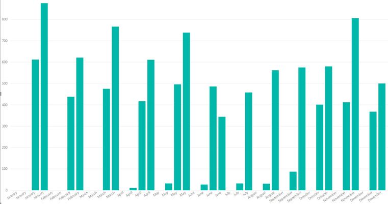
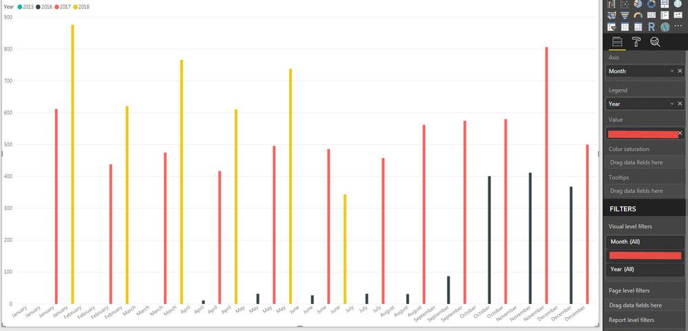
My issue is that when I try to plot the values as described above, I end up with months duplicated for every year in the data (see pic). I imagine this is happening because of the composite key, so that there are multiple Month keys that have the Month Name
How can I aggregate on the Month Name, so that I have one bucket for each month, with as many series bars per bucket as there are years in my data? Is this even possible with my current data model? Do I need to have another Month attribute that doesn't exist in a hierarchy?
Thanks.
Solved! Go to Solution.
- Mark as New
- Bookmark
- Subscribe
- Mute
- Subscribe to RSS Feed
- Permalink
- Report Inappropriate Content
@MFelix, thanks for your response. The Date dimension is coming from a table.
At this point I accept this behavior as that of the my user-defined hierarchy of dates.
I have gotten around this issue by adding another Attribute to the Date dimension, one that uses the Month column in this table but without a composite key. This is giving me the behavior I was looking for originally.
- Mark as New
- Bookmark
- Subscribe
- Mute
- Subscribe to RSS Feed
- Permalink
- Report Inappropriate Content
Hi @pwinz,
If you add the months in the x-axis (remove all other hierarchy levels) and the year on the legend of the bar chart you should get what you need, a single value in month name and different bars for year each one with one colour.
Regards,
MFelix
Regards
Miguel Félix
Did I answer your question? Mark my post as a solution!
Proud to be a Super User!
Check out my blog: Power BI em Português- Mark as New
- Bookmark
- Subscribe
- Mute
- Subscribe to RSS Feed
- Permalink
- Report Inappropriate Content
Thanks for the suggestion. Unfortunately, that's what I originally tried. You can see the results below, first with month on x-axis and year in series/legend, then with just month, no legend.
- Mark as New
- Bookmark
- Subscribe
- Mute
- Subscribe to RSS Feed
- Permalink
- Report Inappropriate Content
Hi @pwinz,
The column month you are using come from what table (the full dataset? or a dimension table?) are you using the hierarchy levels?
I trie it in a file I have with SSAS and was not able to replicate the issue.
Can you share a sample file maybe trough private message?
Regards,
Mfelix
Regards
Miguel Félix
Did I answer your question? Mark my post as a solution!
Proud to be a Super User!
Check out my blog: Power BI em Português- Mark as New
- Bookmark
- Subscribe
- Mute
- Subscribe to RSS Feed
- Permalink
- Report Inappropriate Content
@MFelix, thanks for your response. The Date dimension is coming from a table.
At this point I accept this behavior as that of the my user-defined hierarchy of dates.
I have gotten around this issue by adding another Attribute to the Date dimension, one that uses the Month column in this table but without a composite key. This is giving me the behavior I was looking for originally.
Helpful resources

Microsoft Fabric Learn Together
Covering the world! 9:00-10:30 AM Sydney, 4:00-5:30 PM CET (Paris/Berlin), 7:00-8:30 PM Mexico City

Power BI Monthly Update - April 2024
Check out the April 2024 Power BI update to learn about new features.

| User | Count |
|---|---|
| 111 | |
| 95 | |
| 80 | |
| 68 | |
| 59 |
| User | Count |
|---|---|
| 150 | |
| 119 | |
| 104 | |
| 87 | |
| 67 |


