- Power BI forums
- Updates
- News & Announcements
- Get Help with Power BI
- Desktop
- Service
- Report Server
- Power Query
- Mobile Apps
- Developer
- DAX Commands and Tips
- Custom Visuals Development Discussion
- Health and Life Sciences
- Power BI Spanish forums
- Translated Spanish Desktop
- Power Platform Integration - Better Together!
- Power Platform Integrations (Read-only)
- Power Platform and Dynamics 365 Integrations (Read-only)
- Training and Consulting
- Instructor Led Training
- Dashboard in a Day for Women, by Women
- Galleries
- Community Connections & How-To Videos
- COVID-19 Data Stories Gallery
- Themes Gallery
- Data Stories Gallery
- R Script Showcase
- Webinars and Video Gallery
- Quick Measures Gallery
- 2021 MSBizAppsSummit Gallery
- 2020 MSBizAppsSummit Gallery
- 2019 MSBizAppsSummit Gallery
- Events
- Ideas
- Custom Visuals Ideas
- Issues
- Issues
- Events
- Upcoming Events
- Community Blog
- Power BI Community Blog
- Custom Visuals Community Blog
- Community Support
- Community Accounts & Registration
- Using the Community
- Community Feedback
Register now to learn Fabric in free live sessions led by the best Microsoft experts. From Apr 16 to May 9, in English and Spanish.
- Power BI forums
- Forums
- Get Help with Power BI
- Desktop
- Aggregated KPI
- Subscribe to RSS Feed
- Mark Topic as New
- Mark Topic as Read
- Float this Topic for Current User
- Bookmark
- Subscribe
- Printer Friendly Page
- Mark as New
- Bookmark
- Subscribe
- Mute
- Subscribe to RSS Feed
- Permalink
- Report Inappropriate Content
Aggregated KPI
Hi All!
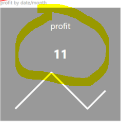
I'm hoping someone can help me here. I've tried updating my last post earlier, but the platform was not allowing me to post. I am hoping someone can help me find a way to develop my KPI where the label here (11 in the screenshot) will be aggregated based on the entire calculation rather than last month's calculation. For example, I am currently working to develop a P90 KPI, and I'd like the line chart to show the P90 over the months while the label (11) will show the P90 overall. I would strongly prefer to combine both the line chart and label into one with the calculation as expected without developing two separate visuals and putting one on top of the other for simplicity sake. This page seemed promising, but I could not see the final solution. Hope that makes sense, but happy to elaborate further! Again, thank you for all your support!
- Mark as New
- Bookmark
- Subscribe
- Mute
- Subscribe to RSS Feed
- Permalink
- Report Inappropriate Content
Hi @Anonymous ,
Please check whether the custom visual KPI Indicator is what you want. If no, please provide some sample data and more details about your requirement. Thank you.
Use of Key Performance Indicators in Power BI
Best Regards
If this post helps, then please consider Accept it as the solution to help the other members find it more quickly.
- Mark as New
- Bookmark
- Subscribe
- Mute
- Subscribe to RSS Feed
- Permalink
- Report Inappropriate Content
Hi @yingyinr,
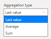
Close, but not exactly, I've tried using the indicator visual but cannot use the total aggregation type if that makes sense. So with the data I've provided here as an example, I'd like to see the P90 value over time, broken up into months, which can be easily done with the KPI Indicator (Dec 2020=192, Jan 2021=410, Feb 2021=195). But with the data I've provided, I would also like to see the total P90 in the highlighted area of the visual if that makes sense. So I'd like to see 260 in the summarized area of the visual, since that's the 90th percentile of the entire dataset. Thanks in advance!
| Month | Value |
| Dec-20 | 150 |
| Dec-20 | 160 |
| Dec-20 | 200 |
| Jan-21 | 10 |
| Jan-21 | 180 |
| Jan-21 | 200 |
| Jan-21 | 500 |
| Feb-21 | 150 |
| Feb-21 | 200 |
Helpful resources

Microsoft Fabric Learn Together
Covering the world! 9:00-10:30 AM Sydney, 4:00-5:30 PM CET (Paris/Berlin), 7:00-8:30 PM Mexico City

Power BI Monthly Update - April 2024
Check out the April 2024 Power BI update to learn about new features.

| User | Count |
|---|---|
| 112 | |
| 97 | |
| 85 | |
| 67 | |
| 60 |
| User | Count |
|---|---|
| 150 | |
| 120 | |
| 99 | |
| 87 | |
| 68 |


