- Power BI forums
- Updates
- News & Announcements
- Get Help with Power BI
- Desktop
- Service
- Report Server
- Power Query
- Mobile Apps
- Developer
- DAX Commands and Tips
- Custom Visuals Development Discussion
- Health and Life Sciences
- Power BI Spanish forums
- Translated Spanish Desktop
- Power Platform Integration - Better Together!
- Power Platform Integrations (Read-only)
- Power Platform and Dynamics 365 Integrations (Read-only)
- Training and Consulting
- Instructor Led Training
- Dashboard in a Day for Women, by Women
- Galleries
- Community Connections & How-To Videos
- COVID-19 Data Stories Gallery
- Themes Gallery
- Data Stories Gallery
- R Script Showcase
- Webinars and Video Gallery
- Quick Measures Gallery
- 2021 MSBizAppsSummit Gallery
- 2020 MSBizAppsSummit Gallery
- 2019 MSBizAppsSummit Gallery
- Events
- Ideas
- Custom Visuals Ideas
- Issues
- Issues
- Events
- Upcoming Events
- Community Blog
- Power BI Community Blog
- Custom Visuals Community Blog
- Community Support
- Community Accounts & Registration
- Using the Community
- Community Feedback
Register now to learn Fabric in free live sessions led by the best Microsoft experts. From Apr 16 to May 9, in English and Spanish.
- Power BI forums
- Forums
- Get Help with Power BI
- Desktop
- Re: Advise on best approach -
- Subscribe to RSS Feed
- Mark Topic as New
- Mark Topic as Read
- Float this Topic for Current User
- Bookmark
- Subscribe
- Printer Friendly Page
- Mark as New
- Bookmark
- Subscribe
- Mute
- Subscribe to RSS Feed
- Permalink
- Report Inappropriate Content
Advise on best approach -
I all, I am looking fo some guidance on best practice.
I am creating a student dashboard. I have a big data table that contains data from an annual student test covering multiple years. I can select a student via basic slicer and diplay current subjects and the series of annual scores.
However I need to show student performance in the context of the other students for that year either as a box or violin plot (ie. Year 5 student vs all Year 5 students in 2013, Year 6 student vs all year 6 students in 2014 etc). The slicer reduces the data set to just the student so the box/violin ends up with one data point.
I can easily create an alternate table using SQL but it seems so wrong to not do this in PBI. What would be the best practice approach? I just need a pointer and can run with it from there.
Thanks in advance.
Solved! Go to Solution.
- Mark as New
- Bookmark
- Subscribe
- Mute
- Subscribe to RSS Feed
- Permalink
- Report Inappropriate Content
Hey @lutho
As @amitchandak mentioned it would be best to have some sample data and a sample output to answer this question.
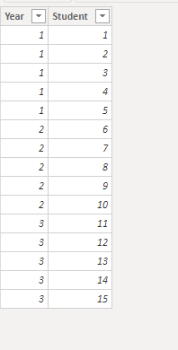
Without this, here is some sample data I have included to try and meet your solution
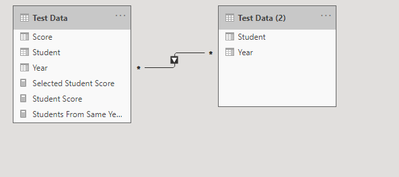
Also I've gone ahead and duplicate this table in the query editor and paried it down just to unique Student-Year combinations
The tables are connected by year and one filters the other in a one way many to many relationship
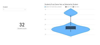
Now we can write a measure like this
Students From Same Year as Selected =

var TheStudent = VALUES('Test Data (2)'[Student])

var TheYear = CALCULATE(MAX('Test Data'[Year]), 'Test Data'[Student] in TheStudent)

return

CALCULATE(MAX('Test Data'[Score]), 'Test Data'[Year] = TheYear)
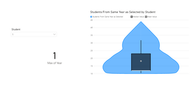
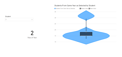
This will allow us to make a violin chart that will adjust based on the year of our selected student
If you wanted to also see the selected student's score you could add a card with this measure
Student Score =

var TheSelectedStudent = SELECTEDVALUE('Test Data (2)'[Student])

return

CALCULATE(MAX('Test Data'[Score]), 'Test Data'[Student] = TheSelectedStudent)
Let me know if this helps or if you were looking for different functionality.
- Mark as New
- Bookmark
- Subscribe
- Mute
- Subscribe to RSS Feed
- Permalink
- Report Inappropriate Content
@lutho ,Can you share sample data and sample output in table format? Or a sample pbix after removing sensitive data.
Microsoft Power BI Learning Resources, 2023 !!
Learn Power BI - Full Course with Dec-2022, with Window, Index, Offset, 100+ Topics !!
Did I answer your question? Mark my post as a solution! Appreciate your Kudos !! Proud to be a Super User! !!
Helpful resources

Microsoft Fabric Learn Together
Covering the world! 9:00-10:30 AM Sydney, 4:00-5:30 PM CET (Paris/Berlin), 7:00-8:30 PM Mexico City

Power BI Monthly Update - April 2024
Check out the April 2024 Power BI update to learn about new features.

| User | Count |
|---|---|
| 113 | |
| 100 | |
| 78 | |
| 76 | |
| 52 |
| User | Count |
|---|---|
| 146 | |
| 109 | |
| 106 | |
| 88 | |
| 61 |

