- Power BI forums
- Updates
- News & Announcements
- Get Help with Power BI
- Desktop
- Service
- Report Server
- Power Query
- Mobile Apps
- Developer
- DAX Commands and Tips
- Custom Visuals Development Discussion
- Health and Life Sciences
- Power BI Spanish forums
- Translated Spanish Desktop
- Power Platform Integration - Better Together!
- Power Platform Integrations (Read-only)
- Power Platform and Dynamics 365 Integrations (Read-only)
- Training and Consulting
- Instructor Led Training
- Dashboard in a Day for Women, by Women
- Galleries
- Community Connections & How-To Videos
- COVID-19 Data Stories Gallery
- Themes Gallery
- Data Stories Gallery
- R Script Showcase
- Webinars and Video Gallery
- Quick Measures Gallery
- 2021 MSBizAppsSummit Gallery
- 2020 MSBizAppsSummit Gallery
- 2019 MSBizAppsSummit Gallery
- Events
- Ideas
- Custom Visuals Ideas
- Issues
- Issues
- Events
- Upcoming Events
- Community Blog
- Power BI Community Blog
- Custom Visuals Community Blog
- Community Support
- Community Accounts & Registration
- Using the Community
- Community Feedback
Register now to learn Fabric in free live sessions led by the best Microsoft experts. From Apr 16 to May 9, in English and Spanish.
- Power BI forums
- Forums
- Get Help with Power BI
- Desktop
- Advanced histogram parametring by cluster of data
- Subscribe to RSS Feed
- Mark Topic as New
- Mark Topic as Read
- Float this Topic for Current User
- Bookmark
- Subscribe
- Printer Friendly Page
- Mark as New
- Bookmark
- Subscribe
- Mute
- Subscribe to RSS Feed
- Permalink
- Report Inappropriate Content
Advanced histogram parametring by cluster of data
Hi people!
I have once again an issue, concerning histogram parametring.
Below are the samples:
- my data is as seen in the table : division by country/region/zone/dealer
- my histogram should show the ratio Sales/offers, but 4 times:
- sales(country)/offer(country)
- sales(region)/offer(region)
- etc.
--> Constraint: their are several slicers allowing the user to choose country/region/zone/dealer but I need to be able to show, for each level of filtering,
- the complete data for the country
- complete country + the region data according to the one selected
- complete country + the region data according to the one selected + the zone selected
- complete country + the region data according to the one selected + the zone selected + dealer selected.
Here are samples :
| Country | Region | Zone | Dealer | Product | Offers | Sales | %Country | %Region | %Dealer | %Zone |
| France | 1 | 1 | 1001 | Pdt 1 | 15 | 5 | 70% | 44% | 33% | 33% |
| France | 1 | 2 | 1002 | Pdt 2 | 45 | 21 | 70% | 44% | 47% | 47% |
| France | 1 | 3 | 1003 | Pdt 3 | 2 | 1 | 70% | 44% | 50% | 50% |
| France | 2 | 4 | 1004 | Pdt 1 | 6 | 3 | 70% | 78% | 50% | 50% |
| France | 2 | 5 | 1005 | Pdt 2 | 67 | 54 | 70% | 78% | 81% | 81% |
| France | 3 | 6 | 1006 | Pdt 3 | 54 | 35 | 70% | 80% | 65% | 65% |
| France | 3 | 7 | 1007 | Pdt 1 | 24 | 24 | 70% | 80% | 100% | 100% |
| France | 3 | 8 | 1008 | Pdt 2 | 22 | 21 | 70% | 80% | 95% | 95% |
| France | 4 | 9 | 1009 | Pdt 3 | 1 | 1 | 70% | 100% | 100% | 100% |
Screenshot:

To all, thanks!
Noob
Solved! Go to Solution.
- Mark as New
- Bookmark
- Subscribe
- Mute
- Subscribe to RSS Feed
- Permalink
- Report Inappropriate Content
Hi @Noob78,
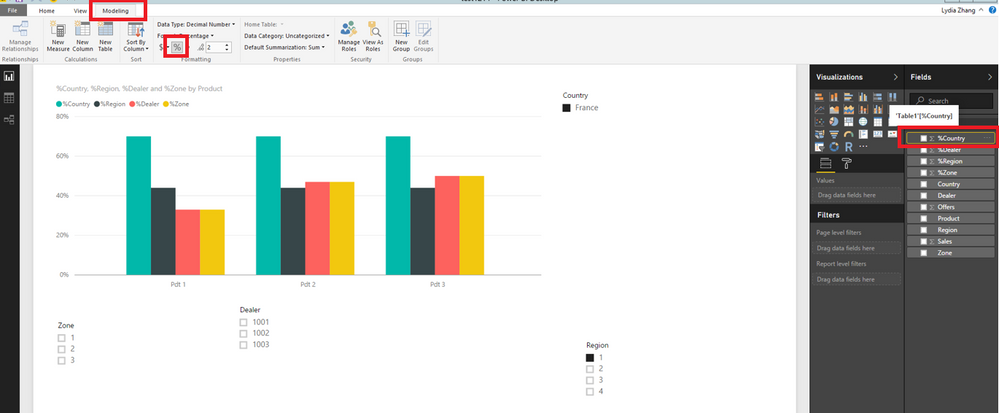
Click your field(for example:%Country) in Fields Panel, then under Modeling ribbon,click the percentage format, you will get your desired result.
Thanks,
Lydia Zhang
If this post helps, then please consider Accept it as the solution to help the other members find it more quickly.
- Mark as New
- Bookmark
- Subscribe
- Mute
- Subscribe to RSS Feed
- Permalink
- Report Inappropriate Content
Hi @Noob78,
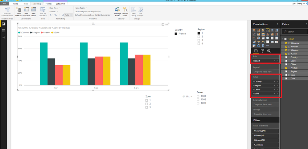
Based on your description and screenshots, it seems that you want to create a column chart using sample data in Power BI Desktop and want to filter it with different levels of slicers, right?
If that is the case, you can create a Clustered column chart using fields as shown in the following screenshot, then create 4 slicers using country/region/zone/dealer field. You will be able to filter the chart using slicers at different levels.
For more details, you can review this attached PBIX file.
Thanks,
Lydia Zhang
If this post helps, then please consider Accept it as the solution to help the other members find it more quickly.
- Mark as New
- Bookmark
- Subscribe
- Mute
- Subscribe to RSS Feed
- Permalink
- Report Inappropriate Content
Thank you! This is quite it visually.
How have you determined the %? A measure? Directly in data?...
- Mark as New
- Bookmark
- Subscribe
- Mute
- Subscribe to RSS Feed
- Permalink
- Report Inappropriate Content
Hi @Noob78,
Click your field(for example:%Country) in Fields Panel, then under Modeling ribbon,click the percentage format, you will get your desired result.
Thanks,
Lydia Zhang
If this post helps, then please consider Accept it as the solution to help the other members find it more quickly.
- Mark as New
- Bookmark
- Subscribe
- Mute
- Subscribe to RSS Feed
- Permalink
- Report Inappropriate Content
Thank you Lydia
- Mark as New
- Bookmark
- Subscribe
- Mute
- Subscribe to RSS Feed
- Permalink
- Report Inappropriate Content
up?
Helpful resources

Microsoft Fabric Learn Together
Covering the world! 9:00-10:30 AM Sydney, 4:00-5:30 PM CET (Paris/Berlin), 7:00-8:30 PM Mexico City

Power BI Monthly Update - April 2024
Check out the April 2024 Power BI update to learn about new features.

| User | Count |
|---|---|
| 113 | |
| 97 | |
| 84 | |
| 67 | |
| 60 |
| User | Count |
|---|---|
| 150 | |
| 120 | |
| 99 | |
| 87 | |
| 68 |


