- Power BI forums
- Updates
- News & Announcements
- Get Help with Power BI
- Desktop
- Service
- Report Server
- Power Query
- Mobile Apps
- Developer
- DAX Commands and Tips
- Custom Visuals Development Discussion
- Health and Life Sciences
- Power BI Spanish forums
- Translated Spanish Desktop
- Power Platform Integration - Better Together!
- Power Platform Integrations (Read-only)
- Power Platform and Dynamics 365 Integrations (Read-only)
- Training and Consulting
- Instructor Led Training
- Dashboard in a Day for Women, by Women
- Galleries
- Community Connections & How-To Videos
- COVID-19 Data Stories Gallery
- Themes Gallery
- Data Stories Gallery
- R Script Showcase
- Webinars and Video Gallery
- Quick Measures Gallery
- 2021 MSBizAppsSummit Gallery
- 2020 MSBizAppsSummit Gallery
- 2019 MSBizAppsSummit Gallery
- Events
- Ideas
- Custom Visuals Ideas
- Issues
- Issues
- Events
- Upcoming Events
- Community Blog
- Power BI Community Blog
- Custom Visuals Community Blog
- Community Support
- Community Accounts & Registration
- Using the Community
- Community Feedback
Register now to learn Fabric in free live sessions led by the best Microsoft experts. From Apr 16 to May 9, in English and Spanish.
- Power BI forums
- Forums
- Get Help with Power BI
- Desktop
- Re: Adjusting PowerBI Desktop layout
- Subscribe to RSS Feed
- Mark Topic as New
- Mark Topic as Read
- Float this Topic for Current User
- Bookmark
- Subscribe
- Printer Friendly Page
- Mark as New
- Bookmark
- Subscribe
- Mute
- Subscribe to RSS Feed
- Permalink
- Report Inappropriate Content
Adjusting PowerBI Desktop layout
Good day all,
Recently starting to make the switch from power query / power pivot to powerbi desktop.
Now, one thing that has been really holding me back is the way powerbi desktop looks when working with the power pivot view.
In the excel variant there is a clear color distinction between non and calculated columns, same for creating measures, you have a seperate 'area' for that. PowerBI desktop just has everything open all the time.
So my question is, is there any way to make powerbi desktop less cluttered? so i can keep my measures together, know visually (colored) which columns are calculated and which are not?
Solved! Go to Solution.
- Mark as New
- Bookmark
- Subscribe
- Mute
- Subscribe to RSS Feed
- Permalink
- Report Inappropriate Content
There is a visual clue for calculated columns: they all have an icon by the name of the field:
Nevertheless, to keep things tidier, I would suggest:
1) As has been suggested for your measures, create measure tables to group the measures by categories (if necessary)
2) For calculated columns, create folders within each table to host the calculated columns. Label the folder accordingly - if you add a "1" at the start of the folder name, the folder itself will appear at the top of the list within the table.
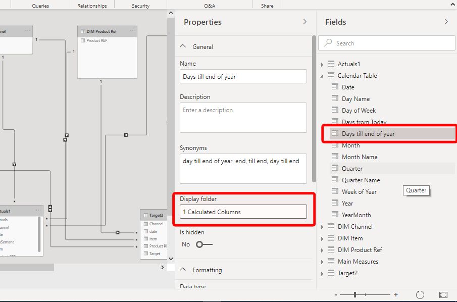
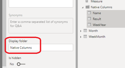
To create a folder within a table, go to the modeling view and select the calculated column. Under properties, enter a name for the folder in "Display Folder". The folder will be created with the calculated column within:
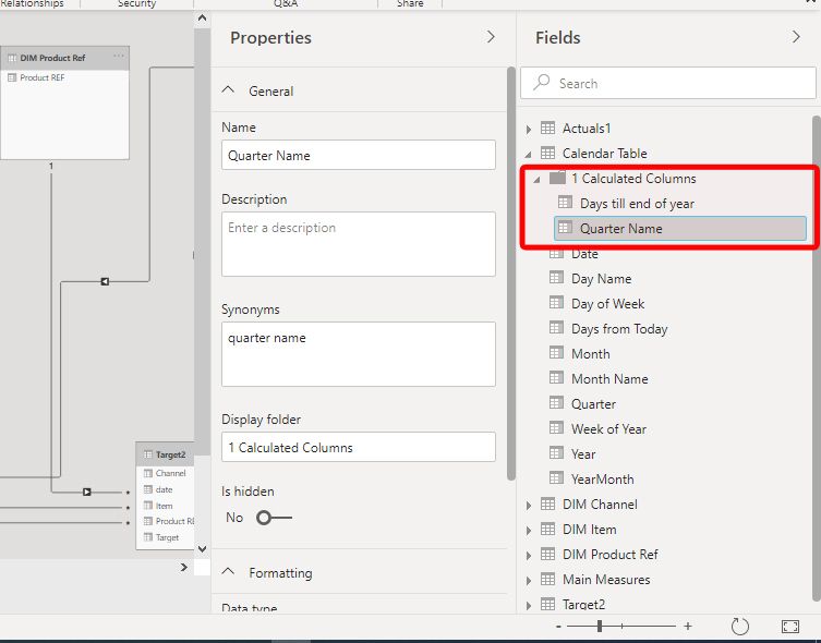
Once the folder is created, you can add more fields by selecting and dragging into the folder:
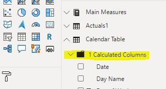
When you go back to the field view, you will see the folder hosting the fields you have included, which you can collapse if need be:
Did I answer your question? Mark my post as a solution!
In doing so, you are also helping me. Thank you!
Proud to be a Super User!
Paul on Linkedin.
- Mark as New
- Bookmark
- Subscribe
- Mute
- Subscribe to RSS Feed
- Permalink
- Report Inappropriate Content
Hi @decarsul ,
Please let us know if the replies above are helpful.
If they are, please always accept the replies making sense as solution to your question so that people who may have the same question can get the solution directly.
If not, please give us more details.
Best Regards,
Icey
- Mark as New
- Bookmark
- Subscribe
- Mute
- Subscribe to RSS Feed
- Permalink
- Report Inappropriate Content
There is a visual clue for calculated columns: they all have an icon by the name of the field:
Nevertheless, to keep things tidier, I would suggest:
1) As has been suggested for your measures, create measure tables to group the measures by categories (if necessary)
2) For calculated columns, create folders within each table to host the calculated columns. Label the folder accordingly - if you add a "1" at the start of the folder name, the folder itself will appear at the top of the list within the table.
To create a folder within a table, go to the modeling view and select the calculated column. Under properties, enter a name for the folder in "Display Folder". The folder will be created with the calculated column within:
Once the folder is created, you can add more fields by selecting and dragging into the folder:
When you go back to the field view, you will see the folder hosting the fields you have included, which you can collapse if need be:
Did I answer your question? Mark my post as a solution!
In doing so, you are also helping me. Thank you!
Proud to be a Super User!
Paul on Linkedin.
- Mark as New
- Bookmark
- Subscribe
- Mute
- Subscribe to RSS Feed
- Permalink
- Report Inappropriate Content
Thanks all for the suggestions.
They are nice and make things a bit more workable, but i have found that for me it is really a structural problem. Why would we need to apply workarounds, creating dummy folders or dummy tables just to keep things tidy?
Oh well, hopefully someone or maybe MS will create a layout modpack or something that does offer these functions.
- Mark as New
- Bookmark
- Subscribe
- Mute
- Subscribe to RSS Feed
- Permalink
- Report Inappropriate Content
Can you try the below article:
https://exceleratorbi.com.au/measure-tables-in-power-bi/
Thanks,
Deepanraj
- Mark as New
- Bookmark
- Subscribe
- Mute
- Subscribe to RSS Feed
- Permalink
- Report Inappropriate Content
That was already mentioned in an earlier response. thanks tho.
- Mark as New
- Bookmark
- Subscribe
- Mute
- Subscribe to RSS Feed
- Permalink
- Report Inappropriate Content
Hi, @decarsul , it's a good practice to seperate measures from tables by creating an empty table in the first place dedicated to measures only.
You may want to refer to this article for details.
https://exceleratorbi.com.au/measure-tables-in-power-bi/
| Thanks to the great efforts by MS engineers to simplify syntax of DAX! Most beginners are SUCCESSFULLY MISLED to think that they could easily master DAX; but it turns out that the intricacy of the most frequently used RANKX() is still way beyond their comprehension! |
DAX is simple, but NOT EASY! |
- Mark as New
- Bookmark
- Subscribe
- Mute
- Subscribe to RSS Feed
- Permalink
- Report Inappropriate Content
Thank you for that suggestion, ill look that up.
But that only 'solves' half my question.
How about the visual distinction between calculated and non calculated columns?
- Mark as New
- Bookmark
- Subscribe
- Mute
- Subscribe to RSS Feed
- Permalink
- Report Inappropriate Content
@decarsul , as to calculated column, I'd like to call it "legacy of Excel"; I personally avoid creating it whenever possible considering Power BI runs on in-memory columnar database. Superfluous calculated columns comsume pretty much memory.
It seems most users don't distinguish calculated columns from native ones in a particular way.
| Thanks to the great efforts by MS engineers to simplify syntax of DAX! Most beginners are SUCCESSFULLY MISLED to think that they could easily master DAX; but it turns out that the intricacy of the most frequently used RANKX() is still way beyond their comprehension! |
DAX is simple, but NOT EASY! |
- Mark as New
- Bookmark
- Subscribe
- Mute
- Subscribe to RSS Feed
- Permalink
- Report Inappropriate Content
@CNENFRNL that makes sence, but for someone being given an report to optimize, it would be very handy to see what columns need to be checked. And if its a report with 100's of columns, that become tedious. As you said, loading that in memory makes load times slow, having to pass by them individually you'll have loading times, and thus delays, to see how they are actually made.
So even tho i agree to what you're saying, praktice teaches us different. And as such would love to find a way to easily mark those columns in a visual way.
- Mark as New
- Bookmark
- Subscribe
- Mute
- Subscribe to RSS Feed
- Permalink
- Report Inappropriate Content
@decarsul , AFAIK, I'm afraid Power BI so far doesn't feature any remarkable visual functionality to distinguish them except for small icons.
A possible workaround is to create subfolders in a table in the Model view, where all calculated columns can be seated.
| Thanks to the great efforts by MS engineers to simplify syntax of DAX! Most beginners are SUCCESSFULLY MISLED to think that they could easily master DAX; but it turns out that the intricacy of the most frequently used RANKX() is still way beyond their comprehension! |
DAX is simple, but NOT EASY! |
Helpful resources

Microsoft Fabric Learn Together
Covering the world! 9:00-10:30 AM Sydney, 4:00-5:30 PM CET (Paris/Berlin), 7:00-8:30 PM Mexico City

Power BI Monthly Update - April 2024
Check out the April 2024 Power BI update to learn about new features.

| User | Count |
|---|---|
| 114 | |
| 100 | |
| 78 | |
| 75 | |
| 52 |
| User | Count |
|---|---|
| 144 | |
| 109 | |
| 108 | |
| 88 | |
| 61 |


