- Power BI forums
- Updates
- News & Announcements
- Get Help with Power BI
- Desktop
- Service
- Report Server
- Power Query
- Mobile Apps
- Developer
- DAX Commands and Tips
- Custom Visuals Development Discussion
- Health and Life Sciences
- Power BI Spanish forums
- Translated Spanish Desktop
- Power Platform Integration - Better Together!
- Power Platform Integrations (Read-only)
- Power Platform and Dynamics 365 Integrations (Read-only)
- Training and Consulting
- Instructor Led Training
- Dashboard in a Day for Women, by Women
- Galleries
- Community Connections & How-To Videos
- COVID-19 Data Stories Gallery
- Themes Gallery
- Data Stories Gallery
- R Script Showcase
- Webinars and Video Gallery
- Quick Measures Gallery
- 2021 MSBizAppsSummit Gallery
- 2020 MSBizAppsSummit Gallery
- 2019 MSBizAppsSummit Gallery
- Events
- Ideas
- Custom Visuals Ideas
- Issues
- Issues
- Events
- Upcoming Events
- Community Blog
- Power BI Community Blog
- Custom Visuals Community Blog
- Community Support
- Community Accounts & Registration
- Using the Community
- Community Feedback
Register now to learn Fabric in free live sessions led by the best Microsoft experts. From Apr 16 to May 9, in English and Spanish.
- Power BI forums
- Forums
- Get Help with Power BI
- Desktop
- Re: Adding two percentage values to visual
- Subscribe to RSS Feed
- Mark Topic as New
- Mark Topic as Read
- Float this Topic for Current User
- Bookmark
- Subscribe
- Printer Friendly Page
- Mark as New
- Bookmark
- Subscribe
- Mute
- Subscribe to RSS Feed
- Permalink
- Report Inappropriate Content
Adding two percentage values to visual
Hello,
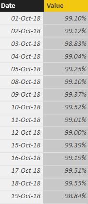
I'm still new to Power BI and trying to understand how everything works, today I ran into while trying to add two different values% into one visual.
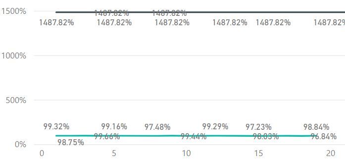
Both look like in picture above and I need to make trend going day-by-day of both in same visual. When I insert one value everything looks good but when I add second value it becomes sum of all percentages:
Therefore I am struggling to change that both values would be same format and would make a nice trend.
Sorry for such a basic question but I really lack knowledge yet!
- Mark as New
- Bookmark
- Subscribe
- Mute
- Subscribe to RSS Feed
- Permalink
- Report Inappropriate Content
Could you supply a sample data, or show how the visualization and fields are setup? 🙂
- Mark as New
- Bookmark
- Subscribe
- Mute
- Subscribe to RSS Feed
- Permalink
- Report Inappropriate Content
- Mark as New
- Bookmark
- Subscribe
- Mute
- Subscribe to RSS Feed
- Permalink
- Report Inappropriate Content
Thank you for help. Sorry if I wasn't clear enough. I do know how to add trend line, issue is that when I add second value to the visual, like the one in my first screenshot, values do not go by the date but gives me one number - sum of all numbers. So I have one line like in your picture but second value line is just a sum of all daily percentages. Its not the trend line I'm trying to achieve here.
- Mark as New
- Bookmark
- Subscribe
- Mute
- Subscribe to RSS Feed
- Permalink
- Report Inappropriate Content
Hello,
Could you give some more detail? Are the values of thoose fields related?
- Mark as New
- Bookmark
- Subscribe
- Mute
- Subscribe to RSS Feed
- Permalink
- Report Inappropriate Content
There is two different sheets in excel file who look exactly same as first screen shot, just different numbers. I need to take both sheet numbers and make graph with two lines going categorical axis day-by-day with needed values (99.7% ; 97.5% etc.) to be able to compare them as you can see light line in my second screenshot. But when I add second sheet values to the visual it does not become needed numbers 99.7%, 97.6% etc. but instead SUM of all those percentages as one number like you can see black line in second screenshot. I hope that makes sense? Thank you for your patience
- Mark as New
- Bookmark
- Subscribe
- Mute
- Subscribe to RSS Feed
- Permalink
- Report Inappropriate Content
Hello @ziogis,
IT's adding all the percentages, most likely, because there is no relationship between tables, so PBI doesnt know how to mix them.
If you have unique dates, on power bi desktop, click under home tab, manage relationships, and establish a 1 to 1 relationship between both tables, using the dates field, that should make it 😄
Regards,
Salva.
- Mark as New
- Bookmark
- Subscribe
- Mute
- Subscribe to RSS Feed
- Permalink
- Report Inappropriate Content
Hello,
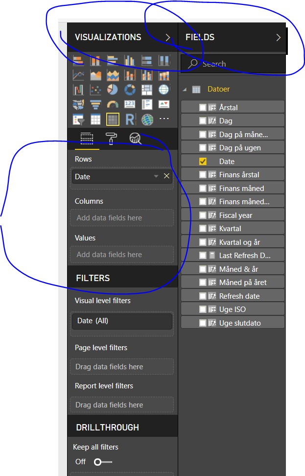
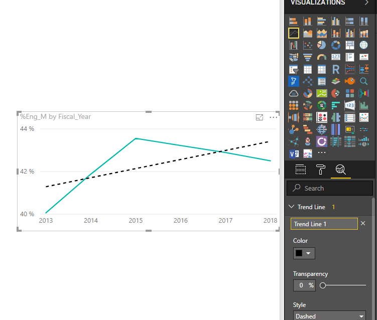
Using the line chart, under visualizations, Analytics (by default it shows the fields view), you can add a trend line, so no need of adding new values or calculating the trend 😄
Regards,
Salva.
Helpful resources

Microsoft Fabric Learn Together
Covering the world! 9:00-10:30 AM Sydney, 4:00-5:30 PM CET (Paris/Berlin), 7:00-8:30 PM Mexico City

Power BI Monthly Update - April 2024
Check out the April 2024 Power BI update to learn about new features.

| User | Count |
|---|---|
| 111 | |
| 100 | |
| 80 | |
| 64 | |
| 58 |
| User | Count |
|---|---|
| 146 | |
| 110 | |
| 93 | |
| 84 | |
| 67 |


