- Power BI forums
- Updates
- News & Announcements
- Get Help with Power BI
- Desktop
- Service
- Report Server
- Power Query
- Mobile Apps
- Developer
- DAX Commands and Tips
- Custom Visuals Development Discussion
- Health and Life Sciences
- Power BI Spanish forums
- Translated Spanish Desktop
- Power Platform Integration - Better Together!
- Power Platform Integrations (Read-only)
- Power Platform and Dynamics 365 Integrations (Read-only)
- Training and Consulting
- Instructor Led Training
- Dashboard in a Day for Women, by Women
- Galleries
- Community Connections & How-To Videos
- COVID-19 Data Stories Gallery
- Themes Gallery
- Data Stories Gallery
- R Script Showcase
- Webinars and Video Gallery
- Quick Measures Gallery
- 2021 MSBizAppsSummit Gallery
- 2020 MSBizAppsSummit Gallery
- 2019 MSBizAppsSummit Gallery
- Events
- Ideas
- Custom Visuals Ideas
- Issues
- Issues
- Events
- Upcoming Events
- Community Blog
- Power BI Community Blog
- Custom Visuals Community Blog
- Community Support
- Community Accounts & Registration
- Using the Community
- Community Feedback
Register now to learn Fabric in free live sessions led by the best Microsoft experts. From Apr 16 to May 9, in English and Spanish.
- Power BI forums
- Forums
- Get Help with Power BI
- Desktop
- Adding a different value op top of a bar in a bar ...
- Subscribe to RSS Feed
- Mark Topic as New
- Mark Topic as Read
- Float this Topic for Current User
- Bookmark
- Subscribe
- Printer Friendly Page
- Mark as New
- Bookmark
- Subscribe
- Mute
- Subscribe to RSS Feed
- Permalink
- Report Inappropriate Content
Adding a different value op top of a bar in a bar chart.
Hey everyone, short question.
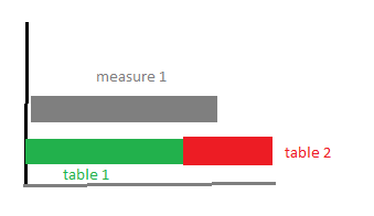
I have a bar chart that looks like the following (see image below):
The grey bar is a measure.
The green bar is sum(table1[column 1])
What I would like to achieve, is to add sum(table 2[column 1]) to the other bar from table 1 (as illustrated), and have both in different colour.
I know there is a visual for a stacked bar chart, but that one stacks both the grey and green line. I think I have to use the legend to differenciate which bars belong together, but since the data is from different tables im not sure how I can achieve this.
thanks!
Solved! Go to Solution.
- Mark as New
- Bookmark
- Subscribe
- Mute
- Subscribe to RSS Feed
- Permalink
- Report Inappropriate Content
Hi @ErikBI ,
You need to create a workaround to have this made:
- Create a measure for the calculation of table 1 and table 2:
Table1_Value = SUM(Table1[Value])

Table2_Value = SUM('Table 2'[Value])- Create a table with the names you want on the x-axis in my case I made this table:
| Measure |
| A |
| B |
- Add the following two measure to use on your chart:
SelectionTable1_Values = SWITCH(SELECTEDVALUE('Table'[Measure]);"a";[Measure];"b";Table1[Table1_Value])

SelectionTable2_values = SWITCH(SELECTEDVALUE('Table'[Measure]);"b";'Table 2'[Table2_Value])
- Create a Stacked bar chart with the following format:
- Axis - MeasureColumn (from the table we created)
- Values:
- SelectionTable1_Values
- SelectionTable2_Values
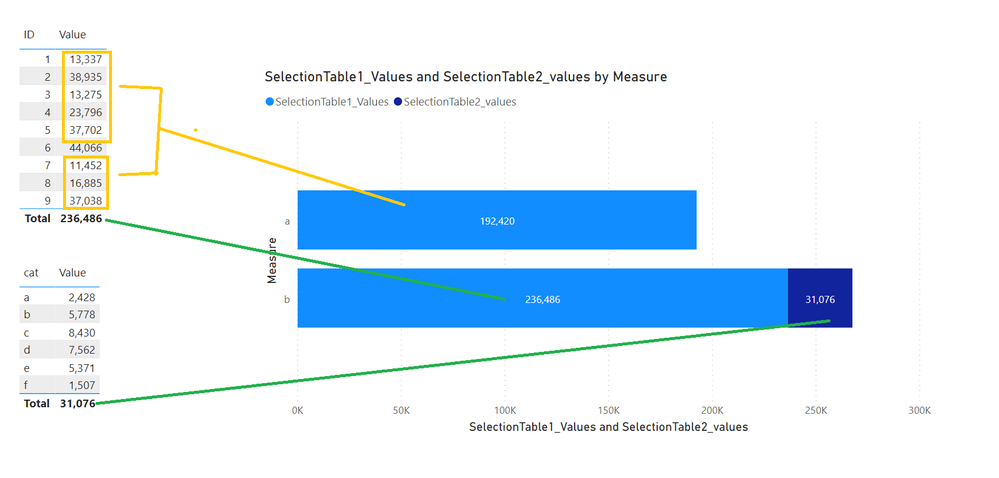
Check result below and in attach PBIX file.
Measure is just a simple one that I calculated to sum all values on table 1 below 40.000 (you can use your own).
Regards
Miguel Félix
Did I answer your question? Mark my post as a solution!
Proud to be a Super User!
Check out my blog: Power BI em Português- Mark as New
- Bookmark
- Subscribe
- Mute
- Subscribe to RSS Feed
- Permalink
- Report Inappropriate Content
Hi @ErikBI ,
To achieve this you need to have some relationship between the two tables, how is the values from table 1 and table 2 related?
Is the Axis values in common between both tables?
Do you want to have a 2 bar with 2 colour (measure one colour Table1+Table2 another colour) or 2 bars 3 colours (measure one colour Table1 one colour Table2 one colour)
Can you share some sample data for the measure and both tables?
Regards
Miguel Félix
Did I answer your question? Mark my post as a solution!
Proud to be a Super User!
Check out my blog: Power BI em Português- Mark as New
- Bookmark
- Subscribe
- Mute
- Subscribe to RSS Feed
- Permalink
- Report Inappropriate Content
Hey Felix,
Sorry for the late reply. Been on and off for a while.
The x values are all the same (euros).
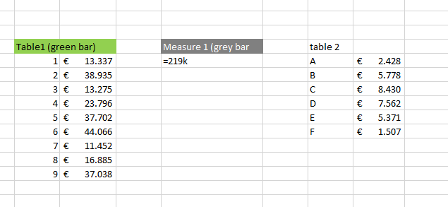
In my previous example. Table 1 is the green bar. Measurue 1 is the grey bar.
I would like to add table 2 to the green bar of table 1, but with a different color.
Hope it makes sense now! 🙂
- Mark as New
- Bookmark
- Subscribe
- Mute
- Subscribe to RSS Feed
- Permalink
- Report Inappropriate Content
Hi @ErikBI ,
You need to create a workaround to have this made:
- Create a measure for the calculation of table 1 and table 2:
Table1_Value = SUM(Table1[Value])

Table2_Value = SUM('Table 2'[Value])- Create a table with the names you want on the x-axis in my case I made this table:
| Measure |
| A |
| B |
- Add the following two measure to use on your chart:
SelectionTable1_Values = SWITCH(SELECTEDVALUE('Table'[Measure]);"a";[Measure];"b";Table1[Table1_Value])

SelectionTable2_values = SWITCH(SELECTEDVALUE('Table'[Measure]);"b";'Table 2'[Table2_Value])
- Create a Stacked bar chart with the following format:
- Axis - MeasureColumn (from the table we created)
- Values:
- SelectionTable1_Values
- SelectionTable2_Values
Check result below and in attach PBIX file.
Measure is just a simple one that I calculated to sum all values on table 1 below 40.000 (you can use your own).
Regards
Miguel Félix
Did I answer your question? Mark my post as a solution!
Proud to be a Super User!
Check out my blog: Power BI em Português- Mark as New
- Bookmark
- Subscribe
- Mute
- Subscribe to RSS Feed
- Permalink
- Report Inappropriate Content
Hey Felix,
First of all, my apologies for replying to you so late. I've been working on and off this project and it got put aside for a bit.
At first I was a bit confused by how you calculated the "a' bar by exlcuding the 44k. But after digging through your example file I managed to understand the method that you used to create the graph and I managed to get it working!
Thanks so much for your help!
Here is what my end result looks like now:
Helpful resources

Microsoft Fabric Learn Together
Covering the world! 9:00-10:30 AM Sydney, 4:00-5:30 PM CET (Paris/Berlin), 7:00-8:30 PM Mexico City

Power BI Monthly Update - April 2024
Check out the April 2024 Power BI update to learn about new features.

| User | Count |
|---|---|
| 109 | |
| 98 | |
| 77 | |
| 66 | |
| 54 |
| User | Count |
|---|---|
| 144 | |
| 104 | |
| 100 | |
| 86 | |
| 64 |


