- Power BI forums
- Updates
- News & Announcements
- Get Help with Power BI
- Desktop
- Service
- Report Server
- Power Query
- Mobile Apps
- Developer
- DAX Commands and Tips
- Custom Visuals Development Discussion
- Health and Life Sciences
- Power BI Spanish forums
- Translated Spanish Desktop
- Power Platform Integration - Better Together!
- Power Platform Integrations (Read-only)
- Power Platform and Dynamics 365 Integrations (Read-only)
- Training and Consulting
- Instructor Led Training
- Dashboard in a Day for Women, by Women
- Galleries
- Community Connections & How-To Videos
- COVID-19 Data Stories Gallery
- Themes Gallery
- Data Stories Gallery
- R Script Showcase
- Webinars and Video Gallery
- Quick Measures Gallery
- 2021 MSBizAppsSummit Gallery
- 2020 MSBizAppsSummit Gallery
- 2019 MSBizAppsSummit Gallery
- Events
- Ideas
- Custom Visuals Ideas
- Issues
- Issues
- Events
- Upcoming Events
- Community Blog
- Power BI Community Blog
- Custom Visuals Community Blog
- Community Support
- Community Accounts & Registration
- Using the Community
- Community Feedback
Register now to learn Fabric in free live sessions led by the best Microsoft experts. From Apr 16 to May 9, in English and Spanish.
- Power BI forums
- Forums
- Get Help with Power BI
- Desktop
- Re: Add the calculated column as custom column int...
- Subscribe to RSS Feed
- Mark Topic as New
- Mark Topic as Read
- Float this Topic for Current User
- Bookmark
- Subscribe
- Printer Friendly Page
- Mark as New
- Bookmark
- Subscribe
- Mute
- Subscribe to RSS Feed
- Permalink
- Report Inappropriate Content
Add the calculated column as custom column into the table in Query Editor
I have created a calculated column in my data model. I want to create or add this calculated column to a new custom column in the Edit Query Table.
Max Value_Week =
CALCULATE ( MAX ( Table[Value] ), ALLEXCEPT ( Table, Table[Person], Table[WeekSequence] ) )
Is it possible to copy the calculated column to the table in Query Editor? or, can anyone suggest me how to convert this DAX function to M query to add the new column to the table, please?
TIA
- Mark as New
- Bookmark
- Subscribe
- Mute
- Subscribe to RSS Feed
- Permalink
- Report Inappropriate Content
You can’t access calculated columns from the query editor. Also, chances are the calculated column is not the best approach anyway (I can’t be sure because I don’t know what it is, but based on experience there may be a better way). What is in the calc column?
You may be interested in my article here https://exceleratorbi.com.au/calculated-columns-vs-measures-dax/
- Mark as New
- Bookmark
- Subscribe
- Mute
- Subscribe to RSS Feed
- Permalink
- Report Inappropriate Content
Hi @MattAllington, Thanks for your response.
The calculated column has the maw_value for each week/ person. Please find the attached screenshot below.
My dataset has only 3 columns - Person, Value and Weeks. I need to create a custom column with Max Value(calculated using the DAX formula mentioned above) to my table in the Query Editor.
- Mark as New
- Bookmark
- Subscribe
- Mute
- Subscribe to RSS Feed
- Permalink
- Report Inappropriate Content
You say “all I need now....” but I don’t think this is what you need at all. What are you wanting to achieve?
- Mark as New
- Bookmark
- Subscribe
- Mute
- Subscribe to RSS Feed
- Permalink
- Report Inappropriate Content
I have created a calculated column in my data model - Max Value_Week
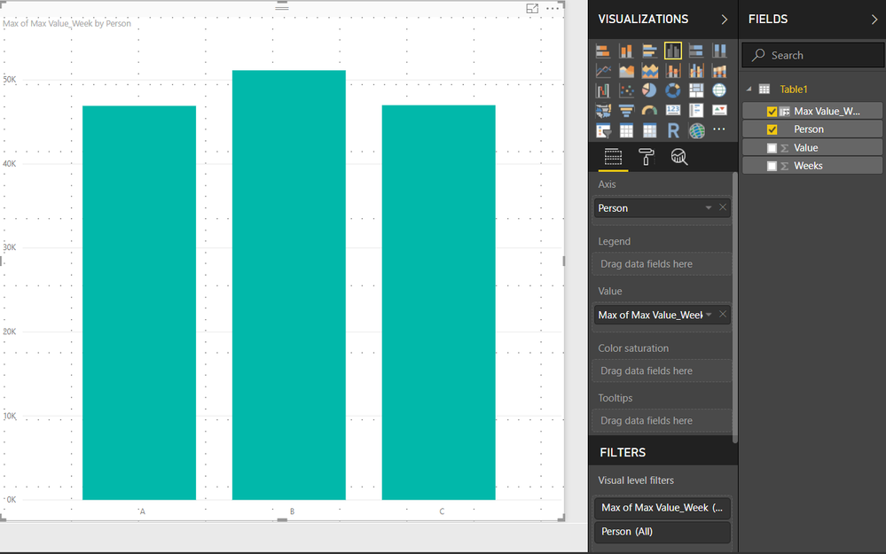
Now, I want to create a custom column in my table in the query editor and want to fill in the max_value_week values, either by writing an M query.

- Mark as New
- Bookmark
- Subscribe
- Mute
- Subscribe to RSS Feed
- Permalink
- Report Inappropriate Content
I understand what you are saying, but my advice to you is that this is likely to be the wrong way to solve your problem. Can you put aside this for a moment and take a step back. Why do you want to do what you say? What are you planning to do with this once it is done? There is likely a better way. Please describe the end state.
- Mark as New
- Bookmark
- Subscribe
- Mute
- Subscribe to RSS Feed
- Permalink
- Report Inappropriate Content
@MattAllington Apologies for not being clear.
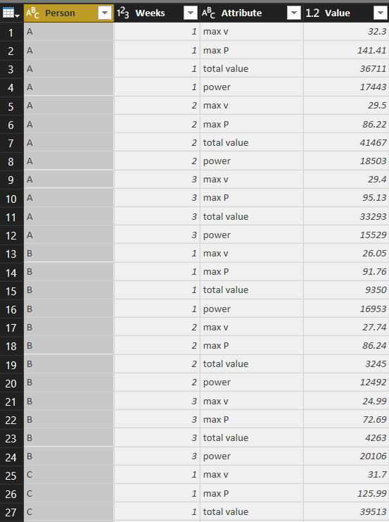
I will try and explain my problem and the output I am expecting in detail. I have the below-attached dataset.
Then I created calculated columns(marked below) for the variables.

I unpivoted the columns to have them in the same columns as attributes.
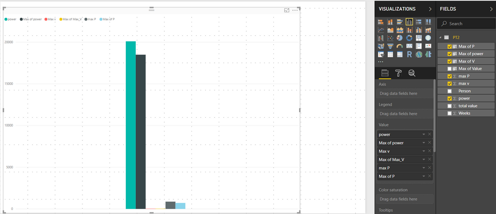
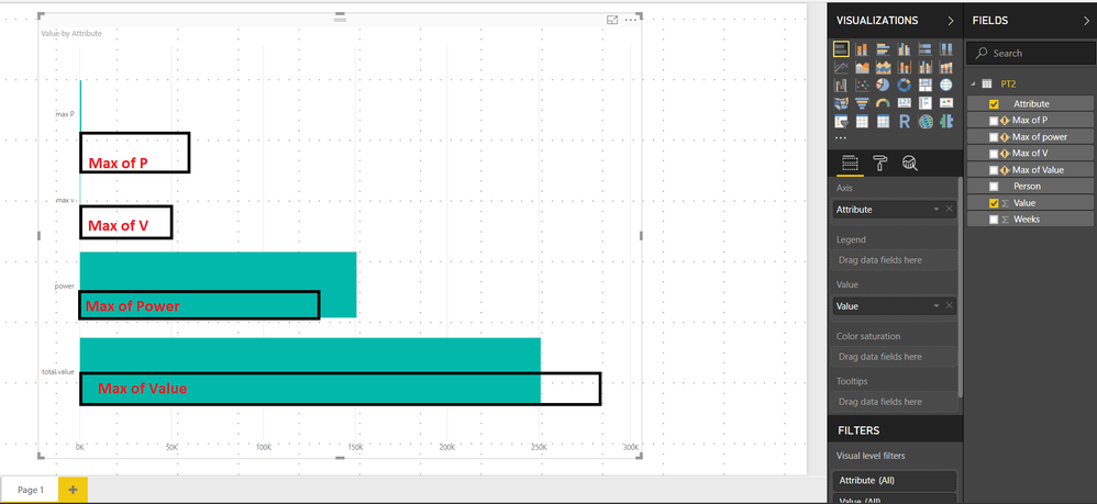
I needed to create a graph as shown below. .. But since I have unpivoted the columns, my calculated columns are throwing me an error as """Column 'max P ' in table 'PT2' cannot be found or may not be used in this expression."""
so, I thought of creating those columns in the table directly to create a bar chart like this..
- Mark as New
- Bookmark
- Subscribe
- Mute
- Subscribe to RSS Feed
- Permalink
- Report Inappropriate Content
@MattAllington Hi Matt,
Do you have any suggestions for me to implement this kind of report, please?
- Mark as New
- Bookmark
- Subscribe
- Mute
- Subscribe to RSS Feed
- Permalink
- Report Inappropriate Content
Just got an Idea Matt. Let me try it tomorrow and see if that is working. Thanks a lot for your response. I will try that and let you know if I managed to solve the problem.
Thanks again 🙂
- Mark as New
- Bookmark
- Subscribe
- Mute
- Subscribe to RSS Feed
- Permalink
- Report Inappropriate Content
Hi @vishnuprashanth,
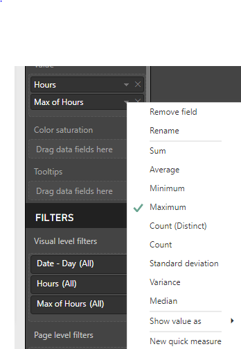
I am not sure that I completely follow what you are after, but could you not just add the field a second time to the values of the visualization and change the aggregation to Maximum. As shown below where I added a field named hours to a chart twice, once as the sum and a second as the Maximum.
- Mark as New
- Bookmark
- Subscribe
- Mute
- Subscribe to RSS Feed
- Permalink
- Report Inappropriate Content
Hi @MarkS
I have already tried it. If I do like that, the labels are shown as Legends and are not displayed in the X-Axis. want the labels to be displayed on the X-Axis.
Helpful resources

Microsoft Fabric Learn Together
Covering the world! 9:00-10:30 AM Sydney, 4:00-5:30 PM CET (Paris/Berlin), 7:00-8:30 PM Mexico City

Power BI Monthly Update - April 2024
Check out the April 2024 Power BI update to learn about new features.

| User | Count |
|---|---|
| 109 | |
| 99 | |
| 77 | |
| 66 | |
| 54 |
| User | Count |
|---|---|
| 144 | |
| 104 | |
| 102 | |
| 88 | |
| 63 |

