- Power BI forums
- Updates
- News & Announcements
- Get Help with Power BI
- Desktop
- Service
- Report Server
- Power Query
- Mobile Apps
- Developer
- DAX Commands and Tips
- Custom Visuals Development Discussion
- Health and Life Sciences
- Power BI Spanish forums
- Translated Spanish Desktop
- Power Platform Integration - Better Together!
- Power Platform Integrations (Read-only)
- Power Platform and Dynamics 365 Integrations (Read-only)
- Training and Consulting
- Instructor Led Training
- Dashboard in a Day for Women, by Women
- Galleries
- Community Connections & How-To Videos
- COVID-19 Data Stories Gallery
- Themes Gallery
- Data Stories Gallery
- R Script Showcase
- Webinars and Video Gallery
- Quick Measures Gallery
- 2021 MSBizAppsSummit Gallery
- 2020 MSBizAppsSummit Gallery
- 2019 MSBizAppsSummit Gallery
- Events
- Ideas
- Custom Visuals Ideas
- Issues
- Issues
- Events
- Upcoming Events
- Community Blog
- Power BI Community Blog
- Custom Visuals Community Blog
- Community Support
- Community Accounts & Registration
- Using the Community
- Community Feedback
Register now to learn Fabric in free live sessions led by the best Microsoft experts. From Apr 16 to May 9, in English and Spanish.
- Power BI forums
- Forums
- Get Help with Power BI
- Desktop
- Add combined line to Line Chart
- Subscribe to RSS Feed
- Mark Topic as New
- Mark Topic as Read
- Float this Topic for Current User
- Bookmark
- Subscribe
- Printer Friendly Page
- Mark as New
- Bookmark
- Subscribe
- Mute
- Subscribe to RSS Feed
- Permalink
- Report Inappropriate Content
Add combined line to Line Chart
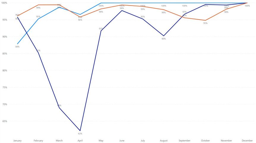
Hi there! I have a line chart below that represents different categories across months. Is it possible to have an additional line that combines the three series in a way that adds the "missing" percent for each month for each series?
E.g. in the month of August this new line would have a value of 88% because 100%-(100%-100%)-(100%-98%)-(100%-90%).
This would for example show the total downtime across multiple pieces of equipment in a factory.
Solved! Go to Solution.
- Mark as New
- Bookmark
- Subscribe
- Mute
- Subscribe to RSS Feed
- Permalink
- Report Inappropriate Content
Hi @Anonymous
with the november update of pbid you can do it like this:
Missed =
VAR _ValueOfA = MIN('Table'[A_])
VAR _ValueOfB = MIN('Table'[B_])
VAR _ValueOfC = MIN('Table'[C_])
VAR _Missed = 3 - (_ValueOfA + _ValueOfB + _ValueOfC)
RETURN
    1 - _Missed
With kind regards from the town where the legend of the 'Pied Piper of Hamelin' is at home
FrankAT (Proud to be a Datanaut)
- Mark as New
- Bookmark
- Subscribe
- Mute
- Subscribe to RSS Feed
- Permalink
- Report Inappropriate Content
Hi @Anonymous ,
I can't download the sample data from your link. Would you please inform us more detailed information( your data and expected output (by OneDrive for Business)) if possible? Then we will help you more correctly.
Please do mask sensitive data before uploading.
Thanks for your understanding and support.
Best Regards,
Dedmon Dai
- Mark as New
- Bookmark
- Subscribe
- Mute
- Subscribe to RSS Feed
- Permalink
- Report Inappropriate Content
Hi @Anonymous
with the november update of pbid you can do it like this:
Missed =
VAR _ValueOfA = MIN('Table'[A_])
VAR _ValueOfB = MIN('Table'[B_])
VAR _ValueOfC = MIN('Table'[C_])
VAR _Missed = 3 - (_ValueOfA + _ValueOfB + _ValueOfC)
RETURN
    1 - _Missed
With kind regards from the town where the legend of the 'Pied Piper of Hamelin' is at home
FrankAT (Proud to be a Datanaut)
- Mark as New
- Bookmark
- Subscribe
- Mute
- Subscribe to RSS Feed
- Permalink
- Report Inappropriate Content
Ah interesting idea! My current data is pivoted, so the categories are all in one column. But it's a good idea to unpivot it. Why is the november release required for this?
- Mark as New
- Bookmark
- Subscribe
- Mute
- Subscribe to RSS Feed
- Permalink
- Report Inappropriate Content
Hi @Anonymous
it's interesting for the chart. You can slide the Y-axis, but for your requirements it's not necessary.
With kind regards from the town where the legend of the 'Pied Piper of Hamelin' is at home
FrankAT (Proud to be a Datanaut)
- Mark as New
- Bookmark
- Subscribe
- Mute
- Subscribe to RSS Feed
- Permalink
- Report Inappropriate Content
@Anonymous ,Can you share sample data and sample output in table format? Or a sample pbix after removing sensitive data.
Microsoft Power BI Learning Resources, 2023 !!
Learn Power BI - Full Course with Dec-2022, with Window, Index, Offset, 100+ Topics !!
Did I answer your question? Mark my post as a solution! Appreciate your Kudos !! Proud to be a Super User! !!
- Mark as New
- Bookmark
- Subscribe
- Mute
- Subscribe to RSS Feed
- Permalink
- Report Inappropriate Content
@amitchandak please see example here: https://gofile.io/d/mnREae
I'd be looking for an additional line that would have the value of 80
Helpful resources

Microsoft Fabric Learn Together
Covering the world! 9:00-10:30 AM Sydney, 4:00-5:30 PM CET (Paris/Berlin), 7:00-8:30 PM Mexico City

Power BI Monthly Update - April 2024
Check out the April 2024 Power BI update to learn about new features.

| User | Count |
|---|---|
| 110 | |
| 94 | |
| 82 | |
| 66 | |
| 58 |
| User | Count |
|---|---|
| 151 | |
| 121 | |
| 104 | |
| 87 | |
| 67 |


