- Power BI forums
- Updates
- News & Announcements
- Get Help with Power BI
- Desktop
- Service
- Report Server
- Power Query
- Mobile Apps
- Developer
- DAX Commands and Tips
- Custom Visuals Development Discussion
- Health and Life Sciences
- Power BI Spanish forums
- Translated Spanish Desktop
- Power Platform Integration - Better Together!
- Power Platform Integrations (Read-only)
- Power Platform and Dynamics 365 Integrations (Read-only)
- Training and Consulting
- Instructor Led Training
- Dashboard in a Day for Women, by Women
- Galleries
- Community Connections & How-To Videos
- COVID-19 Data Stories Gallery
- Themes Gallery
- Data Stories Gallery
- R Script Showcase
- Webinars and Video Gallery
- Quick Measures Gallery
- 2021 MSBizAppsSummit Gallery
- 2020 MSBizAppsSummit Gallery
- 2019 MSBizAppsSummit Gallery
- Events
- Ideas
- Custom Visuals Ideas
- Issues
- Issues
- Events
- Upcoming Events
- Community Blog
- Power BI Community Blog
- Custom Visuals Community Blog
- Community Support
- Community Accounts & Registration
- Using the Community
- Community Feedback
Register now to learn Fabric in free live sessions led by the best Microsoft experts. From Apr 16 to May 9, in English and Spanish.
- Power BI forums
- Forums
- Get Help with Power BI
- Desktop
- Add a secondary Y axis on a line chart with Legend
- Subscribe to RSS Feed
- Mark Topic as New
- Mark Topic as Read
- Float this Topic for Current User
- Bookmark
- Subscribe
- Printer Friendly Page
- Mark as New
- Bookmark
- Subscribe
- Mute
- Subscribe to RSS Feed
- Permalink
- Report Inappropriate Content
Add a secondary Y axis on a line chart with Legend
Hello Everyone,
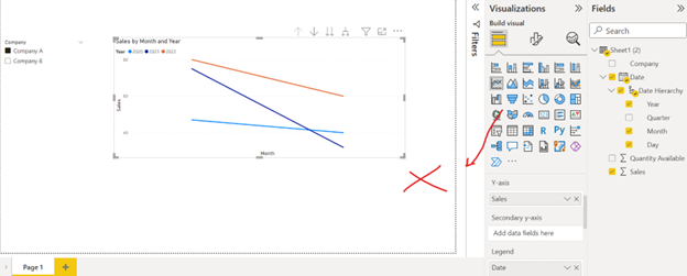
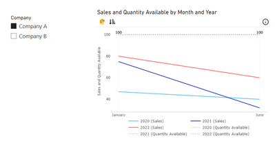
I have a line chart showing sales, I use my date(year) field as a legend to display the years and now I need to add a constant line with the quantity available for each product but I can't use the secondary Y axis if I have a legend... The available quantity is the max number of sales that could have been done on a day.
Do you know a workaround for this please ?
Here is dummy and simplified data but my database looks like this :
| Date | Sales | Quantity Available | Company |
| 1/1/2022 | 80 | 100 | Company A |
| 1/1/2021 | 75 | 100 | Company A |
| 1/1/2020 | 47 | 100 | Company A |
| 6/6/2022 | 60 | 100 | Company A |
| 6/6/2021 | 32 | 100 | Company A |
| 6/6/2020 | 40 | 100 | Company A |
| 1/1/2022 | 187 | 230 | Company B |
| 1/1/2021 | 220 | 230 | Company B |
| 1/1/2020 | 100 | 230 | Company B |
| 6/6/2022 | 175 | 230 | Company B |
| 6/6/2021 | 109 | 230 | Company B |
| 6/6/2020 | 201 | 230 | Company B |
What I have tried :
- Add a constant Y axis with a function for value
- Add max line in the analytics pannel : didn't work because I cannot select my 'quantity available' value as a serie
- make two graphs and put the one with quantity available in front => Y axis is not at the same level
Thanks a lot for your help
Solved! Go to Solution.
- Mark as New
- Bookmark
- Subscribe
- Mute
- Subscribe to RSS Feed
- Permalink
- Report Inappropriate Content
Hey Amit, Thanks for your answer
If this can help, I managed to find a workaround by :
- duplicating the graph
- removing the year legend from the duplicated graph
- adding two measure as lines (max of my sales and available quantity)
- putting the sales and available quantity as 0 Stroke Width
- adding a max line on my available quantity metric
It may not be perfect but it works for me, happy if this can help someone else !
- Mark as New
- Bookmark
- Subscribe
- Mute
- Subscribe to RSS Feed
- Permalink
- Report Inappropriate Content
@Emilien_Granger
The native visual doesn't support this, but you can do this with custom visuals available in appsource like the below (these are paid custom visuals though, not free. costs about $4 or so per user)
https://appsource.microsoft.com/en-us/product/power-bi-visuals/yavdaanalyticspvtltd1628223732998.adv...
You will need to add colours by clicking on the color icon on top left and manually specifying the years and associated colors.
- Mark as New
- Bookmark
- Subscribe
- Mute
- Subscribe to RSS Feed
- Permalink
- Report Inappropriate Content
Hey Amit, Thanks for your answer
If this can help, I managed to find a workaround by :
- duplicating the graph
- removing the year legend from the duplicated graph
- adding two measure as lines (max of my sales and available quantity)
- putting the sales and available quantity as 0 Stroke Width
- adding a max line on my available quantity metric
It may not be perfect but it works for me, happy if this can help someone else !
- Mark as New
- Bookmark
- Subscribe
- Mute
- Subscribe to RSS Feed
- Permalink
- Report Inappropriate Content
Hi Emilien,
I have followed your method to adjust my line chart. But, I have encountered a problem where the range of both graph are not tally. For my situation, I cannot simply change the range to specific number since it will involve data from lots of date. Do you have any ideas to
- Mark as New
- Bookmark
- Subscribe
- Mute
- Subscribe to RSS Feed
- Permalink
- Report Inappropriate Content
@Emilien_Granger , Not possible as far as I know with line visual(Standard), Only possible with the clustered bar or stacked
Microsoft Power BI Learning Resources, 2023 !!
Learn Power BI - Full Course with Dec-2022, with Window, Index, Offset, 100+ Topics !!
Did I answer your question? Mark my post as a solution! Appreciate your Kudos !! Proud to be a Super User! !!
Helpful resources

Microsoft Fabric Learn Together
Covering the world! 9:00-10:30 AM Sydney, 4:00-5:30 PM CET (Paris/Berlin), 7:00-8:30 PM Mexico City

Power BI Monthly Update - April 2024
Check out the April 2024 Power BI update to learn about new features.

| User | Count |
|---|---|
| 111 | |
| 94 | |
| 80 | |
| 68 | |
| 59 |
| User | Count |
|---|---|
| 150 | |
| 119 | |
| 104 | |
| 87 | |
| 67 |


