- Power BI forums
- Updates
- News & Announcements
- Get Help with Power BI
- Desktop
- Service
- Report Server
- Power Query
- Mobile Apps
- Developer
- DAX Commands and Tips
- Custom Visuals Development Discussion
- Health and Life Sciences
- Power BI Spanish forums
- Translated Spanish Desktop
- Power Platform Integration - Better Together!
- Power Platform Integrations (Read-only)
- Power Platform and Dynamics 365 Integrations (Read-only)
- Training and Consulting
- Instructor Led Training
- Dashboard in a Day for Women, by Women
- Galleries
- Community Connections & How-To Videos
- COVID-19 Data Stories Gallery
- Themes Gallery
- Data Stories Gallery
- R Script Showcase
- Webinars and Video Gallery
- Quick Measures Gallery
- 2021 MSBizAppsSummit Gallery
- 2020 MSBizAppsSummit Gallery
- 2019 MSBizAppsSummit Gallery
- Events
- Ideas
- Custom Visuals Ideas
- Issues
- Issues
- Events
- Upcoming Events
- Community Blog
- Power BI Community Blog
- Custom Visuals Community Blog
- Community Support
- Community Accounts & Registration
- Using the Community
- Community Feedback
Register now to learn Fabric in free live sessions led by the best Microsoft experts. From Apr 16 to May 9, in English and Spanish.
- Power BI forums
- Forums
- Get Help with Power BI
- Desktop
- Add a new visual with a calculated measure
- Subscribe to RSS Feed
- Mark Topic as New
- Mark Topic as Read
- Float this Topic for Current User
- Bookmark
- Subscribe
- Printer Friendly Page
- Mark as New
- Bookmark
- Subscribe
- Mute
- Subscribe to RSS Feed
- Permalink
- Report Inappropriate Content
Add a new visual with a calculated measure
Dear all,
I am new to Power BI and these forums and am a bit nervous about asking a silly question here, but please bare with me. I have created a report I am quite happy with, showing among other things how many tickets I have in my data set (an Excel sheet) divided into four age groups (0-10 months, 10-36 months, 36 months-5 years, above 5 years). I did that by adding a calculated column with some IF statements.
Now, I would like to add a visual object to my report showing one calculated figure from these numbers: the ratio beween the rest vs. the 0-10 months. Say f.ex. the number of 0-10 months is 40, and the rest aggregate are 60, I would like a visual showing 60/(40+60) = "60%".
I figure since the numbers are there, in the visual report, I would be able to do these calculations as part of a visual object and could stay out of the data and avoid adding another caluclated column. But I am a bit worried I am misunderstanding a lot by suggesting that... either way, any help to solve this or set me straight would be appreciated. Thank you!
Solved! Go to Solution.
- Mark as New
- Bookmark
- Subscribe
- Mute
- Subscribe to RSS Feed
- Permalink
- Report Inappropriate Content
Hi @JonatanM ,
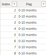
I created some data:
Here are the steps you can follow:
1. Create measure.
Measure =
var _grouptime=
COUNTX(FILTER(ALL('Table'),'Table'[Flag]=MAX('Table'[Flag])),[Flag])
var _Other=
COUNTX(ALL('Table'),[Flag]) - _grouptime
return
DIVIDE(
    _grouptime,_Other)
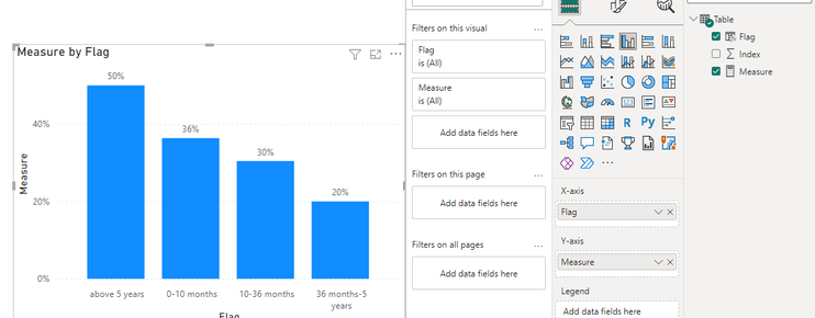
2. Result:
Best Regards,
Liu Yang
If this post helps, then please consider Accept it as the solution to help the other members find it more quickly
- Mark as New
- Bookmark
- Subscribe
- Mute
- Subscribe to RSS Feed
- Permalink
- Report Inappropriate Content
hi @JonatanM
you can plot a Card Visual with a measure like this:
Helpful resources

Microsoft Fabric Learn Together
Covering the world! 9:00-10:30 AM Sydney, 4:00-5:30 PM CET (Paris/Berlin), 7:00-8:30 PM Mexico City

Power BI Monthly Update - April 2024
Check out the April 2024 Power BI update to learn about new features.

| User | Count |
|---|---|
| 109 | |
| 98 | |
| 77 | |
| 66 | |
| 54 |
| User | Count |
|---|---|
| 144 | |
| 104 | |
| 100 | |
| 86 | |
| 64 |


