- Power BI forums
- Updates
- News & Announcements
- Get Help with Power BI
- Desktop
- Service
- Report Server
- Power Query
- Mobile Apps
- Developer
- DAX Commands and Tips
- Custom Visuals Development Discussion
- Health and Life Sciences
- Power BI Spanish forums
- Translated Spanish Desktop
- Power Platform Integration - Better Together!
- Power Platform Integrations (Read-only)
- Power Platform and Dynamics 365 Integrations (Read-only)
- Training and Consulting
- Instructor Led Training
- Dashboard in a Day for Women, by Women
- Galleries
- Community Connections & How-To Videos
- COVID-19 Data Stories Gallery
- Themes Gallery
- Data Stories Gallery
- R Script Showcase
- Webinars and Video Gallery
- Quick Measures Gallery
- 2021 MSBizAppsSummit Gallery
- 2020 MSBizAppsSummit Gallery
- 2019 MSBizAppsSummit Gallery
- Events
- Ideas
- Custom Visuals Ideas
- Issues
- Issues
- Events
- Upcoming Events
- Community Blog
- Power BI Community Blog
- Custom Visuals Community Blog
- Community Support
- Community Accounts & Registration
- Using the Community
- Community Feedback
Register now to learn Fabric in free live sessions led by the best Microsoft experts. From Apr 16 to May 9, in English and Spanish.
- Power BI forums
- Forums
- Get Help with Power BI
- Desktop
- Actuals vs Forecast in one line in the line chart.
- Subscribe to RSS Feed
- Mark Topic as New
- Mark Topic as Read
- Float this Topic for Current User
- Bookmark
- Subscribe
- Printer Friendly Page
- Mark as New
- Bookmark
- Subscribe
- Mute
- Subscribe to RSS Feed
- Permalink
- Report Inappropriate Content
Actuals vs Forecast in one line in the line chart.
Hi guys,
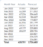
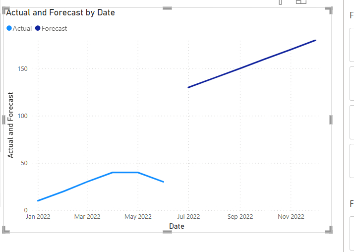
I have the table below and I would like to have a line chart similar to the chart below, showing the actual numbers until June 2022, and from July to December showing the forecast.
Month Date comes from Calendar table.
Actuals from the FACT Table Actuals
Forecast from Forecast table.
I know it's wrong, but this is the logic I have in mind.
I aslo tried this measure from SQLBI, but it won'r work for me as always will have actuals, and I need to show forecast from July to Dec 2022 :
Remaing Forecast = VAR LastDateActuals = calulate (MAX ( Actuals [Date_Key]), REMOVEFILTERS () )
RETURN LastDateActuals.
I'd greatly apprecite your help on that.
Thank you.
Solved! Go to Solution.
- Mark as New
- Bookmark
- Subscribe
- Mute
- Subscribe to RSS Feed
- Permalink
- Report Inappropriate Content
Hi @ROG ,
Try creating two measure to dictate whether it should take Actuals or Forecast and then adding them to your Y axis in the line chart. You will then get two line colours. I assume you have a Date column in your Calendar table.
Actual Measure:
Actual =

CALCULATE(SUM('ACtual Table'[Actual]),'Actual Table'[Date]=MAX('Calendar Table'[Date]),
'Calendar Table'[Date]<DATE(2022,07,01))
Forecast Measure:
Forecast =

CALCULATE(SUM('Forecast Table'[Forecast]),'Forecast Table'[Date]=MAX('Calendar Table'[Date]),
'Calendar Table'[Date]>DATE(2022,06,01) && 'Calendar Table'[Date]<=DATE(2022,12,31))
Only issue is if you put them in the graph, the lines will be disconnected
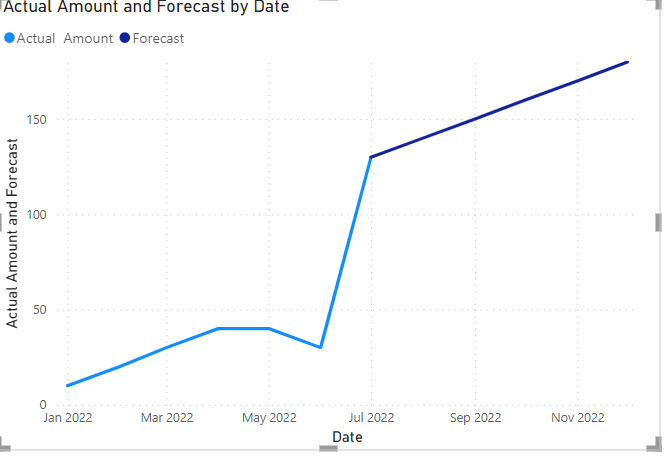
If you want the two lines to connect, you can extend the Actual to include the Forecast for July. If you want to do that, then replace the Actual Measure with this:
Actual with July Forecast=

VAR _Julyforecast=MAX('Calendar Table'[Date])=DATE(2022,07,01) && MAX('Calendar Table'[Date])<=DATE(2022,07,31)
VAR _UntilJune22=MAX('Calendar Table'[Date])<DATE(2022,07,01)

RETURN

IF(_Julyforecast , CALCULATE(SUM('Forecast Table'[Forecast]),'Forecast Table'[Date]=MAX('Calendar Table'[Date])),


IF(_UntilJune22,CALCULATE(SUM('Actual Table'[Actual]),'Actual Table'[Date]=MAX('Calendar Table'[Date]))))
- Mark as New
- Bookmark
- Subscribe
- Mute
- Subscribe to RSS Feed
- Permalink
- Report Inappropriate Content
Hi @ROG,
Could you send me a sample pbix file with dummy data? That will help me understand the columns in your tables and relationships so I can come up with a solution there for you to implement.
- Mark as New
- Bookmark
- Subscribe
- Mute
- Subscribe to RSS Feed
- Permalink
- Report Inappropriate Content
Hi @ROG ,
Try creating two measure to dictate whether it should take Actuals or Forecast and then adding them to your Y axis in the line chart. You will then get two line colours. I assume you have a Date column in your Calendar table.
Actual Measure:
Actual =

CALCULATE(SUM('ACtual Table'[Actual]),'Actual Table'[Date]=MAX('Calendar Table'[Date]),
'Calendar Table'[Date]<DATE(2022,07,01))
Forecast Measure:
Forecast =

CALCULATE(SUM('Forecast Table'[Forecast]),'Forecast Table'[Date]=MAX('Calendar Table'[Date]),
'Calendar Table'[Date]>DATE(2022,06,01) && 'Calendar Table'[Date]<=DATE(2022,12,31))
Only issue is if you put them in the graph, the lines will be disconnected
If you want the two lines to connect, you can extend the Actual to include the Forecast for July. If you want to do that, then replace the Actual Measure with this:
Actual with July Forecast=

VAR _Julyforecast=MAX('Calendar Table'[Date])=DATE(2022,07,01) && MAX('Calendar Table'[Date])<=DATE(2022,07,31)
VAR _UntilJune22=MAX('Calendar Table'[Date])<DATE(2022,07,01)

RETURN

IF(_Julyforecast , CALCULATE(SUM('Forecast Table'[Forecast]),'Forecast Table'[Date]=MAX('Calendar Table'[Date])),


IF(_UntilJune22,CALCULATE(SUM('Actual Table'[Actual]),'Actual Table'[Date]=MAX('Calendar Table'[Date]))))
Helpful resources

Microsoft Fabric Learn Together
Covering the world! 9:00-10:30 AM Sydney, 4:00-5:30 PM CET (Paris/Berlin), 7:00-8:30 PM Mexico City

Power BI Monthly Update - April 2024
Check out the April 2024 Power BI update to learn about new features.

| User | Count |
|---|---|
| 112 | |
| 97 | |
| 84 | |
| 67 | |
| 60 |
| User | Count |
|---|---|
| 150 | |
| 120 | |
| 99 | |
| 87 | |
| 68 |


