- Power BI forums
- Updates
- News & Announcements
- Get Help with Power BI
- Desktop
- Service
- Report Server
- Power Query
- Mobile Apps
- Developer
- DAX Commands and Tips
- Custom Visuals Development Discussion
- Health and Life Sciences
- Power BI Spanish forums
- Translated Spanish Desktop
- Power Platform Integration - Better Together!
- Power Platform Integrations (Read-only)
- Power Platform and Dynamics 365 Integrations (Read-only)
- Training and Consulting
- Instructor Led Training
- Dashboard in a Day for Women, by Women
- Galleries
- Community Connections & How-To Videos
- COVID-19 Data Stories Gallery
- Themes Gallery
- Data Stories Gallery
- R Script Showcase
- Webinars and Video Gallery
- Quick Measures Gallery
- 2021 MSBizAppsSummit Gallery
- 2020 MSBizAppsSummit Gallery
- 2019 MSBizAppsSummit Gallery
- Events
- Ideas
- Custom Visuals Ideas
- Issues
- Issues
- Events
- Upcoming Events
- Community Blog
- Power BI Community Blog
- Custom Visuals Community Blog
- Community Support
- Community Accounts & Registration
- Using the Community
- Community Feedback
Register now to learn Fabric in free live sessions led by the best Microsoft experts. From Apr 16 to May 9, in English and Spanish.
- Power BI forums
- Forums
- Get Help with Power BI
- Desktop
- Accumulated area chart with time and value on x-ax...
- Subscribe to RSS Feed
- Mark Topic as New
- Mark Topic as Read
- Float this Topic for Current User
- Bookmark
- Subscribe
- Printer Friendly Page
- Mark as New
- Bookmark
- Subscribe
- Mute
- Subscribe to RSS Feed
- Permalink
- Report Inappropriate Content
Accumulated area chart with time and value on x-axis
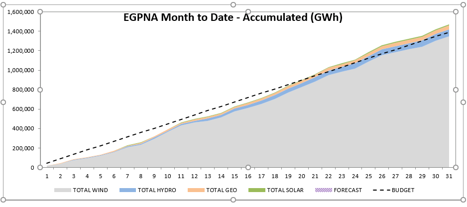
I'm trying to create a chart which seems like it should be simple, but I can't make it happen. What I want is for the x-axis to display days of the month, and with a value on the y-axis. In addition, the value should be split up by values in my hierarchy - for example, technology (wind, hydro, geo, solar). The values display as an accumulated value over time. This is what it looks like in Excel:
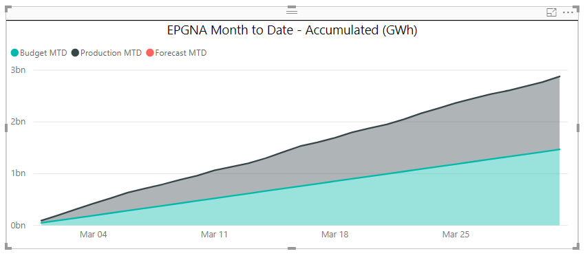
I have it working as a summary, but can't get the technology piece to work. And ultimately, technology is part of a hierarchy that I'd love to be able to drill down through, to show the data divided in more or less granularity as needed. Below is what my current chart looks like:
Can this be done? One thing I just realized is that in the original chart, which I'm trying to replicate, that the budget and forecast data is only being shown as a total, whereas the actuals are being divided by technology. I'm not sure if that's possible, or if it makes it more or less difficult.
Any advice is much appreciated!
thanks
Alex
Solved! Go to Solution.
- Mark as New
- Bookmark
- Subscribe
- Mute
- Subscribe to RSS Feed
- Permalink
- Report Inappropriate Content
@Anonymous so the problem is you are using multiple values. My suggestion would be to combine the technology and measure type column. for example it should have budget-geo, forecast-geo and budget-hydro, forecast-hydro.
my suggestion would be to have the filter like you have set up. if all need to be looked at simultaneously have multiple charts with diff measures in each.
- Mark as New
- Bookmark
- Subscribe
- Mute
- Subscribe to RSS Feed
- Permalink
- Report Inappropriate Content
@Anonymous can you share your power bi file.
- Mark as New
- Bookmark
- Subscribe
- Mute
- Subscribe to RSS Feed
- Permalink
- Report Inappropriate Content
I would love to, but can't find a way to attach it. I see that I can attach photos and video, or a url, but nothing for a file. How do I do that?
thanks!
Alex
- Mark as New
- Bookmark
- Subscribe
- Mute
- Subscribe to RSS Feed
- Permalink
- Report Inappropriate Content
@Anonymous post the file in dropbox or google drive and share the link here.
- Mark as New
- Bookmark
- Subscribe
- Mute
- Subscribe to RSS Feed
- Permalink
- Report Inappropriate Content
Hopefully this works? https://drive.google.com/open?id=1HUgFzuwBbhViniIkLH1XTkGfvYOOk7Ud
- Mark as New
- Bookmark
- Subscribe
- Mute
- Subscribe to RSS Feed
- Permalink
- Report Inappropriate Content
@Anonymous so the problem is you are using multiple values. My suggestion would be to combine the technology and measure type column. for example it should have budget-geo, forecast-geo and budget-hydro, forecast-hydro.
my suggestion would be to have the filter like you have set up. if all need to be looked at simultaneously have multiple charts with diff measures in each.
- Mark as New
- Bookmark
- Subscribe
- Mute
- Subscribe to RSS Feed
- Permalink
- Report Inappropriate Content
Thank you!
Helpful resources

Microsoft Fabric Learn Together
Covering the world! 9:00-10:30 AM Sydney, 4:00-5:30 PM CET (Paris/Berlin), 7:00-8:30 PM Mexico City

Power BI Monthly Update - April 2024
Check out the April 2024 Power BI update to learn about new features.

| User | Count |
|---|---|
| 109 | |
| 99 | |
| 77 | |
| 66 | |
| 54 |
| User | Count |
|---|---|
| 144 | |
| 104 | |
| 102 | |
| 87 | |
| 64 |


