- Power BI forums
- Updates
- News & Announcements
- Get Help with Power BI
- Desktop
- Service
- Report Server
- Power Query
- Mobile Apps
- Developer
- DAX Commands and Tips
- Custom Visuals Development Discussion
- Health and Life Sciences
- Power BI Spanish forums
- Translated Spanish Desktop
- Power Platform Integration - Better Together!
- Power Platform Integrations (Read-only)
- Power Platform and Dynamics 365 Integrations (Read-only)
- Training and Consulting
- Instructor Led Training
- Dashboard in a Day for Women, by Women
- Galleries
- Community Connections & How-To Videos
- COVID-19 Data Stories Gallery
- Themes Gallery
- Data Stories Gallery
- R Script Showcase
- Webinars and Video Gallery
- Quick Measures Gallery
- 2021 MSBizAppsSummit Gallery
- 2020 MSBizAppsSummit Gallery
- 2019 MSBizAppsSummit Gallery
- Events
- Ideas
- Custom Visuals Ideas
- Issues
- Issues
- Events
- Upcoming Events
- Community Blog
- Power BI Community Blog
- Custom Visuals Community Blog
- Community Support
- Community Accounts & Registration
- Using the Community
- Community Feedback
Register now to learn Fabric in free live sessions led by the best Microsoft experts. From Apr 16 to May 9, in English and Spanish.
- Power BI forums
- Forums
- Get Help with Power BI
- Desktop
- monthRe: Accumulate montly expenditures to specifi...
- Subscribe to RSS Feed
- Mark Topic as New
- Mark Topic as Read
- Float this Topic for Current User
- Bookmark
- Subscribe
- Printer Friendly Page
- Mark as New
- Bookmark
- Subscribe
- Mute
- Subscribe to RSS Feed
- Permalink
- Report Inappropriate Content
Accumulate monthly expenditures to specific year per specific product
Dear community,
I'm facing a true challenge for my novice PowerBI skills. I've loaded data from our Analysis Service/Data Warehouse since I'm unable to create measures of calculated columns using a Direct Query to our datacube.
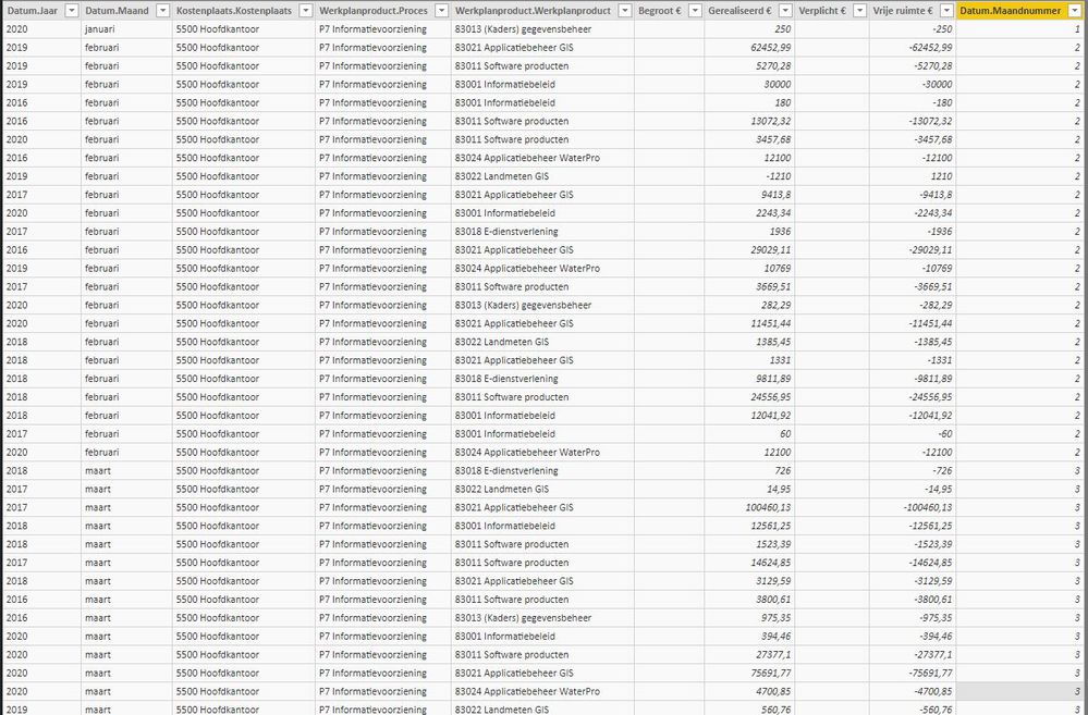
Anyway, my current table is structured like this (column names and values may look like gibberish to you all since they are in Dutch):
"Datum.Jaar" means year
"Datum.Maand" means month
"Datum.Maandnummer" means monthnumber
"Kostenplaats.Kostenplaats" means organizational unit
"Werkplanproduct.Proces" means organizational subunit
"Werkplanproduct.Werkplanproduct" means product (work plan)
"Begroot €" means budgeted
"Gerealiseerd €" means expenditures
"Verplicht €" means financial obligation
"Vrije ruimte €" means free financial space
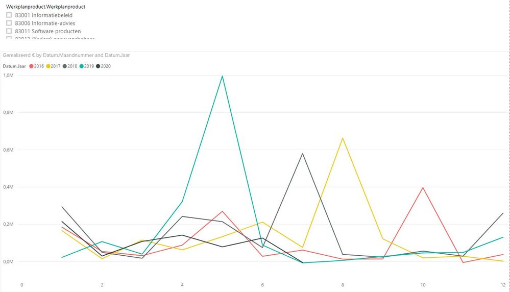
I'm now able to visualize the monthly expenditures per year and product as seen below (rough draft):
But the diagram only shows the actual expenditure per month, whereas the idea is to sum the totals per month for an entire year. So I would like to be able to display a rising line from january ('1') to december ('12').
This should be possible with multiple measures or a calculated column, but I'm really lost how I should make this happen. The necessary columns are:
Datum.Jaar,
Datum.Maand,
Werkplanproduct.Werkplanproduct,
Gerealiseerd €
Any help will be greatly appreciated!
Kind regards from The Netherlands & all the best,
Wilco
Solved! Go to Solution.
- Mark as New
- Bookmark
- Subscribe
- Mute
- Subscribe to RSS Feed
- Permalink
- Report Inappropriate Content
First of all: thanks to both of you for taking the time to reply to my question. Highly appreciated!
It didn't solve my issues unfortunately. I've created the calendar table (altough I probably don't need it, there is already a date hierarchy present in the cube, just had to iincluded in my loaded table) and the YTD-calculations just sums up my total for a year and don't give me the montlhy totals I'm after.
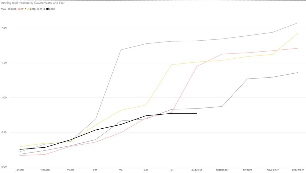
But, while studying all the topics and also a lot of experimenting, I think I've solved my own problem. The following measure give me the monthly figures I was after:

The only issue I am having is data-related: there are months in which there aren't any expenditures and these months are visualized as dots. The line isn't continued to the following dot (or broken line for that matter):

But this probably is an issue which can be resolved by the properties of the visual itself.
Anyway: thanks again and best regards,
Wilco
- Mark as New
- Bookmark
- Subscribe
- Mute
- Subscribe to RSS Feed
- Permalink
- Report Inappropriate Content
First of all: thanks to both of you for taking the time to reply to my question. Highly appreciated!
It didn't solve my issues unfortunately. I've created the calendar table (altough I probably don't need it, there is already a date hierarchy present in the cube, just had to iincluded in my loaded table) and the YTD-calculations just sums up my total for a year and don't give me the montlhy totals I'm after.
But, while studying all the topics and also a lot of experimenting, I think I've solved my own problem. The following measure give me the monthly figures I was after:

The only issue I am having is data-related: there are months in which there aren't any expenditures and these months are visualized as dots. The line isn't continued to the following dot (or broken line for that matter):

But this probably is an issue which can be resolved by the properties of the visual itself.
Anyway: thanks again and best regards,
Wilco
- Mark as New
- Bookmark
- Subscribe
- Mute
- Subscribe to RSS Feed
- Permalink
- Report Inappropriate Content
Hi @GWTF ,
Glad you found a solution.
I didn't really explain my post as well as I could have done. When I said about creating a calendar table, I should also have stated that you need to add a month column to that table, something like:
Month = FORMAT([Date], "mmm")
Also, adding a month number column will allow you to sort the month names in the data view so the text versions of the months can be sorted in the correct order:
monthKey = MONTH([Date])
You then use this month field from the calendar table as your chart axis, and the measure I provided earlier as values. This should work fine.
Pete
Now accepting Kudos! If my post helped you, why not give it a thumbs-up?
Proud to be a Datanaut!
- Mark as New
- Bookmark
- Subscribe
- Mute
- Subscribe to RSS Feed
- Permalink
- Report Inappropriate Content
Hey Pete,
Yup, that was clear to me. Thank you. However, I kept getting the same montlhy expenditure figures. So not the accumulated ones.
Very strange, since the YTD-calculation is the suggested solution in multiple topics I've read.
Anyway, I'm very happy for now. It has been a small journey, but that is the only way to learn, right?
All the best,
Wilco
- Mark as New
- Bookmark
- Subscribe
- Mute
- Subscribe to RSS Feed
- Permalink
- Report Inappropriate Content
Hi @GWTF ,
The first thing you need to do is set up a calendar table. The quickest way to do this is to create a new table in the Data tab with the following:
calendar = CALENDARAUTO(12)
Then you will need to convert your Years and Months in your data table to dates that can be used in a relationship with your calendar table. How you go about this is up to you, but it is necessary to be able to make this relationship.
Once related, you can then use this measure which will give you the cumulative YTD value:
_cumuYTD =
CALCULATE(
    SUM(table[Gerealiseerd £]),
    DATESYTD(calendar[date], "12/31")
)
Pete
Now accepting Kudos! If my post helped you, why not give it a thumbs-up?
Proud to be a Datanaut!
- Mark as New
- Bookmark
- Subscribe
- Mute
- Subscribe to RSS Feed
- Permalink
- Report Inappropriate Content
@GWTF , You can use YTD with date calendar
YTD Sales = CALCULATE(SUM(Sales[Sales Amount]),DATESYTD('Date'[Date],"12/31"))
Last YTD Sales = CALCULATE(SUM(Sales[Sales Amount]),DATESYTD(dateadd('Date'[Date],-1,Year),"12/31"))
This year Sales = CALCULATE(SUM(Sales[Sales Amount]),DATESYTD(ENDOFYEAR('Date'[Date]),"12/31"))
Last year Sales = CALCULATE(SUM(Sales[Sales Amount]),DATESYTD(ENDOFYEAR(dateadd('Date'[Date],-1,Year)),"12/31"))
Last to last YTD Sales = CALCULATE(SUM(Sales[Sales Amount]),DATESYTD(dateadd('Date'[Date],-2,Year),"12/31"))
https://medium.com/@amitchandak.1978/power-bi-ytd-questions-time-intelligence-1-5-e3174b39f38a
To get the best of the time intelligence function. Make sure you have a date calendar and it has been marked as the date in model view. Also, join it with the date column of your fact/s. Refer :
https://radacad.com/creating-calendar-table-in-power-bi-using-dax-functions
https://www.archerpoint.com/blog/Posts/creating-date-table-power-bi
https://www.sqlbi.com/articles/creating-a-simple-date-table-in-dax/
See if my webinar on Time Intelligence can help: https://community.powerbi.com/t5/Webinars-and-Video-Gallery/PowerBI-Time-Intelligence-Calendar-WTD-Y...
Appreciate your Kudos.
Microsoft Power BI Learning Resources, 2023 !!
Learn Power BI - Full Course with Dec-2022, with Window, Index, Offset, 100+ Topics !!
Did I answer your question? Mark my post as a solution! Appreciate your Kudos !! Proud to be a Super User! !!
Helpful resources

Microsoft Fabric Learn Together
Covering the world! 9:00-10:30 AM Sydney, 4:00-5:30 PM CET (Paris/Berlin), 7:00-8:30 PM Mexico City

Power BI Monthly Update - April 2024
Check out the April 2024 Power BI update to learn about new features.

| User | Count |
|---|---|
| 106 | |
| 94 | |
| 77 | |
| 65 | |
| 53 |
| User | Count |
|---|---|
| 145 | |
| 105 | |
| 104 | |
| 90 | |
| 63 |


