- Power BI forums
- Updates
- News & Announcements
- Get Help with Power BI
- Desktop
- Service
- Report Server
- Power Query
- Mobile Apps
- Developer
- DAX Commands and Tips
- Custom Visuals Development Discussion
- Health and Life Sciences
- Power BI Spanish forums
- Translated Spanish Desktop
- Power Platform Integration - Better Together!
- Power Platform Integrations (Read-only)
- Power Platform and Dynamics 365 Integrations (Read-only)
- Training and Consulting
- Instructor Led Training
- Dashboard in a Day for Women, by Women
- Galleries
- Community Connections & How-To Videos
- COVID-19 Data Stories Gallery
- Themes Gallery
- Data Stories Gallery
- R Script Showcase
- Webinars and Video Gallery
- Quick Measures Gallery
- 2021 MSBizAppsSummit Gallery
- 2020 MSBizAppsSummit Gallery
- 2019 MSBizAppsSummit Gallery
- Events
- Ideas
- Custom Visuals Ideas
- Issues
- Issues
- Events
- Upcoming Events
- Community Blog
- Power BI Community Blog
- Custom Visuals Community Blog
- Community Support
- Community Accounts & Registration
- Using the Community
- Community Feedback
Register now to learn Fabric in free live sessions led by the best Microsoft experts. From Apr 16 to May 9, in English and Spanish.
- Power BI forums
- Forums
- Get Help with Power BI
- Desktop
- Re: Accumulate customers on x axis in customer wha...
- Subscribe to RSS Feed
- Mark Topic as New
- Mark Topic as Read
- Float this Topic for Current User
- Bookmark
- Subscribe
- Printer Friendly Page
- Mark as New
- Bookmark
- Subscribe
- Mute
- Subscribe to RSS Feed
- Permalink
- Report Inappropriate Content
Accumulate customers on x axis in customer whale curve
Hi all,
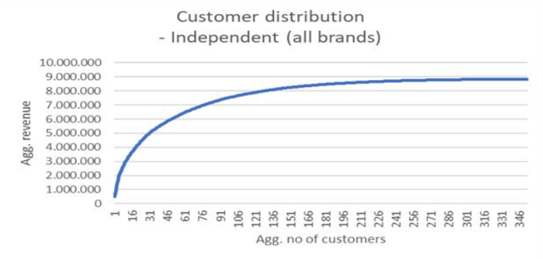
I am making an analysis of aggregated revenue for our customers from the largest to the smallest customers. As we have a couple of thousand customers, the x axis should not display the customer names, but the aggregated number of customers. The first picture shows what the graph should look like. However, when I make it in PowerBi, the graph becomes too big, as the X axis displays over 3.000 customers. Is there any way to fix this in PowerBI?
- Mark as New
- Bookmark
- Subscribe
- Mute
- Subscribe to RSS Feed
- Permalink
- Report Inappropriate Content
Hi @Anonymous ,
I am currently trying to build a whale curve just like you with cumulative Revenue and number of contracts. Were you able to achieve the graph you wanted? I've tried many solutions without success and your post really sums up what I want. i'll be grateful if you could send me your calculations and the way you did it.
Thanks
- Mark as New
- Bookmark
- Subscribe
- Mute
- Subscribe to RSS Feed
- Permalink
- Report Inappropriate Content
Hi @Anonymous ,
Please try to create a calculated column as below and add it to X-Axis.
count = calculate (countrows(your table),filter(your table, your table[customer] = earlieryour table[customer]))If it doesn't meet your requirement, kindly share your sample data and excepted result to me if you don't have any Confidential Information. Please upload your files to One Drive for Business and share the link here.
If this post helps, then please consider Accept it as the solution to help the others find it more quickly.
- Mark as New
- Bookmark
- Subscribe
- Mute
- Subscribe to RSS Feed
- Permalink
- Report Inappropriate Content
Hi,
Thank you very much for your reply. I succeded in making the calculated column that gives each customer a unique ID ( my problem was that each customer had maybe 1000+ rows in my table and I didn't know how to tell PowerBi to give unique ID based on customer and not each row).
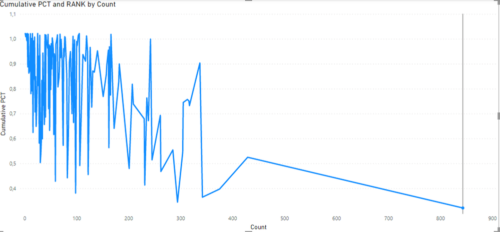
I have also changed the measures to rank by the calculated column instead. However, now my graph looks like this:
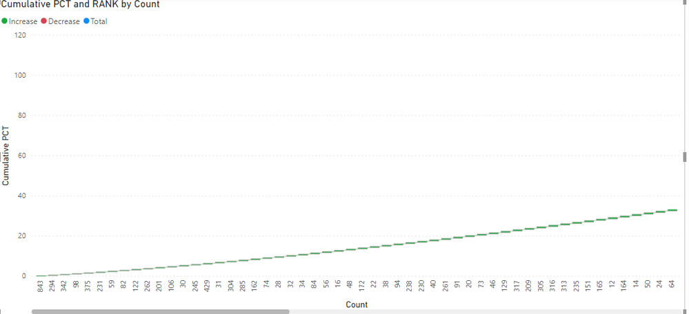
If I change it to a waterfall chart it sorts correctly, by the customer who has the biggest portion of revenue. However, I still need to be able to group them, so the graph doesn't become so long. Any suggestions on how to do that?
- Mark as New
- Bookmark
- Subscribe
- Mute
- Subscribe to RSS Feed
- Permalink
- Report Inappropriate Content
Try to use customer id on x-axis .
If do not have customer id create one using - https://radacad.com/create-row-number-for-each-group-in-power-bi-using-power-query
Microsoft Power BI Learning Resources, 2023 !!
Learn Power BI - Full Course with Dec-2022, with Window, Index, Offset, 100+ Topics !!
Did I answer your question? Mark my post as a solution! Appreciate your Kudos !! Proud to be a Super User! !!
Helpful resources

Microsoft Fabric Learn Together
Covering the world! 9:00-10:30 AM Sydney, 4:00-5:30 PM CET (Paris/Berlin), 7:00-8:30 PM Mexico City

Power BI Monthly Update - April 2024
Check out the April 2024 Power BI update to learn about new features.

| User | Count |
|---|---|
| 117 | |
| 107 | |
| 70 | |
| 70 | |
| 43 |
| User | Count |
|---|---|
| 148 | |
| 106 | |
| 104 | |
| 89 | |
| 65 |


