- Power BI forums
- Updates
- News & Announcements
- Get Help with Power BI
- Desktop
- Service
- Report Server
- Power Query
- Mobile Apps
- Developer
- DAX Commands and Tips
- Custom Visuals Development Discussion
- Health and Life Sciences
- Power BI Spanish forums
- Translated Spanish Desktop
- Power Platform Integration - Better Together!
- Power Platform Integrations (Read-only)
- Power Platform and Dynamics 365 Integrations (Read-only)
- Training and Consulting
- Instructor Led Training
- Dashboard in a Day for Women, by Women
- Galleries
- Community Connections & How-To Videos
- COVID-19 Data Stories Gallery
- Themes Gallery
- Data Stories Gallery
- R Script Showcase
- Webinars and Video Gallery
- Quick Measures Gallery
- 2021 MSBizAppsSummit Gallery
- 2020 MSBizAppsSummit Gallery
- 2019 MSBizAppsSummit Gallery
- Events
- Ideas
- Custom Visuals Ideas
- Issues
- Issues
- Events
- Upcoming Events
- Community Blog
- Power BI Community Blog
- Custom Visuals Community Blog
- Community Support
- Community Accounts & Registration
- Using the Community
- Community Feedback
Register now to learn Fabric in free live sessions led by the best Microsoft experts. From Apr 16 to May 9, in English and Spanish.
- Power BI forums
- Forums
- Get Help with Power BI
- Desktop
- Re: Absence Period Calculation
- Subscribe to RSS Feed
- Mark Topic as New
- Mark Topic as Read
- Float this Topic for Current User
- Bookmark
- Subscribe
- Printer Friendly Page
- Mark as New
- Bookmark
- Subscribe
- Mute
- Subscribe to RSS Feed
- Permalink
- Report Inappropriate Content
Absence Period Calculation
Hello,
I am trying to figure out a way to visualize the period in which an employee was on a leave.
I am trying to do this without doing changes to the dataset I have.
Here is an example of the dataset:
As you can see in the first column I have the month, then employee, while to numerated columns represent the day of a month.
New months are generated by duplicating the employees.
And the desired output would be something like this but in Power BI table:
Does anyone has any ideas how I can achieves the output I want the dataset structure I have?
Solved! Go to Solution.
- Mark as New
- Bookmark
- Subscribe
- Mute
- Subscribe to RSS Feed
- Permalink
- Report Inappropriate Content
Hi @Birdjo,
In your scenario, you can open the Query Editor in Power BI desktop:
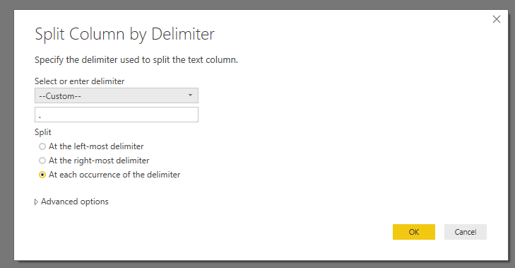
1. Select the column Month, click Split Column.
2. Select columns 1,2,..,7 at the same time, click UnPivot Columns.
3. Add a custom column to combine Year, Month and Day to a date column.
4. Filter to remain Leave values.
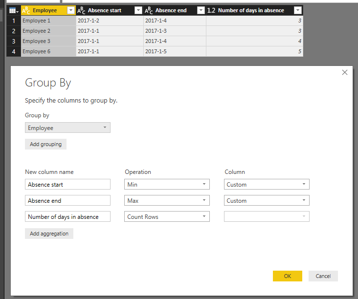
5. Use Group By like below:
For detail steps, please check attached .pbix file.
Best Regards,
Qiuyun Yu
If this post helps, then please consider Accept it as the solution to help the other members find it more quickly.
- Mark as New
- Bookmark
- Subscribe
- Mute
- Subscribe to RSS Feed
- Permalink
- Report Inappropriate Content
My advice - keep the dataset just like it is BUT change the shape of it when you import it into the model. Right now the data isn't tidy - all those columns with dates should be in one columns. It's easy to fix.
In the query select the first two columns, click on the header, and select "unpivot other columns" - After that you should have four columns Month, Employee, DayOfMonth, Value (once you've renamed the last two).
Then if you want to just see it by month, instead of day, then you can use GROUP BY - you don't have to do this because it's really better to keep it at the lowest level of granularity.
Ok that's the dataset, for the report you need to create a absence start & absence end measure - you can create a measure using MAX and MIN.
Hope this helps.
Helpful resources

Microsoft Fabric Learn Together
Covering the world! 9:00-10:30 AM Sydney, 4:00-5:30 PM CET (Paris/Berlin), 7:00-8:30 PM Mexico City

Power BI Monthly Update - April 2024
Check out the April 2024 Power BI update to learn about new features.

| User | Count |
|---|---|
| 107 | |
| 99 | |
| 76 | |
| 64 | |
| 58 |
| User | Count |
|---|---|
| 148 | |
| 113 | |
| 97 | |
| 84 | |
| 67 |


