- Power BI forums
- Updates
- News & Announcements
- Get Help with Power BI
- Desktop
- Service
- Report Server
- Power Query
- Mobile Apps
- Developer
- DAX Commands and Tips
- Custom Visuals Development Discussion
- Health and Life Sciences
- Power BI Spanish forums
- Translated Spanish Desktop
- Power Platform Integration - Better Together!
- Power Platform Integrations (Read-only)
- Power Platform and Dynamics 365 Integrations (Read-only)
- Training and Consulting
- Instructor Led Training
- Dashboard in a Day for Women, by Women
- Galleries
- Community Connections & How-To Videos
- COVID-19 Data Stories Gallery
- Themes Gallery
- Data Stories Gallery
- R Script Showcase
- Webinars and Video Gallery
- Quick Measures Gallery
- 2021 MSBizAppsSummit Gallery
- 2020 MSBizAppsSummit Gallery
- 2019 MSBizAppsSummit Gallery
- Events
- Ideas
- Custom Visuals Ideas
- Issues
- Issues
- Events
- Upcoming Events
- Community Blog
- Power BI Community Blog
- Custom Visuals Community Blog
- Community Support
- Community Accounts & Registration
- Using the Community
- Community Feedback
Register now to learn Fabric in free live sessions led by the best Microsoft experts. From Apr 16 to May 9, in English and Spanish.
- Power BI forums
- Forums
- Get Help with Power BI
- Desktop
- Re: ANY IDEA HELPS, PLEASE
- Subscribe to RSS Feed
- Mark Topic as New
- Mark Topic as Read
- Float this Topic for Current User
- Bookmark
- Subscribe
- Printer Friendly Page
- Mark as New
- Bookmark
- Subscribe
- Mute
- Subscribe to RSS Feed
- Permalink
- Report Inappropriate Content
ANY IDEA HELPS, PLEASE
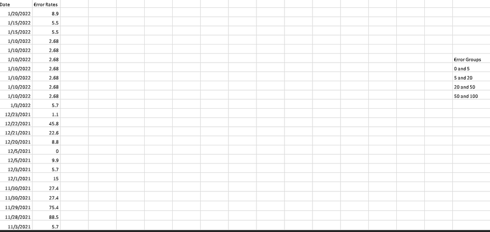
Simple requirment is we need to create a visualization that it will have two variables:
1- Error Rates ( 0-5 (green), 5-20 (yellow), 20-50( orange), 50-100( red))
2. Date (mm/dd/yyyy)
So, this visualization has to display everyday different color depend on Error Rate. I thought Brick Chart visualization is the right one, but I could not do it and now I wonder if anyone is rellay can help me for this problem.
Thank you
Solved! Go to Solution.
- Mark as New
- Bookmark
- Subscribe
- Mute
- Subscribe to RSS Feed
- Permalink
- Report Inappropriate Content
- Mark as New
- Bookmark
- Subscribe
- Mute
- Subscribe to RSS Feed
- Permalink
- Report Inappropriate Content
- Mark as New
- Bookmark
- Subscribe
- Mute
- Subscribe to RSS Feed
- Permalink
- Report Inappropriate Content
Did not know it and helped me a lot
- Mark as New
- Bookmark
- Subscribe
- Mute
- Subscribe to RSS Feed
- Permalink
- Report Inappropriate Content
Hello @theybasar. You can use a simple Table visual, and use Conditional Formatting to change the background color of the error rate.
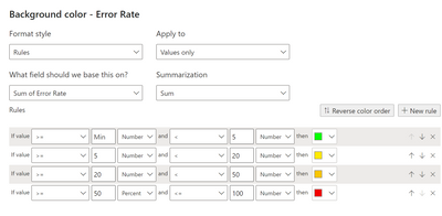
The conditional formatting parameters would look something like this:
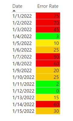
And the results would look like this:
I created a sample .pbix and it is linked here, in case it's helpful.
Here's a link with more info about conditional formatting. The "Color by rules" section would be most relevant here.
Conditional table formatting in Power BI Desktop - Power BI | Microsoft Docs
-Steve
- Mark as New
- Bookmark
- Subscribe
- Mute
- Subscribe to RSS Feed
- Permalink
- Report Inappropriate Content
@SteveHailey Thanks for reply, I have done it but they did not want simple table so that I am really into something little different. Any other idea?
- Mark as New
- Bookmark
- Subscribe
- Mute
- Subscribe to RSS Feed
- Permalink
- Report Inappropriate Content
Perhaps a bar chart?
To format the bars, I created a Measure as seen below:
Error Rate Formatting for Bar Chart =
VAR ErrorRate = SELECTEDVALUE( Data[Error Rate] )
VAR Result =
SWITCH(
    TRUE(),
    ErrorRate < 5, "Green",
    ErrorRate < 20, "Yellow",
    ErrorRate < 50, "Orange",
    "Red"
)
RETURN Result
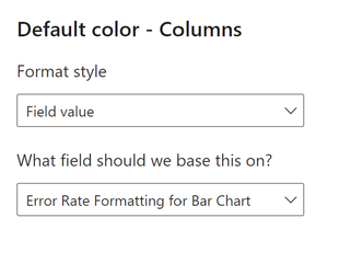
And then set the column color formatting to that measure:
- Mark as New
- Bookmark
- Subscribe
- Mute
- Subscribe to RSS Feed
- Permalink
- Report Inappropriate Content
Hey @theybasar ,
consider creating a pbix that contains sample data, but still reflects your data model (tables, relationships, calculated column, and measures), upload the pbix to onedrive or dropbox and share the link.
If you are using Excel to create the sample data instead of the manual input method share the xlsx as well.
Describe the expected outcome based on the sample data you provided.
Regards,
Tom
Did I answer your question? Mark my post as a solution, this will help others!
Proud to be a Super User!
I accept Kudos 😉
Hamburg, Germany
- Mark as New
- Bookmark
- Subscribe
- Mute
- Subscribe to RSS Feed
- Permalink
- Report Inappropriate Content
- Mark as New
- Bookmark
- Subscribe
- Mute
- Subscribe to RSS Feed
- Permalink
- Report Inappropriate Content
- Mark as New
- Bookmark
- Subscribe
- Mute
- Subscribe to RSS Feed
- Permalink
- Report Inappropriate Content
Hey @theybasar ,
the link requires a login, I will not do that!
Consider providing a link that allows accessing the file without login.
Regards,
Tom
Did I answer your question? Mark my post as a solution, this will help others!
Proud to be a Super User!
I accept Kudos 😉
Hamburg, Germany
- Mark as New
- Bookmark
- Subscribe
- Mute
- Subscribe to RSS Feed
- Permalink
- Report Inappropriate Content
Good morning @TomMartens ,
I am sorry, I did not see it was a private share. Here is the link and anyone can edit and see it. Looking forward to hearing from you hopefully very soon.
Thank you,
Yavuz
- Mark as New
- Bookmark
- Subscribe
- Mute
- Subscribe to RSS Feed
- Permalink
- Report Inappropriate Content
Hi @theybasar ,
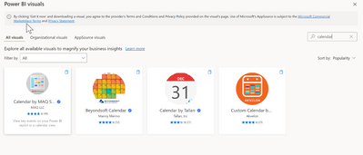
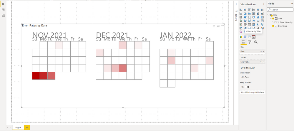
I quite agree with @SteveHailey 's workaround. If you also want other visuals, I found this for you, I don't know if you are satisfied. It's called Calendar by Tallan.
Best Regards,
Stephen Tao
If this post helps, then please consider Accept it as the solution to help the other members find it more quickly.
- Mark as New
- Bookmark
- Subscribe
- Mute
- Subscribe to RSS Feed
- Permalink
- Report Inappropriate Content
Helpful resources

Microsoft Fabric Learn Together
Covering the world! 9:00-10:30 AM Sydney, 4:00-5:30 PM CET (Paris/Berlin), 7:00-8:30 PM Mexico City

Power BI Monthly Update - April 2024
Check out the April 2024 Power BI update to learn about new features.

| User | Count |
|---|---|
| 109 | |
| 99 | |
| 77 | |
| 66 | |
| 54 |
| User | Count |
|---|---|
| 144 | |
| 104 | |
| 102 | |
| 87 | |
| 64 |
