- Power BI forums
- Updates
- News & Announcements
- Get Help with Power BI
- Desktop
- Service
- Report Server
- Power Query
- Mobile Apps
- Developer
- DAX Commands and Tips
- Custom Visuals Development Discussion
- Health and Life Sciences
- Power BI Spanish forums
- Translated Spanish Desktop
- Power Platform Integration - Better Together!
- Power Platform Integrations (Read-only)
- Power Platform and Dynamics 365 Integrations (Read-only)
- Training and Consulting
- Instructor Led Training
- Dashboard in a Day for Women, by Women
- Galleries
- Community Connections & How-To Videos
- COVID-19 Data Stories Gallery
- Themes Gallery
- Data Stories Gallery
- R Script Showcase
- Webinars and Video Gallery
- Quick Measures Gallery
- 2021 MSBizAppsSummit Gallery
- 2020 MSBizAppsSummit Gallery
- 2019 MSBizAppsSummit Gallery
- Events
- Ideas
- Custom Visuals Ideas
- Issues
- Issues
- Events
- Upcoming Events
- Community Blog
- Power BI Community Blog
- Custom Visuals Community Blog
- Community Support
- Community Accounts & Registration
- Using the Community
- Community Feedback
Register now to learn Fabric in free live sessions led by the best Microsoft experts. From Apr 16 to May 9, in English and Spanish.
- Power BI forums
- Forums
- Get Help with Power BI
- Desktop
- 80%-20% pie chart
- Subscribe to RSS Feed
- Mark Topic as New
- Mark Topic as Read
- Float this Topic for Current User
- Bookmark
- Subscribe
- Printer Friendly Page
- Mark as New
- Bookmark
- Subscribe
- Mute
- Subscribe to RSS Feed
- Permalink
- Report Inappropriate Content
80%-20% pie chart
Hi there,
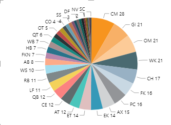
I have created a measure that calculates the no of events that occurred. Now I want to show no events that occurred in different areas of the town using a pie chart. I used Area code as legend and no of events occurred as the value in the pie chart and it created following visual:
I want to change this pie chart into an 80%-20% look so that it only shows the name of area code and their proportions that makeup 80% of total incidents and shows the remaining 20% as 'others'. Is there any way of doing that in Power BI?
Solved! Go to Solution.
- Mark as New
- Bookmark
- Subscribe
- Mute
- Subscribe to RSS Feed
- Permalink
- Report Inappropriate Content
Dear @Dunner2020 ,
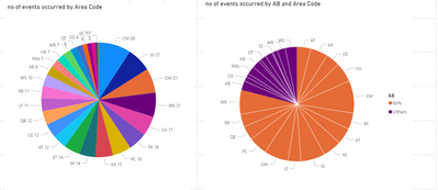
Based on your description, you can create a Cumulative events column as follows.
Command:
calculated events =
SUMX(
FILTER('Sheet1','Sheet1'[no of events occurred]>= EARLIER(Sheet1[no of events occurred])),
'Sheet1'[no of events occurred]
)
AB =
var
cal_percent=DIVIDE('sheet1'[calculated events],SUM(Sheet1[no of events occurred]))
return
IF(
cal_percent<= 0.8,"80%","Others"
)
Result:
Best Regards,
Yuna
If this post helps, then please consider Accept it as the solution to help the other members find it more quickly.
- Mark as New
- Bookmark
- Subscribe
- Mute
- Subscribe to RSS Feed
- Permalink
- Report Inappropriate Content
@Dunner2020 , You have topN and other, Or bucket by percentile
TOPN +others
https://www.youtube.com/watch?v=UAnylK9bm1I
Top 80/20 , percent /percentile - But bucketing you have to create
https://blog.enterprisedna.co/implementing-80-20-logic-in-your-power-bi-analysis/
https://forum.enterprisedna.co/t/testing-the-pareto-principle-80-20-rule-in-power-bi-w-dax/459
https://finance-bi.com/power-bi-pareto-analysis/
https://community.powerbi.com/t5/DAX-Commands-and-Tips/Calculate-the-sum-of-the-top-80/td-p/763156
Microsoft Power BI Learning Resources, 2023 !!
Learn Power BI - Full Course with Dec-2022, with Window, Index, Offset, 100+ Topics !!
Did I answer your question? Mark my post as a solution! Appreciate your Kudos !! Proud to be a Super User! !!
- Mark as New
- Bookmark
- Subscribe
- Mute
- Subscribe to RSS Feed
- Permalink
- Report Inappropriate Content
Hi @Dunner2020 - In power Query, you can create a custom column and group the rows based on some logic (Others/Non Others). Use this new column in your pie chart and it will divide the chart in 2 groups.
Hope this gives some pointers,
Cheers,
-Namish B
Helpful resources

Microsoft Fabric Learn Together
Covering the world! 9:00-10:30 AM Sydney, 4:00-5:30 PM CET (Paris/Berlin), 7:00-8:30 PM Mexico City

Power BI Monthly Update - April 2024
Check out the April 2024 Power BI update to learn about new features.

| User | Count |
|---|---|
| 114 | |
| 99 | |
| 83 | |
| 70 | |
| 61 |
| User | Count |
|---|---|
| 149 | |
| 114 | |
| 107 | |
| 89 | |
| 67 |


