- Power BI forums
- Updates
- News & Announcements
- Get Help with Power BI
- Desktop
- Service
- Report Server
- Power Query
- Mobile Apps
- Developer
- DAX Commands and Tips
- Custom Visuals Development Discussion
- Health and Life Sciences
- Power BI Spanish forums
- Translated Spanish Desktop
- Power Platform Integration - Better Together!
- Power Platform Integrations (Read-only)
- Power Platform and Dynamics 365 Integrations (Read-only)
- Training and Consulting
- Instructor Led Training
- Dashboard in a Day for Women, by Women
- Galleries
- Community Connections & How-To Videos
- COVID-19 Data Stories Gallery
- Themes Gallery
- Data Stories Gallery
- R Script Showcase
- Webinars and Video Gallery
- Quick Measures Gallery
- 2021 MSBizAppsSummit Gallery
- 2020 MSBizAppsSummit Gallery
- 2019 MSBizAppsSummit Gallery
- Events
- Ideas
- Custom Visuals Ideas
- Issues
- Issues
- Events
- Upcoming Events
- Community Blog
- Power BI Community Blog
- Custom Visuals Community Blog
- Community Support
- Community Accounts & Registration
- Using the Community
- Community Feedback
Register now to learn Fabric in free live sessions led by the best Microsoft experts. From Apr 16 to May 9, in English and Spanish.
- Power BI forums
- Forums
- Get Help with Power BI
- Desktop
- Re: 3 month rolling data visual
- Subscribe to RSS Feed
- Mark Topic as New
- Mark Topic as Read
- Float this Topic for Current User
- Bookmark
- Subscribe
- Printer Friendly Page
- Mark as New
- Bookmark
- Subscribe
- Mute
- Subscribe to RSS Feed
- Permalink
- Report Inappropriate Content
3 month rolling data visual
Hello!
Please can someone help with a problem I am having with Power BI. I have 2 tables below (data sources), the first table is showing the time taken to do tasks A and B over a few months, this data is continuously added to through an app. The second table is showing the targets we have for the time taken to do tasks A and B.
I would like to create the following visual in Power BI from the 2 tables, where the 'current' column provides the average time over the past month (from date of viewing the report), and the 3 columns on the right automatically roll-over to show the average times for the past 3 months from the date of viewing the report. For example in January it should show data for October, November and December. Today it should show data for February, March, April.
I also want to be able to conditionally format each 'cell' under the 'Current' column and each of the rolling month columns, so that the cell turns red if it's above 5% of the target, yellow if within 5% of target (above or below), and green if over 5% below target.
Desired output in Power BI
Table 1 (Data source)
| Task | Date | Time taken |
| A | 02-Sep-20 | 42 |
| A | 02-Oct-20 | 45 |
| A | 04-Sep-20 | 42 |
| B | 02-Sep-20 | 65 |
| B | 02-Oct-20 | 64 |
| B | 04-Sep-20 | 62 |
| B | 04-Oct-20 | 65 |
| B | 05-Nov-20 | 56 |
| B | 06-Nov-20 | 67 |
| B | 06-Dec-20 | 58 |
| B | 06-Dec-20 | 58 |
| B | 09-Nov-20 | 62 |
| B | 09-Oct-20 | 57 |
| A | 04-Oct-20 | 38 |
| A | 05-Nov-20 | 42 |
| A | 06-Nov-20 | 41 |
| A | 06-Dec-20 | 42 |
| A | 06-Dec-20 | 40 |
| A | 05-Jan-21 | 42 |
| A | 06-Jan-21 | 41 |
| A | 07-Jan-21 | 41 |
| B | 08-Jan-21 | 63 |
| B | 09-Jan-21 | 62 |
| B | 10-Jan-21 | 61 |
| A | 05-Feb-21 | 41 |
| A | 06-Feb-21 | 38 |
| A | 07-Feb-21 | 37 |
| B | 08-Feb-21 | 63 |
| B | 09-Feb-21 | 58 |
| B | 10-Feb-21 | 59 |
| A | 05-Mar-21 | 42 |
| A | 06-Mar-21 | 41 |
| A | 07-Mar-21 | 41 |
| B | 08-Mar-21 | 62 |
| B | 09-Mar-21 | 62 |
| B | 10-Mar-21 | 62 |
| A | 05-Apr-21 | 44 |
| A | 06-Apr-21 | 41 |
| B | 07-Apr-21 | 62 |
| B | 08-Apr-21 | 62 |
| A | 05-May-21 | 42 |
| A | 06-May-21 | 42 |
| A | 07-May-21 | 42 |
| B | 08-May-21 | 65 |
| B | 09-May-21 | 61 |
Table 2 (Targets)
| Task | Target |
| A | 40 |
| B | 60 |
Thanks very much in advance!
Solved! Go to Solution.
- Mark as New
- Bookmark
- Subscribe
- Mute
- Subscribe to RSS Feed
- Permalink
- Report Inappropriate Content
Hi, @ArslanManzoor
Please check the below steps.
Write a measure something like below.


Hi, My name is Jihwan Kim.
If this post helps, then please consider accept it as the solution to help other members find it faster, and give a big thumbs up.
Linkedin: linkedin.com/in/jihwankim1975/
Twitter: twitter.com/Jihwan_JHKIM
If this post helps, then please consider accepting it as the solution to help other members find it faster, and give a big thumbs up.
- Mark as New
- Bookmark
- Subscribe
- Mute
- Subscribe to RSS Feed
- Permalink
- Report Inappropriate Content
@Jihwan_Kim Hello, I'm replying on behalf of Arslan. He has said:
Great, thanks , the conditional formatting now works.
However I have just noticed my table columns have reordered into alphabetical order, any way to resolve this?
Also, under each column, the same value is repeated across as per the screenshot attached. How would I fix this please?
- Mark as New
- Bookmark
- Subscribe
- Mute
- Subscribe to RSS Feed
- Permalink
- Report Inappropriate Content
Hi, @Pricey79
Thank you for your feedback.
Please share your sample pbix file's link here, then I can try to look into it to find out the cause of the problem.
Thanks.
If this post helps, then please consider accepting it as the solution to help other members find it faster, and give a big thumbs up.
- Mark as New
- Bookmark
- Subscribe
- Mute
- Subscribe to RSS Feed
- Permalink
- Report Inappropriate Content
Hi, @ArslanManzoor
Please check the below picture and the sample pbix file's link down below.
All measures are in the sample pbix file.
In order to show "Current" in the column in Matrix Visualization, I suggest creating an Axis table to show it like below.
Hi, My name is Jihwan Kim.
If this post helps, then please consider accept it as the solution to help other members find it faster, and give a big thumbs up.
Linkedin: linkedin.com/in/jihwankim1975/
Twitter: twitter.com/Jihwan_JHKIM
If this post helps, then please consider accepting it as the solution to help other members find it faster, and give a big thumbs up.
- Mark as New
- Bookmark
- Subscribe
- Mute
- Subscribe to RSS Feed
- Permalink
- Report Inappropriate Content
Hi @Jihwan_Kim
Thanks very much for your response!
How do I create an axis table? is this a custom visual?
- Mark as New
- Bookmark
- Subscribe
- Mute
- Subscribe to RSS Feed
- Permalink
- Report Inappropriate Content
Hi, @ArslanManzoor
Thank you for your feedback.
It is created manually based on the needs.
If your actual model size is big, you can create it by using the table-creating DAX function.
If your actual model size is relatively not big, you can create it by excel and import it, Or you can create it in Power Query Editor. When the size is relatively not big, I prefer creating it in Power Query Editor.
Thanks.
If this post helps, then please consider accepting it as the solution to help other members find it faster, and give a big thumbs up.
- Mark as New
- Bookmark
- Subscribe
- Mute
- Subscribe to RSS Feed
- Permalink
- Report Inappropriate Content
Hi @Jihwan_Kim ,
Thank you for your quick response!
I'm relatively new to Power BI so struggling to implement your DAX formula/axis table approach with my data. Is there a way I can combine the 2 files so I can just feed my data into your visual?
I also want to be able to conditionally format each 'cell' under the 'Current' column and each of the rolling month columns, so that the cell turns red if it's above 5% of the target, yellow if within 5% of target (above or below), and green if over 5% below target. Is this possible with the table you created?
Thanks again for your help!
- Mark as New
- Bookmark
- Subscribe
- Mute
- Subscribe to RSS Feed
- Permalink
- Report Inappropriate Content
Hi, @ArslanManzoor
I am not sure how your real data model looks like, but in my opinion, if your table 1 and table 2 has the same table structure as above, then, you can open my pbix file and replace the data with yours. If the date range is larger, then you need to fix the calendar table and axis table to include your date range.
If it is OK with you, please share your table1 and table2, then I can try to look into it to come up with a more accurate solution.
Thank you.
If this post helps, then please consider accepting it as the solution to help other members find it faster, and give a big thumbs up.
- Mark as New
- Bookmark
- Subscribe
- Mute
- Subscribe to RSS Feed
- Permalink
- Report Inappropriate Content
Thanks @Jihwan_Kim , I have managed to get the table to work for my data.
Is there a solution for my conditional formatting question above I can use in this table?
- Mark as New
- Bookmark
- Subscribe
- Mute
- Subscribe to RSS Feed
- Permalink
- Report Inappropriate Content
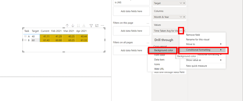
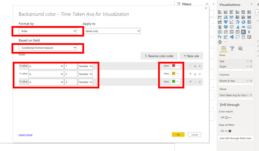
Hi, @ArslanManzoor
Please check the below steps.
Write a measure something like below.


Hi, My name is Jihwan Kim.
If this post helps, then please consider accept it as the solution to help other members find it faster, and give a big thumbs up.
Linkedin: linkedin.com/in/jihwankim1975/
Twitter: twitter.com/Jihwan_JHKIM
If this post helps, then please consider accepting it as the solution to help other members find it faster, and give a big thumbs up.
- Mark as New
- Bookmark
- Subscribe
- Mute
- Subscribe to RSS Feed
- Permalink
- Report Inappropriate Content
@ArslanManzoor , Create a common task table. and a date table, use task from the common table
Rolling 3 before 1 = CALCULATE(sum(Table[Time taken]),DATESINPERIOD('Date'[Date ],eomonth(MAX('Date'[Date]),-1),-3,MONTH))
target = sum(Target[Target])
Microsoft Power BI Learning Resources, 2023 !!
Learn Power BI - Full Course with Dec-2022, with Window, Index, Offset, 100+ Topics !!
Did I answer your question? Mark my post as a solution! Appreciate your Kudos !! Proud to be a Super User! !!
Helpful resources

Microsoft Fabric Learn Together
Covering the world! 9:00-10:30 AM Sydney, 4:00-5:30 PM CET (Paris/Berlin), 7:00-8:30 PM Mexico City

Power BI Monthly Update - April 2024
Check out the April 2024 Power BI update to learn about new features.

| User | Count |
|---|---|
| 112 | |
| 100 | |
| 76 | |
| 74 | |
| 49 |
| User | Count |
|---|---|
| 145 | |
| 108 | |
| 107 | |
| 89 | |
| 61 |


