- Power BI forums
- Updates
- News & Announcements
- Get Help with Power BI
- Desktop
- Service
- Report Server
- Power Query
- Mobile Apps
- Developer
- DAX Commands and Tips
- Custom Visuals Development Discussion
- Health and Life Sciences
- Power BI Spanish forums
- Translated Spanish Desktop
- Power Platform Integration - Better Together!
- Power Platform Integrations (Read-only)
- Power Platform and Dynamics 365 Integrations (Read-only)
- Training and Consulting
- Instructor Led Training
- Dashboard in a Day for Women, by Women
- Galleries
- Community Connections & How-To Videos
- COVID-19 Data Stories Gallery
- Themes Gallery
- Data Stories Gallery
- R Script Showcase
- Webinars and Video Gallery
- Quick Measures Gallery
- 2021 MSBizAppsSummit Gallery
- 2020 MSBizAppsSummit Gallery
- 2019 MSBizAppsSummit Gallery
- Events
- Ideas
- Custom Visuals Ideas
- Issues
- Issues
- Events
- Upcoming Events
- Community Blog
- Power BI Community Blog
- Custom Visuals Community Blog
- Community Support
- Community Accounts & Registration
- Using the Community
- Community Feedback
Register now to learn Fabric in free live sessions led by the best Microsoft experts. From Apr 16 to May 9, in English and Spanish.
- Power BI forums
- Forums
- Get Help with Power BI
- Desktop
- Re: 24 Months Scatter Plot Graph
- Subscribe to RSS Feed
- Mark Topic as New
- Mark Topic as Read
- Float this Topic for Current User
- Bookmark
- Subscribe
- Printer Friendly Page
- Mark as New
- Bookmark
- Subscribe
- Mute
- Subscribe to RSS Feed
- Permalink
- Report Inappropriate Content
24 Months Scatter Plot Graph
Hi,
I would like to create a scatter plot graph with the past 24 mths trend.
The dots are the sales of each respective sales person, and I would like to show a median line of all the sales person.
How do I get the past 24 months trend and to put the respective sales person as an individual dot?
- Mark as New
- Bookmark
- Subscribe
- Mute
- Subscribe to RSS Feed
- Permalink
- Report Inappropriate Content
Hi @naoki
The dots are the sales of each respective sales person, and I would like to show a median line of all the sales person.
You could add a median line. (Analytics->Median line)
How do I get the past 24 months trend and to put the respective sales person as an individual dot?
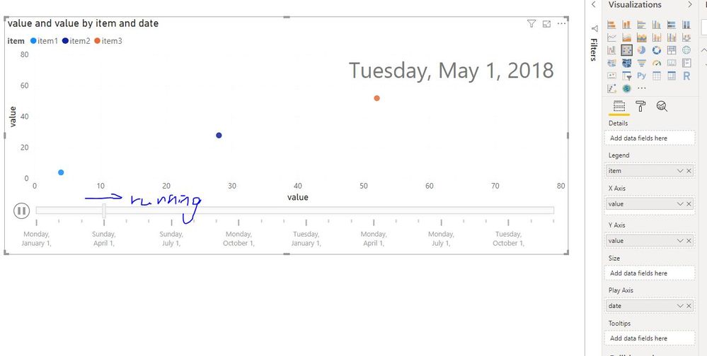
You could add datetime field in “Play axis", add "person name" in the "legend" field.
Reference:
https://radacad.com/storytelling-with-power-bi-scatter-chart
Maggie
If this post helps, then please consider Accept it as the solution to help the other members find it more quickly.
- Mark as New
- Bookmark
- Subscribe
- Mute
- Subscribe to RSS Feed
- Permalink
- Report Inappropriate Content
Apologies, I realised I was unclear with my question.
For the scatter plot, I would need couple of things
1. 24 Months trend (To show their sales for the past 24 months), from month 1 to 24.
- This will show the total sales per month up till 24 months for all sales person. (E.g) Salesperson A, Month 1 10k, Month 2, 20k and so on), however I would need to show for all, as I am intending to create a corelation at a later stage using this result.
2. I also would like to plot my own average line which should be showing an upwards trend as that is the benchmark that I would want to see the sales person growth vs my predetermine sales person.
Thank you.
- Mark as New
- Bookmark
- Subscribe
- Mute
- Subscribe to RSS Feed
- Permalink
- Report Inappropriate Content
Hi @naoki
You could add "date" in the "Play Axis" as this article suggested.
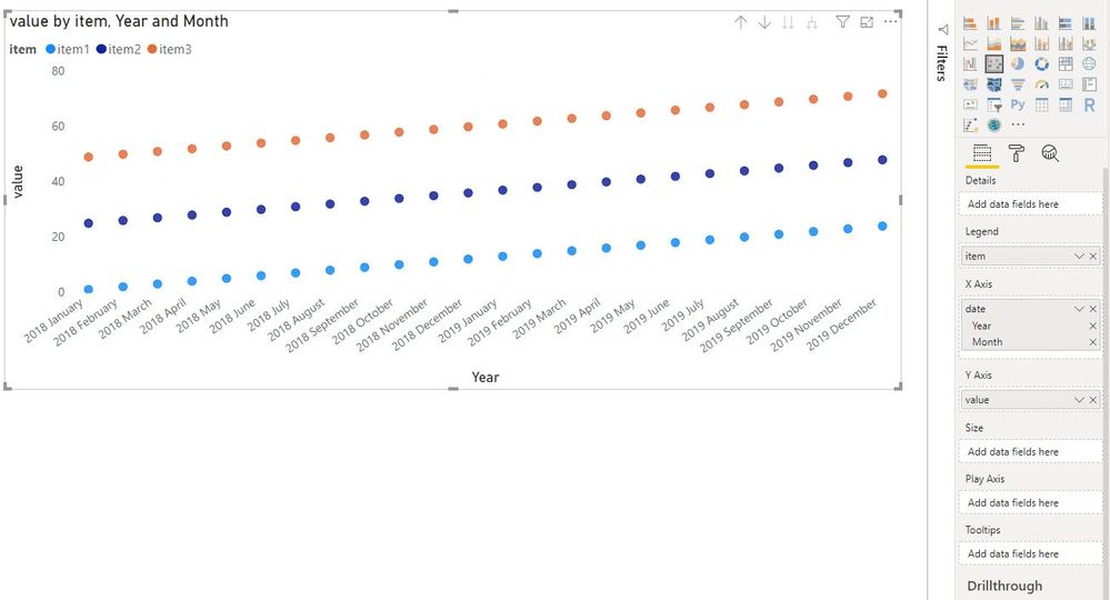
Or add "date" in "Axis", add "sales person" in "Legend" field.
There are 12 months a year, which 24 months do you mean? the last 24 months from the current months?
What is the Independent variable and Dependent variable of the corelation?
Best Regards
Maggie
- Mark as New
- Bookmark
- Subscribe
- Mute
- Subscribe to RSS Feed
- Permalink
- Report Inappropriate Content
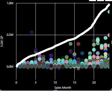
The 24 months that I meant from the day that the sales person joined. It doesn't matter to me when do they join, what matters is when did they made the sales. So if a sales person had their first sales in his 3rd month, a dot will appear on the 3rd month.
Something like my graph here, I sort of managed to get the data to show for 24 months, however, I have yet to check for issues. As for the white line, it should be an average line that is preset by me, whereby i will be able to identify which sales person is performing below average and it needs to be as per what I drawn a growing line.
Helpful resources

Microsoft Fabric Learn Together
Covering the world! 9:00-10:30 AM Sydney, 4:00-5:30 PM CET (Paris/Berlin), 7:00-8:30 PM Mexico City

Power BI Monthly Update - April 2024
Check out the April 2024 Power BI update to learn about new features.

| User | Count |
|---|---|
| 107 | |
| 93 | |
| 77 | |
| 65 | |
| 53 |
| User | Count |
|---|---|
| 147 | |
| 106 | |
| 104 | |
| 87 | |
| 61 |


