- Power BI forums
- Updates
- News & Announcements
- Get Help with Power BI
- Desktop
- Service
- Report Server
- Power Query
- Mobile Apps
- Developer
- DAX Commands and Tips
- Custom Visuals Development Discussion
- Health and Life Sciences
- Power BI Spanish forums
- Translated Spanish Desktop
- Power Platform Integration - Better Together!
- Power Platform Integrations (Read-only)
- Power Platform and Dynamics 365 Integrations (Read-only)
- Training and Consulting
- Instructor Led Training
- Dashboard in a Day for Women, by Women
- Galleries
- Community Connections & How-To Videos
- COVID-19 Data Stories Gallery
- Themes Gallery
- Data Stories Gallery
- R Script Showcase
- Webinars and Video Gallery
- Quick Measures Gallery
- 2021 MSBizAppsSummit Gallery
- 2020 MSBizAppsSummit Gallery
- 2019 MSBizAppsSummit Gallery
- Events
- Ideas
- Custom Visuals Ideas
- Issues
- Issues
- Events
- Upcoming Events
- Community Blog
- Power BI Community Blog
- Custom Visuals Community Blog
- Community Support
- Community Accounts & Registration
- Using the Community
- Community Feedback
Register now to learn Fabric in free live sessions led by the best Microsoft experts. From Apr 16 to May 9, in English and Spanish.
- Power BI forums
- Forums
- Get Help with Power BI
- Desktop
- 2 values in axis
- Subscribe to RSS Feed
- Mark Topic as New
- Mark Topic as Read
- Float this Topic for Current User
- Bookmark
- Subscribe
- Printer Friendly Page
- Mark as New
- Bookmark
- Subscribe
- Mute
- Subscribe to RSS Feed
- Permalink
- Report Inappropriate Content
2 values in axis
Hi Everyone,
I checked the post but could not find the one that I really want to do.
I have the following example data:
| name | category | PTIme | KTime | Price | KPrice |
| john | a | 1 | 1 | 10 | 160 |
| john | b | 1 | 2 | 15 | 150 |
| john | d | 2 | 3 | 16 | 160 |
| john | e | 2 | 3 | 18 | 190 |
| john | f | 3 | 3 | 20 | 180 |
| john | g | 4 | 5 | 23 | 160 |
| john | h | 4 | 6 | 26 | 110 |
| john | i | 5 | 7 | 30 | 140 |
| john | j | 6 | 7 | 32 | 130 |
| john | k | 6 | 7 | 35 | 120 |
| john | l | 7 | 7 | 39 | 100 |
The total is:
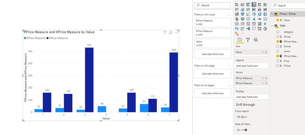
| PPrice | KPrice | |
| 1 | 25 | 160 |
| 2 | 34 | 150 |
| 3 | 20 | 530 |
| 4 | 49 | - |
| 5 | 30 | 160 |
| 6 | 67 | 110 |
| 7 | 39 | 490 |
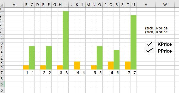
I want to make a chart to show the values in such visual:
(Not very good visualizaiton, but just to explain my goal. :))
Can any of you help me?
Best
- Mark as New
- Bookmark
- Subscribe
- Mute
- Subscribe to RSS Feed
- Permalink
- Report Inappropriate Content
Hi Icey,
I thought that everything is perfect, but I miss one point and the file didn't work. I will explain in details.
In my graph, i have a slicer for name and the data should show based on the selection. The category values and name are repeating in my data. I added three more rows to the previous table.
name | category | PTIme | KTime | Price | KPrice |
john | a | 1 | 1 | 10 | 160 |
john | b | 1 | 2 | 15 | 150 |
john | d | 2 | 3 | 16 | 160 |
john | e | 2 | 3 | 18 | 190 |
john | f | 3 | 3 | 20 | 180 |
john | g | 4 | 5 | 23 | 160 |
john | h | 4 | 6 | 26 | 110 |
john | i | 5 | 7 | 30 | 140 |
john | j | 6 | 7 | 32 | 130 |
john | k | 6 | 7 | 35 | 120 |
john | l | 7 | 7 | 39 | 100 |
Maj | j | 12 | 3 | 50 | 80 |
Maj | k | 16 | 2 | 55 | 70 |
Maj | l | 15 | 1 | 60 | 50 |
When there is repeated value, it should be provide the data with the formula below, which i did by adding custom column:
PTime2=[PTIme]*[Price]/[Price]
Ktime2=[KTime]*[KPrice]/[KPrice]
|
|
|
|
|
| PTime2 | KTime2 |
john | j | 6 | 7 | 32 | 130 | 192 | 910 |
john | k | 6 | 7 | 35 | 120 | 210 | 840 |
john | l | 7 | 7 | 39 | 100 | 273 | 700 |
Maj | j | 12 | 3 | 50 | 80 | 600 | 240 |
Maj | k | 16 | 2 | 55 | 70 | 880 | 140 |
Maj | l | 15 | 1 | 60 | 50 | 900 | 50 |
|
|
|
|
|
|
|
|
|
|
|
|
|
| 600+192 | 240+910 |
|
|
|
|
|
| 792 | 1150 |
|
|
|
|
|
|
|
|
|
|
|
|
|
| 32+50 | 130+80 |
|
|
|
|
|
| 82 | 210 |
|
|
|
|
|
|
|
|
|
|
|
|
|
| 792/82 | 1150/210 |
|
| if nothing is selected: | j | 10 | 5 |
If we go with the example for category j, in no name is selected, it should be shown under Ptime2: value 10 and Ktime2:value 5. If John is selected, it should be shown under Ptime:5, KTime:7.
I followed the steps that you provided, but it shows different result for the repeated values.
Here is the file that I used if you can have a look at it. : https://gofile.io/d/V8Fonh
I know that I kept too much of your time, but this is a very good example for the ones that are using repeated values and slicer, which is the case most of the time.
regards,
- Mark as New
- Bookmark
- Subscribe
- Mute
- Subscribe to RSS Feed
- Permalink
- Report Inappropriate Content
Hi @IF ,
I can't download your file.
Can't you open the file attached under my last reply? There are some changes in it. If you can't open it, I will explain what I did in details.
Best Regards,
Icey
- Mark as New
- Bookmark
- Subscribe
- Mute
- Subscribe to RSS Feed
- Permalink
- Report Inappropriate Content
Hi Icey,
Was my explanation clear?
Regards,
- Mark as New
- Bookmark
- Subscribe
- Mute
- Subscribe to RSS Feed
- Permalink
- Report Inappropriate Content
Hi again,
What you provided is very clear. When there are different names and same categories, then it doesn't work. For example;
name | category | PTIme | KTime | Price | KPrice |
john | a | 1 | 1 | 10 | 160 |
john | b | 1 | 2 | 15 | 150 |
john | d | 2 | 3 | 16 | 160 |
john | e | 2 | 3 | 18 | 190 |
john | f | 3 | 3 | 20 | 180 |
john | g | 4 | 5 | 23 | 160 |
john | h | 4 | 6 | 26 | 110 |
john | i | 5 | 7 | 30 | 140 |
john | j | 6 | 7 | 32 | 130 |
john | k | 6 | 7 | 35 | 120 |
john | l | 7 | 7 | 39 | 100 |
Maj | j | 12 | 3 | 50 | 80 |
Maj | k | 16 | 2 | 55 | 70 |
Maj | l | 15 | 1 | 60 | 50 |
I added last three rows. I added new columns to the power bi file as well:
PTime2=[PTIme]*[Price]/[Price]
Ktime2=[KTime]*[KPrice]/[KPrice]
Let's look at category "j". If no name is selected, it should be shown under Ptime2: value 10 and Ktime2:value 5 based on the formula or new columns that I explained (there are two values for category j: one for John and one for Maj). If John is selected, it should be shown under Ptime:5, KTime:7.
Here is the new link from dropbox:
https://www.dropbox.com/s/mzm9w83cz1wf0pl/2%20values%20in%20axis%20-%20increaseddata%202.pbix?dl=0
I tried this link but it works for me: https://gofile.io/d/V8Fonh
I hope one of them works for you at least.
I hope it is clear and you can find a solution. 🙂
regards,
- Mark as New
- Bookmark
- Subscribe
- Mute
- Subscribe to RSS Feed
- Permalink
- Report Inappropriate Content
Hi @IF ,
Try this:
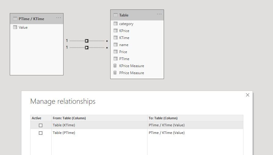
1. Create another table.
PTime / KTime = GENERATESERIES(1,7,1)
2. Create relationship.
3. Create measures.
PPrice Measure = CALCULATE(SUM('Table'[Price]),USERELATIONSHIP('PTime / KTime'[Value],'Table'[PTIme]))KPrice Measure = CALCULATE(SUM('Table'[KPrice]),USERELATIONSHIP('PTime / KTime'[Value],'Table'[KTime]))
4. Create a Clustered column chart visual.
Best regards
Icey
If this post helps,then consider Accepting it as the solution to help other members find it faster.
- Mark as New
- Bookmark
- Subscribe
- Mute
- Subscribe to RSS Feed
- Permalink
- Report Inappropriate Content
Hi Icey,
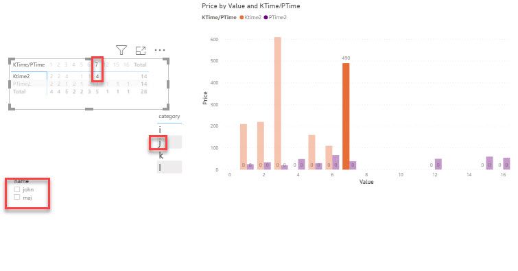
It works very well. Thanks a lot. However, now I have an issue. Actually, I am also using a matrix to show the count of PTime and KTime under the graph. I used unpivot option to do that. When I did unpivot, the table worked but I had a problem with graph. Therefore, I only posted the graph problem. After this method, I can not use unpivot option anymore and now I have a problem with the matrix. The matrix shows:
| COUNT | 1 | 2 | 3 | 4 | 5 | 6 | 7 |
| Ptime | 2 | 2 | 1 | 2 | 1 | 2 | 1 |
| Ktime | 1 | 1 | 3 | 0 | 1 | 1 | 3 |
I also made a table under the matrix and drag drop the Table[Category] column. If I select, 3 (Ktime:3 and value 3) it shows the values for d,e,f
| d |
| e |
| f |
You already helped a lot, but this graph should work with the matrix to see the category values. Will you be able to help me this part so that graph and table works together?
All the best
- Mark as New
- Bookmark
- Subscribe
- Mute
- Subscribe to RSS Feed
- Permalink
- Report Inappropriate Content
Hi @IF ,
Kindly check whether the attched file is helpful.
Best regards
Icey
If this post helps,then consider Accepting it as the solution to help other members find it faster.
- Mark as New
- Bookmark
- Subscribe
- Mute
- Subscribe to RSS Feed
- Permalink
- Report Inappropriate Content
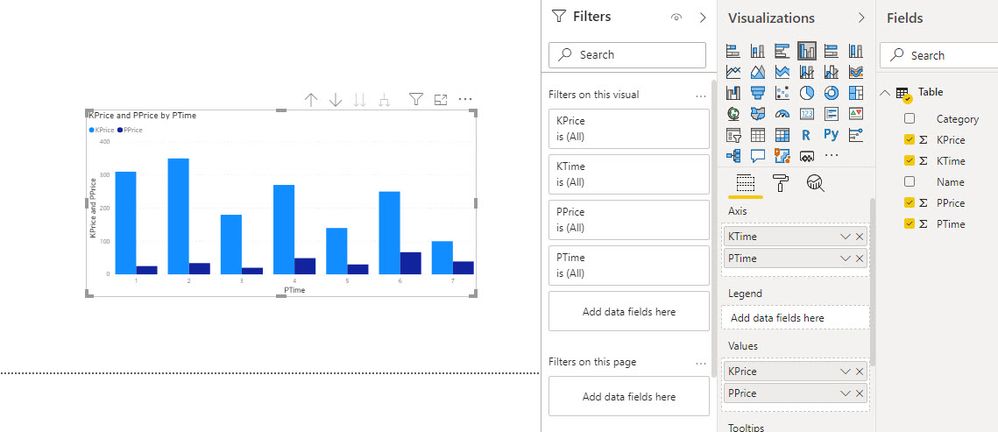
Graph was missing:
- Mark as New
- Bookmark
- Subscribe
- Mute
- Subscribe to RSS Feed
- Permalink
- Report Inappropriate Content
- Mark as New
- Bookmark
- Subscribe
- Mute
- Subscribe to RSS Feed
- Permalink
- Report Inappropriate Content
Hi,
Yes, Can you show me how did you do it?
Mine doesn't show correct values.
- Mark as New
- Bookmark
- Subscribe
- Mute
- Subscribe to RSS Feed
- Permalink
- Report Inappropriate Content
Here you are,
Regards
https://1drv.ms/u/s!Ah7_1Sua__g-62yWeyGEVCok0zpI?e=YlQsrb
If it is ok please mark as solution.
_________________________________________
- Mark as New
- Bookmark
- Subscribe
- Mute
- Subscribe to RSS Feed
- Permalink
- Report Inappropriate Content
Hi,
Thanks for sharing the file. However, I want to use the table that I posted. I have quite big data coming directly from another source. I can not do manual calculation. In the table that you shared the data is already agregated :
regards,
Helpful resources

Microsoft Fabric Learn Together
Covering the world! 9:00-10:30 AM Sydney, 4:00-5:30 PM CET (Paris/Berlin), 7:00-8:30 PM Mexico City

Power BI Monthly Update - April 2024
Check out the April 2024 Power BI update to learn about new features.

| User | Count |
|---|---|
| 112 | |
| 97 | |
| 85 | |
| 67 | |
| 59 |
| User | Count |
|---|---|
| 150 | |
| 120 | |
| 100 | |
| 87 | |
| 68 |

