- Power BI forums
- Updates
- News & Announcements
- Get Help with Power BI
- Desktop
- Service
- Report Server
- Power Query
- Mobile Apps
- Developer
- DAX Commands and Tips
- Custom Visuals Development Discussion
- Health and Life Sciences
- Power BI Spanish forums
- Translated Spanish Desktop
- Power Platform Integration - Better Together!
- Power Platform Integrations (Read-only)
- Power Platform and Dynamics 365 Integrations (Read-only)
- Training and Consulting
- Instructor Led Training
- Dashboard in a Day for Women, by Women
- Galleries
- Community Connections & How-To Videos
- COVID-19 Data Stories Gallery
- Themes Gallery
- Data Stories Gallery
- R Script Showcase
- Webinars and Video Gallery
- Quick Measures Gallery
- 2021 MSBizAppsSummit Gallery
- 2020 MSBizAppsSummit Gallery
- 2019 MSBizAppsSummit Gallery
- Events
- Ideas
- Custom Visuals Ideas
- Issues
- Issues
- Events
- Upcoming Events
- Community Blog
- Power BI Community Blog
- Custom Visuals Community Blog
- Community Support
- Community Accounts & Registration
- Using the Community
- Community Feedback
Register now to learn Fabric in free live sessions led by the best Microsoft experts. From Apr 16 to May 9, in English and Spanish.
- Power BI forums
- Forums
- Get Help with Power BI
- Desktop
- Re: 2 slicer graph, Company name & Attribute
- Subscribe to RSS Feed
- Mark Topic as New
- Mark Topic as Read
- Float this Topic for Current User
- Bookmark
- Subscribe
- Printer Friendly Page
- Mark as New
- Bookmark
- Subscribe
- Mute
- Subscribe to RSS Feed
- Permalink
- Report Inappropriate Content
2 slicer graph, Company name & Attribute
Hi all,
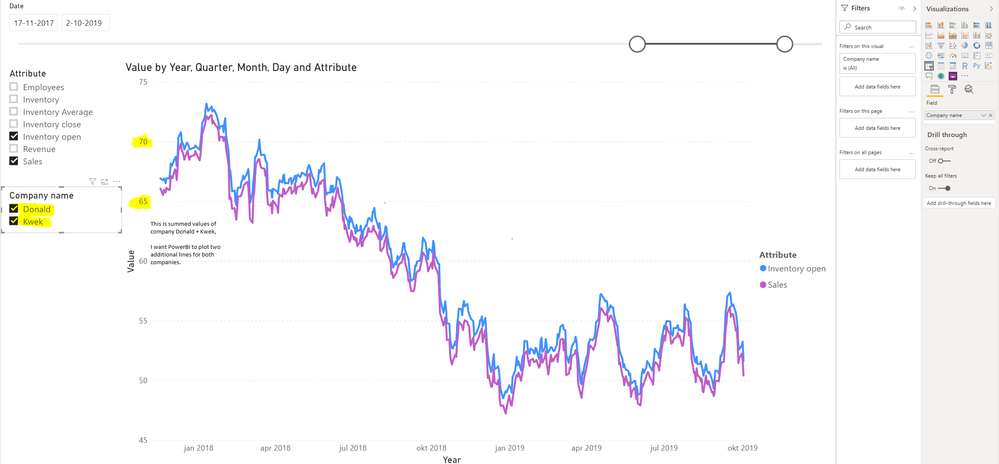
Currently I want to add a line graph with multiple lines. It depends how many 'companies' are selected and how many 'attributes' to be shown are selected. Currently my model does work with 1 slicer, so if I tick an additional attribute another line is plotted. So far so good.
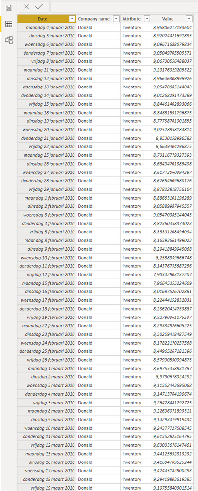
However, from the moment I add another company Powerbi sums all attribute values. So instead of plotting an additional line for company A sales and company B sales, it's summing A&B. I tried to unpivot columns already, but unfortunately it messes up my data. I will add some screenshots.
Thanks for all the help already!
- Mark as New
- Bookmark
- Subscribe
- Mute
- Subscribe to RSS Feed
- Permalink
- Report Inappropriate Content
Hi,
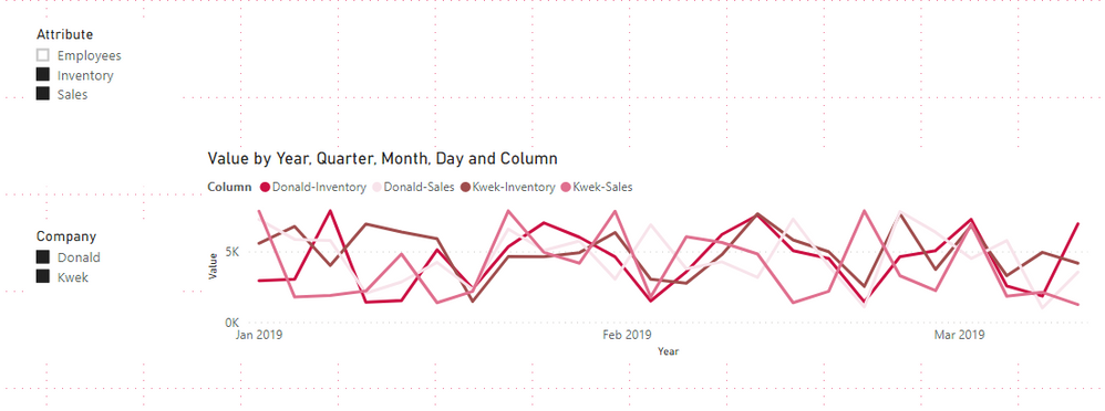
Please try to create a calculated column in your table to combine [Company] and [Attribute]:
Column = 'Table'[Company]&"-"&'Table'[Attribute]Then choose this column as Legend field, when you select more than one company in slicer, it shows the single value for each company but not the sum:
Here is my test pbix file:
Hope this helps.
Best Regards,
Giotto Zhi
- Mark as New
- Bookmark
- Subscribe
- Mute
- Subscribe to RSS Feed
- Permalink
- Report Inappropriate Content
Hi @Anonymous ,
The solution with measures is the same as with the columns, you need to make a measure for each combination between KPI and company so you would need 75 company vs 7 KPI.
Looking at the information you are giving you can have up to 525 lines in your visualization not reallt sure if this is the best option to have on a visualization, because the user can select any amount of company's / KPI.
Can you explain a little better what is the final purpose for not creating the 525 options.
Regards
Miguel Félix
Did I answer your question? Mark my post as a solution!
Proud to be a Super User!
Check out my blog: Power BI em Português- Mark as New
- Bookmark
- Subscribe
- Mute
- Subscribe to RSS Feed
- Permalink
- Report Inappropriate Content
Hi @Anonymous ,
On legend visualization you don't have the possibility to have to levels that is basically what you are trying yo achieve that is having a value for Attribute Per company you have two possibilities.
To create measure for each of the company/attribute and used them as your values in the chart and then create a switch measure to turn on and off.
Another solution that I believe is easier is to create a new column with the concatenation of Company - Attribute then use this as your legend on your visualization that will allow a line per attribute per company.
Regards
Miguel Félix
Did I answer your question? Mark my post as a solution!
Proud to be a Super User!
Check out my blog: Power BI em Português- Mark as New
- Bookmark
- Subscribe
- Mute
- Subscribe to RSS Feed
- Permalink
- Report Inappropriate Content
Thanks MFelix, if I do understand you correctly: the concatenation is indeed a solution. However, my list is longer than 2 companies... I have 75 companies. Which will result in an endless list of variables, which doesn't add value. Do you have an example of the first solution? video and or code? Thanks for your fast reply!
Helpful resources

Microsoft Fabric Learn Together
Covering the world! 9:00-10:30 AM Sydney, 4:00-5:30 PM CET (Paris/Berlin), 7:00-8:30 PM Mexico City

Power BI Monthly Update - April 2024
Check out the April 2024 Power BI update to learn about new features.

| User | Count |
|---|---|
| 111 | |
| 96 | |
| 80 | |
| 68 | |
| 59 |
| User | Count |
|---|---|
| 150 | |
| 119 | |
| 104 | |
| 87 | |
| 67 |


