- Power BI forums
- Updates
- News & Announcements
- Get Help with Power BI
- Desktop
- Service
- Report Server
- Power Query
- Mobile Apps
- Developer
- DAX Commands and Tips
- Custom Visuals Development Discussion
- Health and Life Sciences
- Power BI Spanish forums
- Translated Spanish Desktop
- Power Platform Integration - Better Together!
- Power Platform Integrations (Read-only)
- Power Platform and Dynamics 365 Integrations (Read-only)
- Training and Consulting
- Instructor Led Training
- Dashboard in a Day for Women, by Women
- Galleries
- Community Connections & How-To Videos
- COVID-19 Data Stories Gallery
- Themes Gallery
- Data Stories Gallery
- R Script Showcase
- Webinars and Video Gallery
- Quick Measures Gallery
- 2021 MSBizAppsSummit Gallery
- 2020 MSBizAppsSummit Gallery
- 2019 MSBizAppsSummit Gallery
- Events
- Ideas
- Custom Visuals Ideas
- Issues
- Issues
- Events
- Upcoming Events
- Community Blog
- Power BI Community Blog
- Custom Visuals Community Blog
- Community Support
- Community Accounts & Registration
- Using the Community
- Community Feedback
Register now to learn Fabric in free live sessions led by the best Microsoft experts. From Apr 16 to May 9, in English and Spanish.
- Power BI forums
- Forums
- Get Help with Power BI
- Desktop
- 100% stacked bar chart - Y axis - max area width -...
- Subscribe to RSS Feed
- Mark Topic as New
- Mark Topic as Read
- Float this Topic for Current User
- Bookmark
- Subscribe
- Printer Friendly Page
- Mark as New
- Bookmark
- Subscribe
- Mute
- Subscribe to RSS Feed
- Permalink
- Report Inappropriate Content
100% stacked bar chart - Y axis - max area width - can I fix the width
Hi,
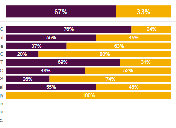
I am using a 100% Stacked bar chart, together with separate "total%" of it:
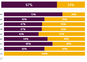
I have played around with the Y-axis: max area width, but as we can only play around with the MAX width, and cannot FIX it, I am facing problems when I am breaking down on different dimension, e.g.:
The detailed chart starts before the Total when Y axis label is shorter:
The detailed chart starts after the Total when Y axis label is longer:
This problem is based on the assumption of: We can only play around with the MAX width of Y-axis label, and cannot FIX it.
Is there any way to FIX this width - so I know exactly where the viz starts, and align the Total chart ?
Thanks.
Solved! Go to Solution.
- Mark as New
- Bookmark
- Subscribe
- Mute
- Subscribe to RSS Feed
- Permalink
- Report Inappropriate Content
Hi @Saniat
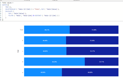
Create a disconnected table with all the categories and a row with the total:
Then add the following metric:
Total values =
SWITCH (
    TRUE (),
    SELECTEDVALUE ( 'Table (2)'[Cat] ) = "Total", SUM ( 'Table'[Value] ),
    CALCULATE (
        SUM ( 'Table'[Value] ),
        FILTER ( 'Table', 'Table'[Cat] IN DISTINCT ( 'Table (2)'[Cat] ) )
    )
)
Now use this metric and the new table on the visual.
If you want you can add a sort id on the table so you have the values of the category in the correct order.
Regards
Miguel Félix
Did I answer your question? Mark my post as a solution!
Proud to be a Super User!
Check out my blog: Power BI em Português- Mark as New
- Bookmark
- Subscribe
- Mute
- Subscribe to RSS Feed
- Permalink
- Report Inappropriate Content
Hi @Saniat
Create a disconnected table with all the categories and a row with the total:
Then add the following metric:
Total values =
SWITCH (
    TRUE (),
    SELECTEDVALUE ( 'Table (2)'[Cat] ) = "Total", SUM ( 'Table'[Value] ),
    CALCULATE (
        SUM ( 'Table'[Value] ),
        FILTER ( 'Table', 'Table'[Cat] IN DISTINCT ( 'Table (2)'[Cat] ) )
    )
)
Now use this metric and the new table on the visual.
If you want you can add a sort id on the table so you have the values of the category in the correct order.
Regards
Miguel Félix
Did I answer your question? Mark my post as a solution!
Proud to be a Super User!
Check out my blog: Power BI em PortuguêsHelpful resources

Microsoft Fabric Learn Together
Covering the world! 9:00-10:30 AM Sydney, 4:00-5:30 PM CET (Paris/Berlin), 7:00-8:30 PM Mexico City

Power BI Monthly Update - April 2024
Check out the April 2024 Power BI update to learn about new features.

| User | Count |
|---|---|
| 109 | |
| 99 | |
| 77 | |
| 66 | |
| 54 |
| User | Count |
|---|---|
| 144 | |
| 104 | |
| 102 | |
| 87 | |
| 64 |


