- Power BI forums
- Updates
- News & Announcements
- Get Help with Power BI
- Desktop
- Service
- Report Server
- Power Query
- Mobile Apps
- Developer
- DAX Commands and Tips
- Custom Visuals Development Discussion
- Health and Life Sciences
- Power BI Spanish forums
- Translated Spanish Desktop
- Power Platform Integration - Better Together!
- Power Platform Integrations (Read-only)
- Power Platform and Dynamics 365 Integrations (Read-only)
- Training and Consulting
- Instructor Led Training
- Dashboard in a Day for Women, by Women
- Galleries
- Community Connections & How-To Videos
- COVID-19 Data Stories Gallery
- Themes Gallery
- Data Stories Gallery
- R Script Showcase
- Webinars and Video Gallery
- Quick Measures Gallery
- 2021 MSBizAppsSummit Gallery
- 2020 MSBizAppsSummit Gallery
- 2019 MSBizAppsSummit Gallery
- Events
- Ideas
- Custom Visuals Ideas
- Issues
- Issues
- Events
- Upcoming Events
- Community Blog
- Power BI Community Blog
- Custom Visuals Community Blog
- Community Support
- Community Accounts & Registration
- Using the Community
- Community Feedback
Register now to learn Fabric in free live sessions led by the best Microsoft experts. From Apr 16 to May 9, in English and Spanish.
- Power BI forums
- Galleries
- Data Stories Gallery
- Two Presidencies, Two Presidents, Two Persons in 2...
Two Presidencies, Two Presidents, Two Persons in 2017 (As Seen on Facebook)
01-26-2018 12:47 PM - last edited 10-22-2018 02:18 AM


- Mark as New
- Bookmark
- Subscribe
- Mute
- Subscribe to RSS Feed
- Permalink
- Report Inappropriate Content
Two Presidencies, Two Presidents, Two Persons in 2017 (As Seen on Facebook)
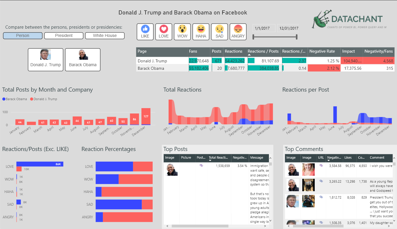
On Friday, January 20, 2017 Donald Trump was inaugurated as the 45th President of the United States. Social media have become a key communication tool for the last two presidents. For Power BI Year-in-Review contest, here is a special DataChant report, that will allow you to learn about the two presidents, the two presidencies and the two persons.
The report is based on the Facebook feeds, user reaction and top comments and commenters of the official pages of the presidents, the pages of the white houses, and the official pages of Trump and Obama as public figures.
You can explore 8 different report pages - Each shows a different facet on the men, their roles and the institute they represented in 2017. The data includes all of the status updates for the six Facebook pages (2 presidents, 2 white houses, and 2 public figures). You can download the PBIX file, or static Excel workbook to expand the time period beyond 2017.
In the first page, you can compare between the two presidents, by the facebook type (Official president page, white house, or public figure).

The report includes two measures to assess audience negative sentiment.
Negative Reaction Rate: The ratio between Angry and Sad reactions to the total number of reactions (Like, Wow, Love, Haha, Angry, Sad).
Negative Impact: The total sum across all posts of the number of comments and likes that commenters had received, multiplied by the Negative Reaction Rate per post.
The second page, compares between president Trump's page as a president, his public figure page, and his white house. You can see in the highlighted visual than there is high rate of angry reactions to the white house page.

In the second page, you can discover that the official page of president trump (https://facebook.com/POTUS) had stopped sharing posts during August, and is relatively inactive since in sharing new posts. On the other hand, president trump's main page (https://facebook.com/DonaldTrump) has been significantly increasing its posts from month to month since August 2017. Could these changes in postings be related somehow to the appointment of John Kelly as chief of staff, or the firing of Steve Bannon? See timeline here. Perhaps Kelly assumed control of the POTUS page?

The third page of the report compares the top recurring words, that are used by the selected pages.

The fourth page allows you to compare side by side the top recurring words, against the words by positive reactions, against words by negative reactions. You can see for example, that the word Melania stands out as the third highest word with high rate of positive reactions.

In the fifth page, you can compare users' comments recurring words vs. words by negative reaction rates.

In the sixth page, you can find outliers in specific posts and comments. Click on any bubble in the scatter chart, and drill down to the relevant post or comment in the tables below.

The seventh page gives you a glimpse into the top commenters. Learn more about their engagement styles, how many likes and comments they receive, and read their opinions. In the last page, you can explore the top comments to status updates that received the highest negative reaction rate.

Data Sources:
A static workbook with the data is available here.
The data extraction was done in Power Query, advanced M Web.Content, functions and lots of Facebook Graph API calls. A single refresh can collect all the data to this report, but it is too complex to share the queries in this context.
Disclaimer:
This is not a political post. The report was not created to communicate any specific agenda.
eyJrIjoiNGQyZWU0NTItNzA4Mi00YzhlLTkzMmMtZjMyOTQzZWMyODZlIiwidCI6IjIyNzNjNDFiLWI4ZDAtNDVhZi1iZWU2LWUwODQ5NmFlNjcxOCIsImMiOjN9