- Power BI forums
- Updates
- News & Announcements
- Get Help with Power BI
- Desktop
- Service
- Report Server
- Power Query
- Mobile Apps
- Developer
- DAX Commands and Tips
- Custom Visuals Development Discussion
- Health and Life Sciences
- Power BI Spanish forums
- Translated Spanish Desktop
- Power Platform Integration - Better Together!
- Power Platform Integrations (Read-only)
- Power Platform and Dynamics 365 Integrations (Read-only)
- Training and Consulting
- Instructor Led Training
- Dashboard in a Day for Women, by Women
- Galleries
- Community Connections & How-To Videos
- COVID-19 Data Stories Gallery
- Themes Gallery
- Data Stories Gallery
- R Script Showcase
- Webinars and Video Gallery
- Quick Measures Gallery
- 2021 MSBizAppsSummit Gallery
- 2020 MSBizAppsSummit Gallery
- 2019 MSBizAppsSummit Gallery
- Events
- Ideas
- Custom Visuals Ideas
- Issues
- Issues
- Events
- Upcoming Events
- Community Blog
- Power BI Community Blog
- Custom Visuals Community Blog
- Community Support
- Community Accounts & Registration
- Using the Community
- Community Feedback
Register now to learn Fabric in free live sessions led by the best Microsoft experts. From Apr 16 to May 9, in English and Spanish.
- Power BI forums
- Galleries
- Data Stories Gallery
- Re: Social Media Monitoring & Analytics Report


- Mark as New
- Bookmark
- Subscribe
- Mute
- Subscribe to RSS Feed
- Permalink
- Report Inappropriate Content
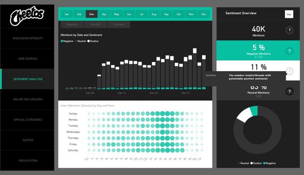
Social Media Monitoring & Analytics Report
Hello Community,
This month I bring you a new Power BI Report. It is a 100% interactive Power BI for beginers users. I hope @marcr and @JamesMPhillips like Cheetos because this report shows you how powerful can be Power BI when companies like Cheetos uses it as main Social Media Monitoring & Analytic tool, to improve Sales, Product's Quality, Crisis Control and understand the Audience opinion about the Product. If you want to play and see the report in action just click the link.
Enjoy it.
You can follow me in twitter @myersmiguel
Or by mail if you want to get in touch (mmyers@redwaves.onmicrosoft.com)
eyJrIjoiY2UwNmZkMDItN2Y0My00Mzc4LTk2ODAtZGZlMzY5MjUxZDU0IiwidCI6ImNmNzM2YWVhLWU4ZGUtNDNiMy1hZmNmLTcxYTg1ODU1NTVmNiIsImMiOjN9
- Mark as New
- Bookmark
- Subscribe
- Mute
- Subscribe to RSS Feed
- Permalink
- Report Inappropriate Content
I’d be interested as well in a PBIX file if available...?
- Mark as New
- Bookmark
- Subscribe
- Mute
- Subscribe to RSS Feed
- Permalink
- Report Inappropriate Content
- Mark as New
- Bookmark
- Subscribe
- Mute
- Subscribe to RSS Feed
- Permalink
- Report Inappropriate Content
VERY SLICK!!! Any chance you can share the dektop (.pbix) file? Thanks...
- Mark as New
- Bookmark
- Subscribe
- Mute
- Subscribe to RSS Feed
- Permalink
- Report Inappropriate Content
Hi,
Thats a wonderful report. So interactive and such a stunning look. I would be grateful if you can somewhat explain how did you create this especially the left side bar that represents different pages. A little explanation will do.
Regards,
Ankita
- Mark as New
- Bookmark
- Subscribe
- Mute
- Subscribe to RSS Feed
- Permalink
- Report Inappropriate Content
Hi,
Also interested in knowing how the left side navigator was created.
Thanks,
Vineeli
- Mark as New
- Bookmark
- Subscribe
- Mute
- Subscribe to RSS Feed
- Permalink
- Report Inappropriate Content
Hi @Mykhael. Fantastic report presented here.. Just one question.. When any month is selected in month slicer, it also gets displayed in the top right corner. How did you do that??
- Mark as New
- Bookmark
- Subscribe
- Mute
- Subscribe to RSS Feed
- Permalink
- Report Inappropriate Content
HI Mykhael this looks really good, how are you using the left hand filters to bring up different charts?
thanks Ed
- Mark as New
- Bookmark
- Subscribe
- Mute
- Subscribe to RSS Feed
- Permalink
- Report Inappropriate Content
wow. perfect.
Miguel You really friendly and good person ![]()
![]()
![]()
- Mark as New
- Bookmark
- Subscribe
- Mute
- Subscribe to RSS Feed
- Permalink
- Report Inappropriate Content
- Mark as New
- Bookmark
- Subscribe
- Mute
- Subscribe to RSS Feed
- Permalink
- Report Inappropriate Content
Great job!
One question. What type of graph are you using in the sentiment analysis to show User Mentions Detected by day and hours?
Best regards
- Mark as New
- Bookmark
- Subscribe
- Mute
- Subscribe to RSS Feed
- Permalink
- Report Inappropriate Content
did you find out the name of the visual? i am also interested in implementing in my report.
- Mark as New
- Bookmark
- Subscribe
- Mute
- Subscribe to RSS Feed
- Permalink
- Report Inappropriate Content
Hi @abadiu,
How is it going?. I used scatter Charts aplying few filters in them. Remember... I don't use any custom visualization. If you want to see more details about that trick I sugest you to check this webinar (at the end I speak about it).
How to Design Visually Stunning Reports in Power BI
I hope you like it, but if you need anything else let me know... will be a pleasure to help you.
Best
Miguel
- Mark as New
- Bookmark
- Subscribe
- Mute
- Subscribe to RSS Feed
- Permalink
- Report Inappropriate Content
Thank you very much Mykhael! Great video, and nice out of the box thinking!
I don't know if here is the right place to ask, but do you know if there is a way in Power Bi to create relantioships between data and photos? I would like to add geographical data to the photos, time of the day, etc and based on my slicer choice to visualise the photos...
Best regards
- Mark as New
- Bookmark
- Subscribe
- Mute
- Subscribe to RSS Feed
- Permalink
- Report Inappropriate Content
Hi @abadiu,
Of course is possible to create relationships between data and photos!!! and you can do that in Power BI, the key is "the conector" between those photos and your data, once you have it, you can do wonderfuls. I did that in one of my reports here is the link.
http://community.powerbi.com/t5/Power-BI-Showcase/Online-Sentiment-Analysis/m-p/24092#M152
as you can see everytime you select a sentiment the face will change as well. 🙂 Hope this helps you.
Best
Mykhael
- Mark as New
- Bookmark
- Subscribe
- Mute
- Subscribe to RSS Feed
- Permalink
- Report Inappropriate Content
How have you created those tabs on the left? like "Discussion Intensity", "Web Sources" etc. Is it a slicer you have used?
Also, this is a Power BI Report and not a dashboard right?
- Mark as New
- Bookmark
- Subscribe
- Mute
- Subscribe to RSS Feed
- Permalink
- Report Inappropriate Content
Hello @vanessa,
Those tabs are not a slicer, are just shapes and texts together... the idea it was to design a original way to show the page title... like a Website... and I think I did it VERY WELL because everybody thinks are a Menu Panel or a Slicer. 🙂
- Mark as New
- Bookmark
- Subscribe
- Mute
- Subscribe to RSS Feed
- Permalink
- Report Inappropriate Content
- Mark as New
- Bookmark
- Subscribe
- Mute
- Subscribe to RSS Feed
- Permalink
- Report Inappropriate Content
Hello @vanessa,
This is a "Report" designed and programed as a Dashboard. That's why you are thinking is a Dashboard (which is my real intention to let you believe that) when actually in Power BI "TERMS" should be called a Report.
Sorry to answer you too late, because it seems too important to you. If you have another question let me know.
Best
Mykhael
- Mark as New
- Bookmark
- Subscribe
- Mute
- Subscribe to RSS Feed
- Permalink
- Report Inappropriate Content
- Mark as New
- Bookmark
- Subscribe
- Mute
- Subscribe to RSS Feed
- Permalink
- Report Inappropriate Content
Very Nice Dashboard.
Is the underlying data available for public or is it proprietary ?
Please also suggest how can we get free data to mock the one you have presented.
Thanks,
Achin
- Mark as New
- Bookmark
- Subscribe
- Mute
- Subscribe to RSS Feed
- Permalink
- Report Inappropriate Content
hello @achinm45,
This data is "Public" (anyone can get access, you don't need any special credential, token or permission). There are many FREE services out there where you can get this information, but if you want to pay, the rates starts from 100 US Dollars to 2,000 per month, all depends how bast (or big) you want the information be collected. Some services only give you mentions per specific social channel, other ones only tweets, hashtags or facebook comments; some of them are flexible and give you the chance to create groups or categories, and they have Sentiment analysis as well. The market is big. But if you use Power BI to create your own dashboards and reports usind the data from any service you choose, you can make rich and interactive the anlysis like never before.
Chek this link
http://60secondmarketer.com/blog/2014/03/10/5-best-brand-monitoring-tools-marketers/
Let me know if this information helped you.