- Power BI forums
- Updates
- News & Announcements
- Get Help with Power BI
- Desktop
- Service
- Report Server
- Power Query
- Mobile Apps
- Developer
- DAX Commands and Tips
- Custom Visuals Development Discussion
- Health and Life Sciences
- Power BI Spanish forums
- Translated Spanish Desktop
- Power Platform Integration - Better Together!
- Power Platform Integrations (Read-only)
- Power Platform and Dynamics 365 Integrations (Read-only)
- Training and Consulting
- Instructor Led Training
- Dashboard in a Day for Women, by Women
- Galleries
- Community Connections & How-To Videos
- COVID-19 Data Stories Gallery
- Themes Gallery
- Data Stories Gallery
- R Script Showcase
- Webinars and Video Gallery
- Quick Measures Gallery
- 2021 MSBizAppsSummit Gallery
- 2020 MSBizAppsSummit Gallery
- 2019 MSBizAppsSummit Gallery
- Events
- Ideas
- Custom Visuals Ideas
- Issues
- Issues
- Events
- Upcoming Events
- Community Blog
- Power BI Community Blog
- Custom Visuals Community Blog
- Community Support
- Community Accounts & Registration
- Using the Community
- Community Feedback
Register now to learn Fabric in free live sessions led by the best Microsoft experts. From Apr 16 to May 9, in English and Spanish.
- Power BI forums
- Galleries
- Data Stories Gallery
- Re: Sales Scorecard: Where are we losing money? by...
Re: Sales Scorecard: Where are we losing money? by Decisive Data
03-30-2022 05:23 AM


- Mark as New
- Bookmark
- Subscribe
- Mute
- Subscribe to RSS Feed
- Permalink
- Report Inappropriate Content
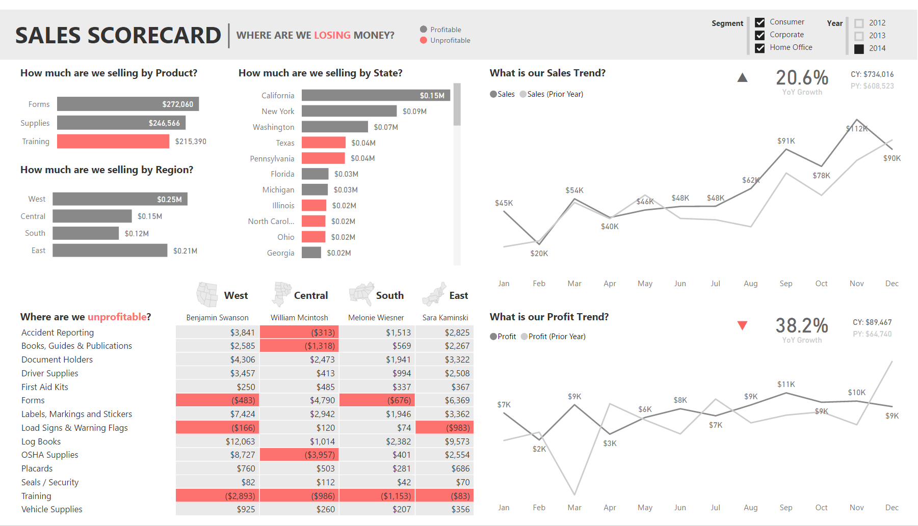
Sales Scorecard: Where are we losing money? by Decisive Data
Summary
"How is my company doing?"
It's a question we hear often. It seems simple enough, but answering it is a complex process. This report is designed to answer the question in a clear and straightforward manner, while providing enough detail to take some action.
If we wanted to further develop this story, we would build on the outcomes of our Sales Scorecard by adding additional reports with more granular data. Each of these report tabs would answer one specific question that arises from use of our Sales Scorecard.
Approach
A report is most valuable when it's actionable. We started by identifying which components of the process we can influence:
- What we're selling (products)
- Where we're selling (region, state)
- When we're selling (month, year)
- Who is doing the selling (salesperson)
We then determined the report's focus: areas that are not performing well. We used color to highlight these problem areas, and leveraged a matrix with conditional formatting to give us granular insights that could prompt strategy changes. Finally, we included comparisons of profit and sales against prior years to put the performance into perspective. We leveraged basic Power BI elements (cards, shapes, tree maps, and DAX) to develop a KPI section in the top right of these charts to provide additional context.
From this report it's clear that we should evaluate our training programs. We may want to pick up the phone and follow up with William, who seems to be struggling in several areas, most notably in OSHA supplies which is a profitable area for all other sales staff.
We might also want to look further into the strange profit behavior in Mar 2013, where we saw a large dip compared to the prior year.
A report like this is the first step into answering the question "How is my company doing?"
Pushing the Boundaries
Every so often you have a clear vision of how to communicate something, but you aren't quite able to realize that vision with the default tools or options. Custom visuals is one method to help realize your vision, but I'm not a D3 expert and I like a challenge, so sometimes I'll attempt to repurpose default tools in non-standard ways to achieve the same effect.
I had a vision for what I wanted my KPI visualization to look like:
The main elements are:

- % Growth Year over Year (main value)
- Current Year value (adds context)
- Prior Year value (adds context)
- Indicator (quick recognition of good/bad state)
I started with a card for my main value, the % Growth Year over Year. I then created 2 dax measures to format my Current Year and Prior Year values nicely for display (using FORMAT to add "CY: " or "PY: " in front of the value for context). I put each of those into separate cards and arranged them next to my % Growth card.
Finally, I created the indicators. I made a triangle shape, colored it grey, and oriented it upwards. I made a second triangle shape, colored it red, and oriented it downwards, and aligned it directly under the upward triangle. I then created 2 dax measures called KPI Red and KPI Grey.
KPI Red = 1 when % Growth is Positive and 0 when % Growth is Negative.
KPI Grey = 0 when % Growth is Positive and 1 when % Growth is Negative.
I then put each of those into individual tree maps, changed the data colors to match the background, and arranged the tree maps over the tops of the triangles. Now when % Growth is negative, KPI Red is 0 and the tree map disappears and shows the red triangle underneath, while KPI Greyis 1 and the tree map covers the grey arrow.

Wrapping it up
The method above worked pretty well and got me what I wanted. However there are a few oddities - light white lines that outline the tree maps, the arrows are in different locations if they are up or down (because they're 2 different triangles), and the CY and PY are centered rather than left aligned since they're in cards.
Ultimately, this got us where we needed to go for now. However, as a next step I would begin investigating how to turn this into a custom visual to make future use much simpler. For now, it's great to know that we can leverage basic Power BI elements like triangles to create custom KPIs. It just takes a bit of thinking outside the box, plus some creative use of DAX and willingness to use standard visuals (tree maps) in non-standard ways (covers to hide something).
4/12 Update: Simplify using UNICHAR
I just discovered the UNICHAR function in DAX, and used this to simplify my process! Currently we have 2 elements for each indicator, for a total of 8 elements. This method cuts the elements in half!
- Delete the tree maps and the arrow objects
- Delete the KPI Red/Green measures for Sales and Profit (4 total)
- Create 4 new measures
- Sales Indicator Positive = IF(AND(HASONEVALUE('Date'[Fiscal Year]),'Sales Scorecard'[Sales YoY Growth]>0),UNICHAR(11205),"")
- Sales Indicator Negative = IF(AND(HASONEVALUE('Date'[Fiscal Year]),'Sales Scorecard'[Sales YoY Growth]<0),UNICHAR(11206),"")
- Profit Indicator Negative = IF(AND(HASONEVALUE('Date'[Fiscal Year]),'Sales Scorecard'[Profit YoY Growth]<0),UNICHAR(11205),"")
- Profit Indicator Positive = IF(AND(HASONEVALUE('Date'[Fiscal Year]),'Sales Scorecard'[Profit YoY Growth]>0),UNICHAR(11206),"")
- Put each measure in a separate card.
- Change the Data Label colors to make the down arrows red and the up arrows grey
- Arrange your arrows and you're done!
With this method, we are using the UNICHAR to display UNICODE arrow characters. Since we're doing this in DAX, we can us IF statements to hide/show the arrows based on our measures, which means we no longer need to use the tree maps as covers, cutting our number of elements in half! Less elements = easier to maintain.
Enjoy!
Jared Knutzen | Visualization Consultant
Decisive Data | www.decisivedata.net

eyJrIjoiZjQ0NWYwYzEtYjE1OC00MWExLWEwYjgtMGMwZmFmZTZiYTUyIiwidCI6IjdlY2M4YWEwLTgzMGUtNGQ4Ni1hZjc4LTgzYTNkY2MyNjIzOCIsImMiOjZ9
- Mark as New
- Bookmark
- Subscribe
- Mute
- Subscribe to RSS Feed
- Permalink
- Report Inappropriate Content
Great dashboard. Can you share your pbix file. email - juanenriquemunozh@gmail.com..
- Mark as New
- Bookmark
- Subscribe
- Mute
- Subscribe to RSS Feed
- Permalink
- Report Inappropriate Content
- Mark as New
- Bookmark
- Subscribe
- Mute
- Subscribe to RSS Feed
- Permalink
- Report Inappropriate Content
Hi,
Great dashboard and DAX formula. Can you forward me the .pbix please to thanhtruong1@hotmail.com?
Thanks,
- Mark as New
- Bookmark
- Subscribe
- Mute
- Subscribe to RSS Feed
- Permalink
- Report Inappropriate Content
Hi,
I like your dashboard, its really amazing...!!
Can you please share the .pbix file with me? *mbhor@cogentiz.com*
Thanks!
- Mark as New
- Bookmark
- Subscribe
- Mute
- Subscribe to RSS Feed
- Permalink
- Report Inappropriate Content
- Mark as New
- Bookmark
- Subscribe
- Mute
- Subscribe to RSS Feed
- Permalink
- Report Inappropriate Content
- Mark as New
- Bookmark
- Subscribe
- Mute
- Subscribe to RSS Feed
- Permalink
- Report Inappropriate Content
- Mark as New
- Bookmark
- Subscribe
- Mute
- Subscribe to RSS Feed
- Permalink
- Report Inappropriate Content
Hi Jared,
Thanks for kind sharing, and may you forward me with a copy of pbix. to further study this topic.
Best regards,
Sam
- Mark as New
- Bookmark
- Subscribe
- Mute
- Subscribe to RSS Feed
- Permalink
- Report Inappropriate Content
can you share with me the pblix file, my email is: lenguyenanhphuong0908@gmail.com
- Mark as New
- Bookmark
- Subscribe
- Mute
- Subscribe to RSS Feed
- Permalink
- Report Inappropriate Content
Hi, great dashboard. Could you please share your pbix file? My email address is haru331@hotmail.com
- Mark as New
- Bookmark
- Subscribe
- Mute
- Subscribe to RSS Feed
- Permalink
- Report Inappropriate Content
Nice template. Could you pls share pbix file via voanhhaohung@gmail.com. Thanks a lot.
- Mark as New
- Bookmark
- Subscribe
- Mute
- Subscribe to RSS Feed
- Permalink
- Report Inappropriate Content
Hi Jared,
Thanks for sharing this simple but advanced dashboard. Kindly share the pbix file (tmub47 at duck dot com). Thanks
- Mark as New
- Bookmark
- Subscribe
- Mute
- Subscribe to RSS Feed
- Permalink
- Report Inappropriate Content
Hey Jared,
Great dashboard! Would you send the pbix. file? WOuld be very helpful!
Thank you!
- Mark as New
- Bookmark
- Subscribe
- Mute
- Subscribe to RSS Feed
- Permalink
- Report Inappropriate Content
Can you please pbix visual! It will be very helpful for me.
- Mark as New
- Bookmark
- Subscribe
- Mute
- Subscribe to RSS Feed
- Permalink
- Report Inappropriate Content
Hi! Congratulations! Could you pleasse share the pbix file franciscoazevedo@fmcenter.com.ve Thanks
- Mark as New
- Bookmark
- Subscribe
- Mute
- Subscribe to RSS Feed
- Permalink
- Report Inappropriate Content
Hello,
I would like to get your pbix file? could you send the file to my email? My email address is khan3@gsu.edu
Thank you so much!
- Mark as New
- Bookmark
- Subscribe
- Mute
- Subscribe to RSS Feed
- Permalink
- Report Inappropriate Content
Hi Jared,
This is great and very nice dashboard. Can you please email me the pbix file? bpradeen@gmail.com
Thank you,
- Mark as New
- Bookmark
- Subscribe
- Mute
- Subscribe to RSS Feed
- Permalink
- Report Inappropriate Content
Hi Jared,
Great content and I'm learning a lot as a newbie to PowerBI!
If you could share your PBIX file with me that would be great! email - imoir72@yahoo.co.uk
Thanks
Ian
- Mark as New
- Bookmark
- Subscribe
- Mute
- Subscribe to RSS Feed
- Permalink
- Report Inappropriate Content
Hi JaredK,
Awesome visualization. Appreciate if you can share your pbix file. email - sbacalso0214@gmail.com..
Thanks in advance
Spencer
- Mark as New
- Bookmark
- Subscribe
- Mute
- Subscribe to RSS Feed
- Permalink
- Report Inappropriate Content
Hello JaredK,
Would you mind sharing the Pbix file for this report with me? my email is Sam_YL_Shen@wiwynn.com. Thank you.
It's impressing to show out YoY performance with a Card. And I also like your correlated 2 line graphs between prior-year(in gray) and this-year(in black).
Best regrads,
Sam
- Mark as New
- Bookmark
- Subscribe
- Mute
- Subscribe to RSS Feed
- Permalink
- Report Inappropriate Content