- Power BI forums
- Updates
- News & Announcements
- Get Help with Power BI
- Desktop
- Service
- Report Server
- Power Query
- Mobile Apps
- Developer
- DAX Commands and Tips
- Custom Visuals Development Discussion
- Health and Life Sciences
- Power BI Spanish forums
- Translated Spanish Desktop
- Power Platform Integration - Better Together!
- Power Platform Integrations (Read-only)
- Power Platform and Dynamics 365 Integrations (Read-only)
- Training and Consulting
- Instructor Led Training
- Dashboard in a Day for Women, by Women
- Galleries
- Community Connections & How-To Videos
- COVID-19 Data Stories Gallery
- Themes Gallery
- Data Stories Gallery
- R Script Showcase
- Webinars and Video Gallery
- Quick Measures Gallery
- 2021 MSBizAppsSummit Gallery
- 2020 MSBizAppsSummit Gallery
- 2019 MSBizAppsSummit Gallery
- Events
- Ideas
- Custom Visuals Ideas
- Issues
- Issues
- Events
- Upcoming Events
- Community Blog
- Power BI Community Blog
- Custom Visuals Community Blog
- Community Support
- Community Accounts & Registration
- Using the Community
- Community Feedback
Register now to learn Fabric in free live sessions led by the best Microsoft experts. From Apr 16 to May 9, in English and Spanish.
- Power BI forums
- Galleries
- Data Stories Gallery
- Re: OV UNV Data Challenge - Andrew Yap


- Mark as New
- Bookmark
- Subscribe
- Mute
- Subscribe to RSS Feed
- Permalink
- Report Inappropriate Content
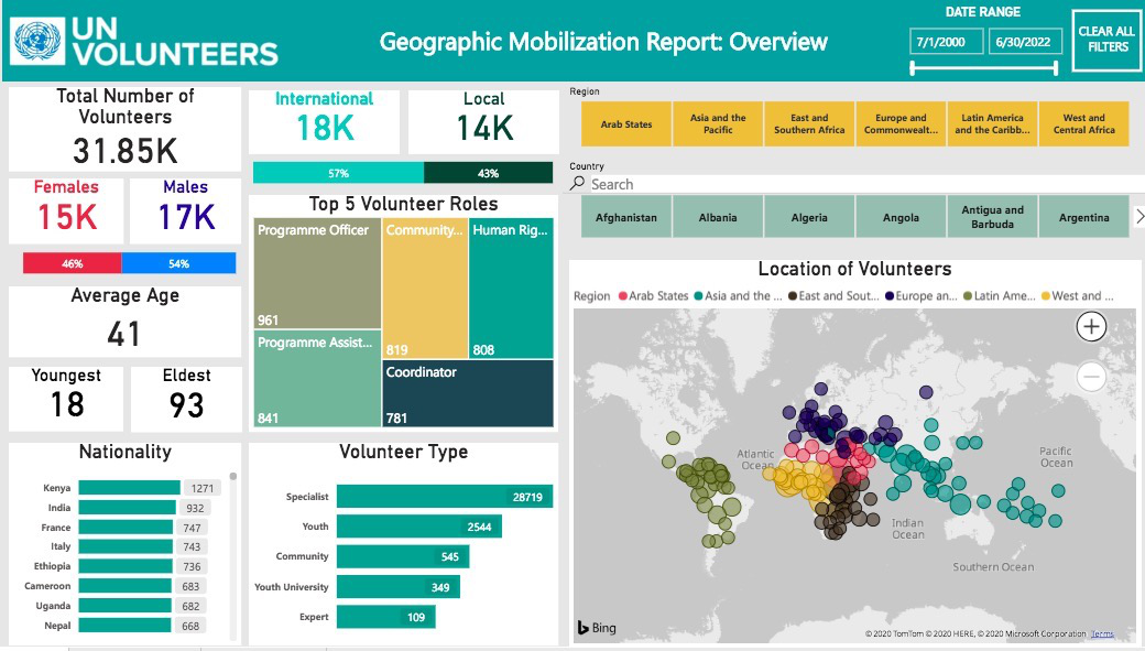
OV UNV Data Challenge - Andrew Yap
Every year, roughly 3000 selfless United Nations Volunteers offer their time and expertise to make the world a better place.
On behalf of United Nations, this simple interactive dashboard was created to serve as an easily accessible platform to provide key insights regarding the geographic mobilization and demographics of the volunteers. Built with intuitive filters, users can look into specific groups of volunteers to better understand the operations the volunteers are involved in during their work with UN.
Volunteer management, trend analysis, monitoring and tracking will be made easier without users having to directly deal with spreadsheets and data.
Content of each page is as follows:
Page 1: Overview: Snapshot of all essential numbers and information that are commonly asked for
Page 2: Demographic breakdown: Trends and key information of key demographic groups
Page 3: Organization breakdown: Specific look into UN subsidiaries to track areas of operations
Thanks for reading. I would love to have some feedback on the user experience of this dashboard, feel free to comment so we can all learn to improve as a data visualization community! Cheers ✌️
eyJrIjoiNzkzMTM5NTQtZGJkOC00NDZmLWI4YTYtZjFjMzA1YmMxNTNkIiwidCI6IjA2ODQ3YTc5LTUwYjUtNDM2MC1iYjhlLTYzNTc1M2Y4MzEyOSIsImMiOjEwfQ%3D%3D
- Mark as New
- Bookmark
- Subscribe
- Mute
- Subscribe to RSS Feed
- Permalink
- Report Inappropriate Content
It was made very informative and easy to read. Thank you for your good work!
- Mark as New
- Bookmark
- Subscribe
- Mute
- Subscribe to RSS Feed
- Permalink
- Report Inappropriate Content
Thanks Andrew!
gab
- Mark as New
- Bookmark
- Subscribe
- Mute
- Subscribe to RSS Feed
- Permalink
- Report Inappropriate Content
This graphic not only tells an amazing story about the team of volunteers it is also very easy to follow and encourages exploration. You want to learn more about what is happening in different locations as well as the types of skills or roles within those locations.
- Mark as New
- Bookmark
- Subscribe
- Mute
- Subscribe to RSS Feed
- Permalink
- Report Inappropriate Content
Great to see your work set as a Featured project. It is an inspiring story. Continue to create more of such.
- Mark as New
- Bookmark
- Subscribe
- Mute
- Subscribe to RSS Feed
- Permalink
- Report Inappropriate Content
- Mark as New
- Bookmark
- Subscribe
- Mute
- Subscribe to RSS Feed
- Permalink
- Report Inappropriate Content
Great job.
- Mark as New
- Bookmark
- Subscribe
- Mute
- Subscribe to RSS Feed
- Permalink
- Report Inappropriate Content
Great job! Your work and report are truely praiseworthy.
As per my exprience, I have some suggestions for you.
1. Try to use the PNG (transparent logo)
2. In all treemap chart label values are not showing completly. At first glance complete value should be displayed.
3.Page 3 - Organization filter, one value "WEF" showing after cliking on small right-left arrow ("<" or ">"). So try to shirnk the size of this slicer to display all possbile slicer values at once.
4. On page 3 - all cards are showing absolute numbers but only Total no. of Volunteers card showing value in decimal. So make the consistency.
5.On page 3 - Make the proper adjustment of Average Age card size. Because it's cutting the value of this card.
6. Page 2 - Regarding Age groupe slicer's last value "65 and ..." So, make it visible at first glance.
7.Page 2 - Assignment Duration by Age chart - Y axis title is not showing completely.
8. Better to use the consistency in all tree map charts across all pages. Meaning that, Page 1 treemap chart showing data values but rest page's chart are only showing category without data label.
Thanks!
Please take a quick glance at newly created dashboards : Restaurant Management Dashboard , HR Analytics Report , Hotel Management Report, Sales Analysis Report , Fortune 500 Companies Analysis , Revenue Tracking Dashboard
- Mark as New
- Bookmark
- Subscribe
- Mute
- Subscribe to RSS Feed
- Permalink
- Report Inappropriate Content
Much appreciated advice @Tahreem24 ! Will most definitely incorporate these changes to the dashboard 👍
- Mark as New
- Bookmark
- Subscribe
- Mute
- Subscribe to RSS Feed
- Permalink
- Report Inappropriate Content
For your convience, I am attaching PNG logo for you!
Atleast try it and see the more beauty of the report.
Please take a quick glance at newly created dashboards : Restaurant Management Dashboard , HR Analytics Report , Hotel Management Report, Sales Analysis Report , Fortune 500 Companies Analysis , Revenue Tracking Dashboard
- Mark as New
- Bookmark
- Subscribe
- Mute
- Subscribe to RSS Feed
- Permalink
- Report Inappropriate Content
Hi @andrewyap ,
This dashboard is quite interesting an it looks amazing.
As I am no expert in dashboard visualisation, but couple of suggestions which I would use to improve the dashboard from user point of view:
- For some of the filter selections, I get BLANK() value in the card visuals. May be this blank can be replaced with something like "No Information", etc.
- When I hover over the "Location of Volunteers" map visual, I see a tooltip which has "Count of Volunteer Id". This can be replaced with "Number of Volunteers", to make it more user friendly. Same can be used on other tabs as well.
- On selecting a bar from "Volunteer Type" chart, the "Nationality" chart filters down based on the selection, but displays values in thousands. In the original state this chart displays data values without an format, just numbers. May be some consistency can be taken here on displaying data labels on the chart.
Thanks,
Pragati
- Mark as New
- Bookmark
- Subscribe
- Mute
- Subscribe to RSS Feed
- Permalink
- Report Inappropriate Content
Thanks Pragati, this is super valuable feedback!
- Mark as New
- Bookmark
- Subscribe
- Mute
- Subscribe to RSS Feed
- Permalink
- Report Inappropriate Content
This was done in a very informative way and it's an easy read. Thank you for the inspiring work
- Mark as New
- Bookmark
- Subscribe
- Mute
- Subscribe to RSS Feed
- Permalink
- Report Inappropriate Content
Great initiative! Absolutely love the visuals