- Power BI forums
- Updates
- News & Announcements
- Get Help with Power BI
- Desktop
- Service
- Report Server
- Power Query
- Mobile Apps
- Developer
- DAX Commands and Tips
- Custom Visuals Development Discussion
- Health and Life Sciences
- Power BI Spanish forums
- Translated Spanish Desktop
- Power Platform Integration - Better Together!
- Power Platform Integrations (Read-only)
- Power Platform and Dynamics 365 Integrations (Read-only)
- Training and Consulting
- Instructor Led Training
- Dashboard in a Day for Women, by Women
- Galleries
- Community Connections & How-To Videos
- COVID-19 Data Stories Gallery
- Themes Gallery
- Data Stories Gallery
- R Script Showcase
- Webinars and Video Gallery
- Quick Measures Gallery
- 2021 MSBizAppsSummit Gallery
- 2020 MSBizAppsSummit Gallery
- 2019 MSBizAppsSummit Gallery
- Events
- Ideas
- Custom Visuals Ideas
- Issues
- Issues
- Events
- Upcoming Events
- Community Blog
- Power BI Community Blog
- Custom Visuals Community Blog
- Community Support
- Community Accounts & Registration
- Using the Community
- Community Feedback
Register now to learn Fabric in free live sessions led by the best Microsoft experts. From Apr 16 to May 9, in English and Spanish.
- Power BI forums
- Galleries
- Data Stories Gallery
- Re: How recessions impact unemployment rate


- Mark as New
- Bookmark
- Subscribe
- Mute
- Subscribe to RSS Feed
- Permalink
- Report Inappropriate Content
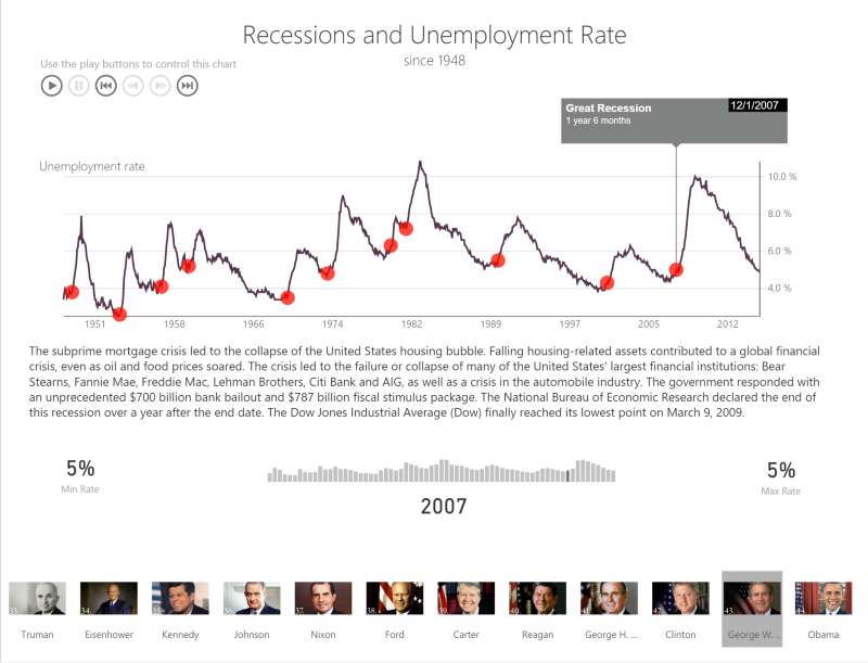
How recessions impact unemployment rate
In the above example, I’m using the Pulse Chart to show the impact of recessions on unemployment rate in the United States of America. It seems logical that a whenever a recession hits, unemployment would go up. But there’s something deeply engaging about seeing the unemployment rate unfold in front of your eyes and seeing exactly when the recession started and its effect on the unemployment rate.
Get the pulse chart here:
https://app.powerbi.com/visuals/show/PulseChart1459209850231
Originally posted here:
https://powerbi.microsoft.com/en-us/blog/visual-awesomeness-unlocked-pulse-chart/
eyJrIjoiOTkxMWQ0Y2EtYTY2Yy00ZDM5LTgwNjgtMTQzZjMyNmU2YTkzIiwidCI6IjNlN2ZjNjM1LTkxOTAtNDFmMC04MDZiLWI4OWIwZmJkNzU5ZSIsImMiOjF9
- Mark as New
- Bookmark
- Subscribe
- Mute
- Subscribe to RSS Feed
- Permalink
- Report Inappropriate Content
That is an impressive piece of work.
I'm very curious about how you got this to work - images at the bottom, chiclet slicer? Having the animation pause and have a control - all very cool.
Well done, congratulations.
Brian
- Mark as New
- Bookmark
- Subscribe
- Mute
- Subscribe to RSS Feed
- Permalink
- Report Inappropriate Content
- Mark as New
- Bookmark
- Subscribe
- Mute
- Subscribe to RSS Feed
- Permalink
- Report Inappropriate Content
- Mark as New
- Bookmark
- Subscribe
- Mute
- Subscribe to RSS Feed
- Permalink
- Report Inappropriate Content