- Power BI forums
- Updates
- News & Announcements
- Get Help with Power BI
- Desktop
- Service
- Report Server
- Power Query
- Mobile Apps
- Developer
- DAX Commands and Tips
- Custom Visuals Development Discussion
- Health and Life Sciences
- Power BI Spanish forums
- Translated Spanish Desktop
- Power Platform Integration - Better Together!
- Power Platform Integrations (Read-only)
- Power Platform and Dynamics 365 Integrations (Read-only)
- Training and Consulting
- Instructor Led Training
- Dashboard in a Day for Women, by Women
- Galleries
- Community Connections & How-To Videos
- COVID-19 Data Stories Gallery
- Themes Gallery
- Data Stories Gallery
- R Script Showcase
- Webinars and Video Gallery
- Quick Measures Gallery
- 2021 MSBizAppsSummit Gallery
- 2020 MSBizAppsSummit Gallery
- 2019 MSBizAppsSummit Gallery
- Events
- Ideas
- Custom Visuals Ideas
- Issues
- Issues
- Events
- Upcoming Events
- Community Blog
- Power BI Community Blog
- Custom Visuals Community Blog
- Community Support
- Community Accounts & Registration
- Using the Community
- Community Feedback
Register now to learn Fabric in free live sessions led by the best Microsoft experts. From Apr 16 to May 9, in English and Spanish.
- Power BI forums
- Galleries
- Data Stories Gallery
- Going the Distance: Ranking Cruise Lines by Meters...
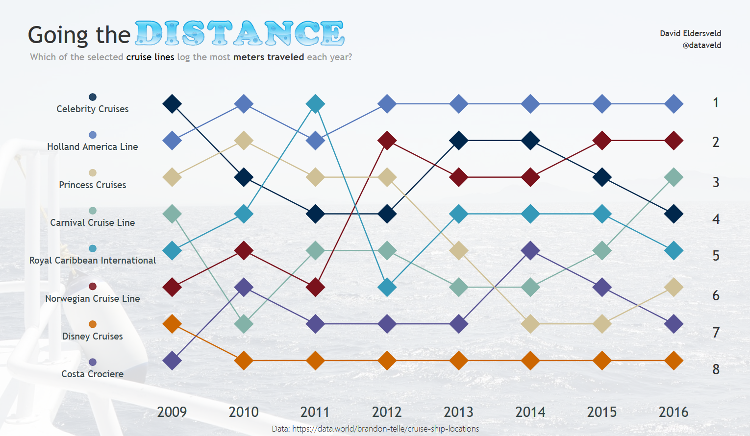
Going the Distance: Ranking Cruise Lines by Meters Traveled
07-26-2017 10:18 AM


- Mark as New
- Bookmark
- Subscribe
- Mute
- Subscribe to RSS Feed
- Permalink
- Report Inappropriate Content
Going the Distance: Ranking Cruise Lines by Meters Traveled
This visualization showcases a "Bump Chart" using Power BI, which displays ranking over time. While each cruise line has a different number of active ships and several varying routes, how do they rank relative to each other when it comes to the distance that each line logs each year?
eyJrIjoiOWY0ODlhMmYtODBhMi00MDcxLTllODMtYTZkZGU3NTlkNTY1IiwidCI6ImFjYzhhYWE1LWYxOTEtNDgyZi05MjFiLWNmNmMzM2E1ODgzMiIsImMiOjF9
- Mark as New
- Bookmark
- Subscribe
- Mute
- Subscribe to RSS Feed
- Permalink
- Report Inappropriate Content
Great chart! Reminded me about my dream about world wide cruise.There are many decent cruises sites , I guess I will try services of Cruisedirect or may be Carnival.
- Mark as New
- Bookmark
- Subscribe
- Mute
- Subscribe to RSS Feed
- Permalink
- Report Inappropriate Content
Great Dashboard,
Can you share the Pbix file please?
thanks,
- Mark as New
- Bookmark
- Subscribe
- Mute
- Subscribe to RSS Feed
- Permalink
- Report Inappropriate Content
Nice! Is this a standard line chart visualization or some custom made one?
Regards
- Mark as New
- Bookmark
- Subscribe
- Mute
- Subscribe to RSS Feed
- Permalink
- Report Inappropriate Content
This uses the standard line chart with markers. You need to have the Axis be categorical to get the markers option. For the ranking, I used a measure similar to this one:
=RANKX(ALLSELECTED('Table'[Cruise Line]),CALCULATE(SUM('Table'[meters_traveled])))