- Power BI forums
- Updates
- News & Announcements
- Get Help with Power BI
- Desktop
- Service
- Report Server
- Power Query
- Mobile Apps
- Developer
- DAX Commands and Tips
- Custom Visuals Development Discussion
- Health and Life Sciences
- Power BI Spanish forums
- Translated Spanish Desktop
- Power Platform Integration - Better Together!
- Power Platform Integrations (Read-only)
- Power Platform and Dynamics 365 Integrations (Read-only)
- Training and Consulting
- Instructor Led Training
- Dashboard in a Day for Women, by Women
- Galleries
- Community Connections & How-To Videos
- COVID-19 Data Stories Gallery
- Themes Gallery
- Data Stories Gallery
- R Script Showcase
- Webinars and Video Gallery
- Quick Measures Gallery
- 2021 MSBizAppsSummit Gallery
- 2020 MSBizAppsSummit Gallery
- 2019 MSBizAppsSummit Gallery
- Events
- Ideas
- Custom Visuals Ideas
- Issues
- Issues
- Events
- Upcoming Events
- Community Blog
- Power BI Community Blog
- Custom Visuals Community Blog
- Community Support
- Community Accounts & Registration
- Using the Community
- Community Feedback
Register now to learn Fabric in free live sessions led by the best Microsoft experts. From Apr 16 to May 9, in English and Spanish.
- Power BI forums
- Galleries
- Data Stories Gallery
- Re: Fleet Summary - Power BI Visualization by Thir...
Re: Fleet Summary - Power BI Visualization by Third I
06-06-2019 22:32 PM


- Mark as New
- Bookmark
- Subscribe
- Mute
- Subscribe to RSS Feed
- Permalink
- Report Inappropriate Content
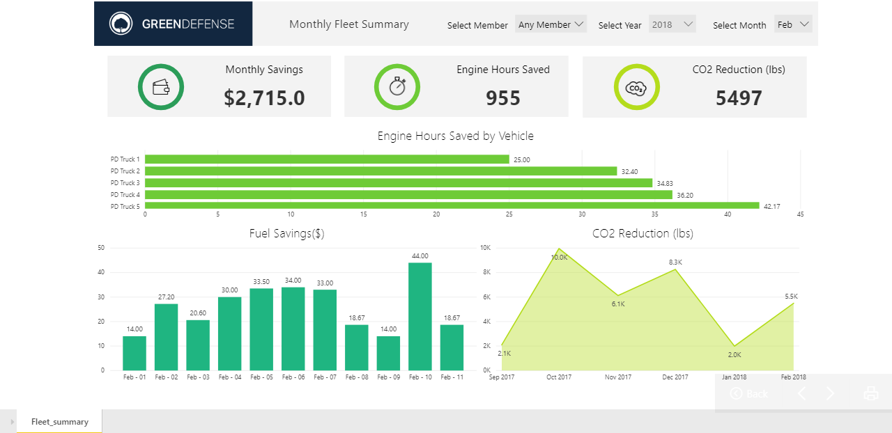
Fleet Summary - Power BI Visualization by Third I
Billions of metric tons of greenhouse gases are emitted every year across the globe and the transportation sector accounts for about half of these emissions. For fleet owners, this highlights the need for fleet management analytics that can help reduce their carbon footprint.
Third I developed a Monthly Fleet Summary dashboard that utilizes real-time data to enhance fleet operation and maintenance.
With this Power BI report, the data sourced from the vehicles is made easily accessible to the users in the form of stunning visualizations, all in a matter of minutes. This powerful visualization empowers the fleet owners to access the insights on the move in real-time. Users can monitor vehicle health and fuel efficiency, and understand driving patterns/behavior based on the insights about CO2 emissions reduction, monthly fuel savings, engine hours saved, and more.
Questions it helps answer:
- How many engine hours were saved by individual fleets?
- Has the CO2 emission reduction improved over the last 6 months?
eyJrIjoiYWJmMDcxYTctMjk0NS00MzkzLWE5M2MtZjcyMzcwMGUxYjg1IiwidCI6ImExMTdlOGM2LWRhYTMtNDFlMi1iZDJhLTgyYzUwMmZlMzM4NCJ9
- Mark as New
- Bookmark
- Subscribe
- Mute
- Subscribe to RSS Feed
- Permalink
- Report Inappropriate Content
Hello Wow I am also inthe fleet department and and saw your dashboard. Is ther a possiblity you can share with me.The issues I am having is trying to set up the data model. Any assistance would be greatly appreciated.
lydriarivera@gmail.com
thank you!
- Mark as New
- Bookmark
- Subscribe
- Mute
- Subscribe to RSS Feed
- Permalink
- Report Inappropriate Content
I think the Circle KPI gauge would look better here than the used KPI.
https://appsource.microsoft.com/en-us/product/power-bi-visuals/WA104381742?tab=Overview
- Mark as New
- Bookmark
- Subscribe
- Mute
- Subscribe to RSS Feed
- Permalink
- Report Inappropriate Content
The Circle KPI gauge looks nice! Thank you for sharing.