- Power BI forums
- Updates
- News & Announcements
- Get Help with Power BI
- Desktop
- Service
- Report Server
- Power Query
- Mobile Apps
- Developer
- DAX Commands and Tips
- Custom Visuals Development Discussion
- Health and Life Sciences
- Power BI Spanish forums
- Translated Spanish Desktop
- Power Platform Integration - Better Together!
- Power Platform Integrations (Read-only)
- Power Platform and Dynamics 365 Integrations (Read-only)
- Training and Consulting
- Instructor Led Training
- Dashboard in a Day for Women, by Women
- Galleries
- Community Connections & How-To Videos
- COVID-19 Data Stories Gallery
- Themes Gallery
- Data Stories Gallery
- R Script Showcase
- Webinars and Video Gallery
- Quick Measures Gallery
- 2021 MSBizAppsSummit Gallery
- 2020 MSBizAppsSummit Gallery
- 2019 MSBizAppsSummit Gallery
- Events
- Ideas
- Custom Visuals Ideas
- Issues
- Issues
- Events
- Upcoming Events
- Community Blog
- Power BI Community Blog
- Custom Visuals Community Blog
- Community Support
- Community Accounts & Registration
- Using the Community
- Community Feedback
Register now to learn Fabric in free live sessions led by the best Microsoft experts. From Apr 16 to May 9, in English and Spanish.
- Power BI forums
- Galleries
- Data Stories Gallery
- Re: Executive Insights by Decisive Data
Re: Executive Insights by Decisive Data
08-03-2020 22:52 PM


- Mark as New
- Bookmark
- Subscribe
- Mute
- Subscribe to RSS Feed
- Permalink
- Report Inappropriate Content
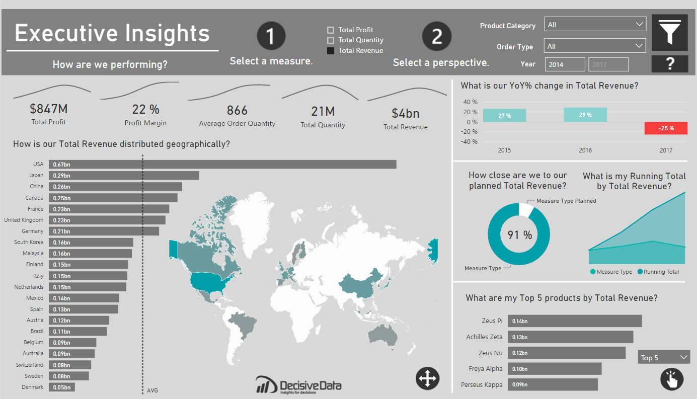
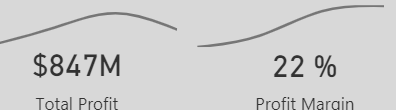
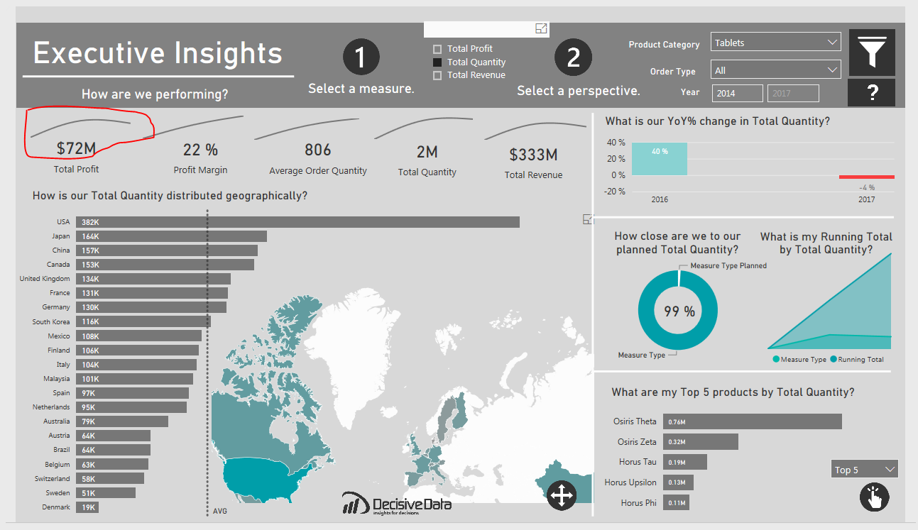
Executive Insights by Decisive Data
Summary
Often asking, “How are we performing?” can be a question that cascades into a series of further questions, spinoffs and investigative research. This is especially true for globally minded companies. I wanted to create a report that preemptively addressed this kind of exploration. This report is meant to provide data-driven decision making, while emphasizing user-flexibility and visual analysis. I was able to achieve my goal to empower the user by leveraging dynamic visuals. Thus, this dashboard can scale as the needs of the global business changes.
Approach
A dashboard is most valuable when you immediately understand what you can do. I looked into what attributes that can be influenced by the company:
- What we are selling (products)
- When we are selling (year)
- Where we are selling (country)
- How we are selling (order type)
The focus here is to view the business from multiple angles for these attributes, providing a holistic approach to the business, through dynamic parameters. I was able to provide deeper analysis with Top/Bottom products, YoY growth and Running totals to name a few. I leveraged, bar charts, line charts, donut charts and custom visuals for visual analysis.
Pushing the Boundaries
There were two things I wished to achieve with this dashboard, attractive mapping and next-level user interactivity.
I wanted to have a map that was design oriented and subtle, like an art piece, meant to invite the user into the dashboard. If users are going to be using a report all the time, why not make it pleasing to the eye? I found that design piece with the new “Shape Map” feature, where one can import custom TopoJSON files. I edited and imported a custom world map from http://mapstarter.com/. The simple map was meant to ground the user geographically and compliment the adjacent bar chart, which holds the same information.
Moreover, I am a firm believer that interactivity is empowering. Giving users the tools to investigate data on their own terms is liberating. As such, I wanted to provide two layers of dynamic parameters. This was done with a Top 5/Bottom 5 measure that reflects whatever measure the user has selected at the top of the dashboard. This was executed within DAX. The question I wanted to be able to answer was “What is my [Top/Bottom] products by [Value]?” in one, simple, clean visual.
For the first part of this method of creating dynamic measures, I was inspired by Sam McKay’s wonderful blog post on Dynamic Visuals, within Power BI. This provided me the groundwork for my dynamic values, and how I would approach the rest of this problem.
Now came the real challenge. I had to build two ranks on a value that could change with a click. To do this I set my dynamic parameter as two rank fields, one Ascending and the other to Descending, for the respective ends of the product performance. These were calculated across my desired field, Products.
Next, I needed to filter each of these Ranks to only keep the Top 5 Products. This can be down with two IF statements, keeping the Rank with only five values or else appearing as BLANK(). Once the IFs are built, you can then build another selector table with McKay’s method with a “Top 5” and “Bottom 5”, which can eventually be used with a SWITCH function to include only the [Filtered Rank DESC] or the [Filtered Rank ASC].
The result means that instead of six individual bar charts, one for a Top or Bottom, across three measures, Quantity, Revenue and Profit, you end up with one, dynamic visual. The result empowers users and saves valuable real estate for other interesting insights.
Quality over quantity.
Wrapping it up
The dynamic parameters and tables worked very well, but it took a little research to have the two dynamic parameters work in conjunction, as I had yet to see any specific topic utilize such before in Power BI. Another aspect that comes to mind, is whether one could make the number of values, in this case 5, also a parameter, so you could select how many TopN you are seeing. Food for thought. In the end, it’s great to know that great visuals can be created just with DAX, determination and some trial and error.
Overall, with the combination of the custom visuals, and dynamic parameters, I created a clean dashboard for analytical insights that’s also a pleasure to interact with.
Jake Olsby


eyJrIjoiYTYxMzllYjQtYjU5NS00MTM4LTlmMjEtMTY0NzVkM2U4OGE4IiwidCI6IjdlY2M4YWEwLTgzMGUtNGQ4Ni1hZjc4LTgzYTNkY2MyNjIzOCIsImMiOjZ9
- Mark as New
- Bookmark
- Subscribe
- Mute
- Subscribe to RSS Feed
- Permalink
- Report Inappropriate Content
Could you share the pbix?
- Mark as New
- Bookmark
- Subscribe
- Mute
- Subscribe to RSS Feed
- Permalink
- Report Inappropriate Content
Great job,
Can you please send me the pbix file? Thanks!
- Mark as New
- Bookmark
- Subscribe
- Mute
- Subscribe to RSS Feed
- Permalink
- Report Inappropriate Content
@jolsby - I hope you already fixed this, keep all your slicers single select to fix below issue

If this post helps, then please consider Accept it as the solution, Appreciate your Kudos!!
Proud to be a Super User!!
- Mark as New
- Bookmark
- Subscribe
- Mute
- Subscribe to RSS Feed
- Permalink
- Report Inappropriate Content
Great dashboard!
would it be possible to share the pbix?
- Mark as New
- Bookmark
- Subscribe
- Mute
- Subscribe to RSS Feed
- Permalink
- Report Inappropriate Content
HI Jobsly, I just wanted to say that this report is filled with insights and looks amazing. Would it be possible to get the pbix file for this?
- Mark as New
- Bookmark
- Subscribe
- Mute
- Subscribe to RSS Feed
- Permalink
- Report Inappropriate Content
Hi @jolsby
Very interesting dashboard and descriptive approach. I am interested to know more about the design aspects further. Kindly let me know if you could share your dashboard.
Thank you
- Mark as New
- Bookmark
- Subscribe
- Mute
- Subscribe to RSS Feed
- Permalink
- Report Inappropriate Content
- Mark as New
- Bookmark
- Subscribe
- Mute
- Subscribe to RSS Feed
- Permalink
- Report Inappropriate Content
Hi Jolsby,
Such a great dashboard! if you dont mind, could you please explain how to make an option for "rank" works? I know how to make the rank, but i would like to let the end user have the choice for the range of the rank like yours. For example, top 5, top 10, or top 15.
Yours:

Currently i am using visual level filter in the dashboard and make it fix top 5.
Would be great if you can share. Thank you
Best regards
Firman
- Mark as New
- Bookmark
- Subscribe
- Mute
- Subscribe to RSS Feed
- Permalink
- Report Inappropriate Content
And how are you able to get the YOY percent change work with the selected metric ?
Thanks
- Mark as New
- Bookmark
- Subscribe
- Mute
- Subscribe to RSS Feed
- Permalink
- Report Inappropriate Content
- Mark as New
- Bookmark
- Subscribe
- Mute
- Subscribe to RSS Feed
- Permalink
- Report Inappropriate Content
Wow!!! clean and straight to the point.
i like this dashboard and i would really appreciate if you could send the pbix. file.
- Mark as New
- Bookmark
- Subscribe
- Mute
- Subscribe to RSS Feed
- Permalink
- Report Inappropriate Content
Did you find your slicers in the Marketplace?
Thanks,
Dashiellc1
- Mark as New
- Bookmark
- Subscribe
- Mute
- Subscribe to RSS Feed
- Permalink
- Report Inappropriate Content
- Mark as New
- Bookmark
- Subscribe
- Mute
- Subscribe to RSS Feed
- Permalink
- Report Inappropriate Content
Could you provide the steps to import and use the World Map from Map Starter inside of Power BI?
- Mark as New
- Bookmark
- Subscribe
- Mute
- Subscribe to RSS Feed
- Permalink
- Report Inappropriate Content
Good afternoon,
maybe a silly question, but it is bugging me ![]()
In the top banner, you have made a time filter where an user is able to insert two years (for example: 2014 and 2017).
When I make a time slicer, I get the option to insert a startdate and an end date, but when I change the data to only years the time slicer does not give me the option to select between. Only dropdown and list are selectable.
In short: I'm able to set a time slicer between 1-1-2015 and 31-12-2017, but what I want is that the user only have to insert the year like: 2015 (start year) and 2017 (end year).
Can you explain how you made your date slicer in this dashboard?
Many Thanks
- Mark as New
- Bookmark
- Subscribe
- Mute
- Subscribe to RSS Feed
- Permalink
- Report Inappropriate Content
Could you provide the steps to import and use the World Map from Map Starter inside of Power BI?
- Mark as New
- Bookmark
- Subscribe
- Mute
- Subscribe to RSS Feed
- Permalink
- Report Inappropriate Content
Awesome!
One issue: I can control-click to select multiple measures and break your visualizations.
- Mark as New
- Bookmark
- Subscribe
- Mute
- Subscribe to RSS Feed
- Permalink
- Report Inappropriate Content
Can you share the formula for the Top/Bottom slicer?
I created switch statements following Sam McKay's setup. Everything works, but I cannot get the ranking to show top or bottom performers.
- Mark as New
- Bookmark
- Subscribe
- Mute
- Subscribe to RSS Feed
- Permalink
- Report Inappropriate Content
Here's the thread with the switch formula. You'll need to adjust to your specific report.
- Mark as New
- Bookmark
- Subscribe
- Mute
- Subscribe to RSS Feed
- Permalink
- Report Inappropriate Content
Is it possible to download this report?
- Mark as New
- Bookmark
- Subscribe
- Mute
- Subscribe to RSS Feed
- Permalink
- Report Inappropriate Content
Great report.
I wonder what the plan is around when your data bars encroach into your map visual? Given there wouldnt be any dynamic resizing happening. Did you test that against the data and determine the likelihood of it was too low for it to be a valid consideration?