- Power BI forums
- Updates
- News & Announcements
- Get Help with Power BI
- Desktop
- Service
- Report Server
- Power Query
- Mobile Apps
- Developer
- DAX Commands and Tips
- Custom Visuals Development Discussion
- Health and Life Sciences
- Power BI Spanish forums
- Translated Spanish Desktop
- Power Platform Integration - Better Together!
- Power Platform Integrations (Read-only)
- Power Platform and Dynamics 365 Integrations (Read-only)
- Training and Consulting
- Instructor Led Training
- Dashboard in a Day for Women, by Women
- Galleries
- Community Connections & How-To Videos
- COVID-19 Data Stories Gallery
- Themes Gallery
- Data Stories Gallery
- R Script Showcase
- Webinars and Video Gallery
- Quick Measures Gallery
- 2021 MSBizAppsSummit Gallery
- 2020 MSBizAppsSummit Gallery
- 2019 MSBizAppsSummit Gallery
- Events
- Ideas
- Custom Visuals Ideas
- Issues
- Issues
- Events
- Upcoming Events
- Community Blog
- Power BI Community Blog
- Custom Visuals Community Blog
- Community Support
- Community Accounts & Registration
- Using the Community
- Community Feedback
Register now to learn Fabric in free live sessions led by the best Microsoft experts. From Apr 16 to May 9, in English and Spanish.
- Power BI forums
- Galleries
- Data Stories Gallery
- EJADA COVID-19 Dashbaord - Tracking and Analytical...
EJADA COVID-19 Dashbaord - Tracking and Analytical Solution
09-22-2020 08:20 AM


- Mark as New
- Bookmark
- Subscribe
- Mute
- Subscribe to RSS Feed
- Permalink
- Report Inappropriate Content
EJADA COVID-19 Dashbaord - Tracking and Analytical Solution
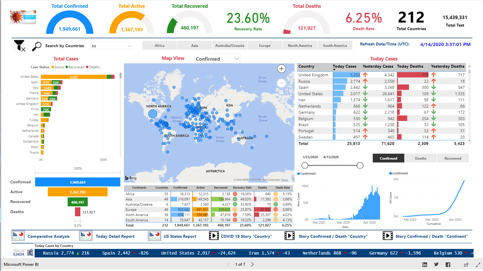
COVID-19 Tracking & Analytics Solution Overview
COVID 19 - Dashboard
Our objective is to provide this interactive dashboard “COVID 19 Dashboard” that could be used by anyone to quickly understand the spread of COVID-19 around the world whilst providing capabilities to navigate and drilldown into the data.
We are pleased to invite “data analysts” and “decision makers” to use this dashboard. We added comparative analysis functionalities that could help in comparing the trend “behaviour” of COVID19 spread between multiple countries which will give insights about the expected future COVID 19 spread.
This dashboard provides slicing and dicing capabilities by just simple click. i.e. by clicking on a specific country, the dashboard will be converted to display all metrics and trends for that country.
Dashboard data is sourced from Johns Hopkins University SSE GitHub repository and Worldometer .
The dashboard contains the following views:
Within this dashboard we built a set of reports and dashboard s for the daily monitoring and tracking numbers of COVID-19 spreading around the world which include:
- Overview - Global view of the number of confirmed cases, deaths and recoveries.
- Provides a comprehensive overview of the key metrics and major KPIs which all of us are looking for related to COVID-19 subject which give a quick overview of cases, deaths and recoveries across time, death and recovery rates.
- An Interactive world map shows figures of the total number of COVID-19 Cases worldwide for 4 categories including Confirmed cases, Active Cases, Deaths Cases and Recovered Cases.
- Trends - Analysis of the rate of growth over time of COVID-19 looks at Confirmed Cases, Recoveries and Deaths in all countries.
- The daily number of new cases for top 10 countries shown in a scrolling text visual with appearance of an animated stock ticker which display data that changes and deviation from day to day.
- Country Comparison - Covid-19 daily cases comparison among countries.
- Continents Comparison - Covid-19 cases comparison among continents with the capability to drill through the countries for selected continent.
- A comparative analysis of how different countries are being impacted by the virus, to allow examination of how different government policy responses have impacted the spread of the virus.
- A story column charts show details about the top countries most affected by the virus while the line chart displays information for each category’s daily value.
- An animated story scatter chart to visualize the progression of infection and fatalities over time on both countries and continents level.
- A summary and detailed reports.
- A detailed report for US states.
Refresh Frequency:
The Dashboard will be updated and refreshed frequently during the day (multiple times, currently 8 times and we are working to enhance it).
Notes:
- To view Dashboard in complete screen mode for web browser, click in bottom-right icon 'Open in full screen'.
- Please use arrows < and > at the bottom of the dashboard page to navigate between views and pages.
- To apply multiple filters please hold CTRL button.
eyJrIjoiZDlhZGUyMDgtZGEyNi00NTJkLTk4ZWEtMzcwMTk2M2U0ZTQwIiwidCI6ImUxMzA0YWQ5LTkzYmEtNDU1Ny04YjIwLThjMWMxMTQzYjM5OSIsImMiOjl9&pageName=ReportSection