- Power BI forums
- Updates
- News & Announcements
- Get Help with Power BI
- Desktop
- Service
- Report Server
- Power Query
- Mobile Apps
- Developer
- DAX Commands and Tips
- Custom Visuals Development Discussion
- Health and Life Sciences
- Power BI Spanish forums
- Translated Spanish Desktop
- Power Platform Integration - Better Together!
- Power Platform Integrations (Read-only)
- Power Platform and Dynamics 365 Integrations (Read-only)
- Training and Consulting
- Instructor Led Training
- Dashboard in a Day for Women, by Women
- Galleries
- Community Connections & How-To Videos
- COVID-19 Data Stories Gallery
- Themes Gallery
- Data Stories Gallery
- R Script Showcase
- Webinars and Video Gallery
- Quick Measures Gallery
- 2021 MSBizAppsSummit Gallery
- 2020 MSBizAppsSummit Gallery
- 2019 MSBizAppsSummit Gallery
- Events
- Ideas
- Custom Visuals Ideas
- Issues
- Issues
- Events
- Upcoming Events
- Community Blog
- Power BI Community Blog
- Custom Visuals Community Blog
- Community Support
- Community Accounts & Registration
- Using the Community
- Community Feedback
Register now to learn Fabric in free live sessions led by the best Microsoft experts. From Apr 16 to May 9, in English and Spanish.
- Power BI forums
- Galleries
- Data Stories Gallery
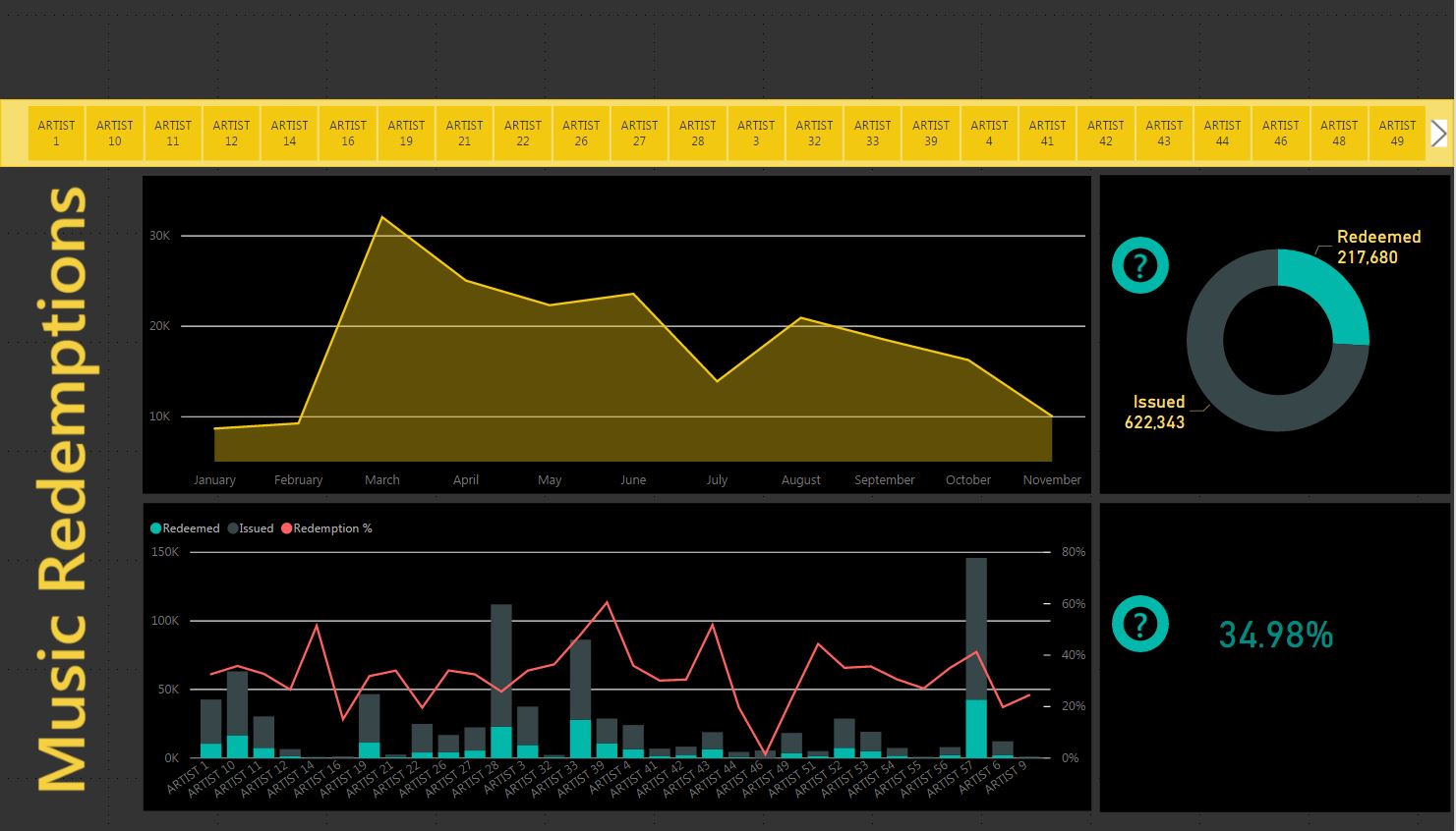
- Code Redemption Report
Code Redemption Report
12-08-2016 14:01 PM - last edited 12-12-2016 10:49 AM


- Mark as New
- Bookmark
- Subscribe
- Mute
- Subscribe to RSS Feed
- Permalink
- Report Inappropriate Content
Code Redemption Report
I thought I'd share the dashboard I created for one of the facets of our business. We work in a sector of the music industry, supplying codes for concert ticket purchasers to redeem towards the artists latest CD. The report shows redemption trends, number of codes issued and redeemed, and each of the graphs can drill down for more specific information (ie. days of the month, or redemption statistics for each venue that sold tickets). I've removed sensitive details and replaced with "ARTIST 1" etc.
A lot of inspiration for this dashboard came from a webinar that I watched recently, "How To Design Visually Stunning Reports in Power BI", with @myersmiguel.
eyJrIjoiOTlmYjZkNjItYmQwMy00Y2FkLWI2N2YtNzljMjJiMzM2OGNjIiwidCI6IjZmZmMxMDZkLWFkMTItNDY1Ni1iMWY0LTAzOGFhN2FkODMyMCIsImMiOjN9