- Power BI forums
- Updates
- News & Announcements
- Get Help with Power BI
- Desktop
- Service
- Report Server
- Power Query
- Mobile Apps
- Developer
- DAX Commands and Tips
- Custom Visuals Development Discussion
- Health and Life Sciences
- Power BI Spanish forums
- Translated Spanish Desktop
- Power Platform Integration - Better Together!
- Power Platform Integrations (Read-only)
- Power Platform and Dynamics 365 Integrations (Read-only)
- Training and Consulting
- Instructor Led Training
- Dashboard in a Day for Women, by Women
- Galleries
- Community Connections & How-To Videos
- COVID-19 Data Stories Gallery
- Themes Gallery
- Data Stories Gallery
- R Script Showcase
- Webinars and Video Gallery
- Quick Measures Gallery
- 2021 MSBizAppsSummit Gallery
- 2020 MSBizAppsSummit Gallery
- 2019 MSBizAppsSummit Gallery
- Events
- Ideas
- Custom Visuals Ideas
- Issues
- Issues
- Events
- Upcoming Events
- Community Blog
- Power BI Community Blog
- Custom Visuals Community Blog
- Community Support
- Community Accounts & Registration
- Using the Community
- Community Feedback
Register now to learn Fabric in free live sessions led by the best Microsoft experts. From Apr 16 to May 9, in English and Spanish.
- Power BI forums
- Galleries
- Data Stories Gallery
- Charticulator: Radial and Scatter Plots with Diver...
Charticulator: Radial and Scatter Plots with Diverging Colour Scales
02-12-2020 16:55 PM


- Mark as New
- Bookmark
- Subscribe
- Mute
- Subscribe to RSS Feed
- Permalink
- Report Inappropriate Content
Charticulator: Radial and Scatter Plots with Diverging Colour Scales
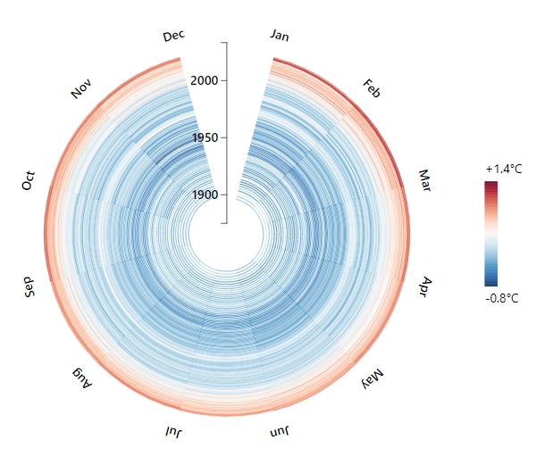
The report represents some exploration of Charticulator capabilities and its integration with Power BI, using the version available at https://charts.powerbi.tips/.
Visuals are inspired by Jugal K. Patel's NY Times article, "How 2016 Became Earth’s Hottest Year on Record" and has a number of insightful and interactive visuals, as well as detailed commentary behind them. Data source: NASA Goddard Institute for Space Studies (.csv).
Both visuals use the same diverging colour scale, which is based upon the recorded average temperature of that month and year, against the 1951-1980 average amount.
The native Power BI scatter chart can't do date-based axes, so it's something I also wanted to explore. The radial chart is designed to show the months of the year in a circular fashion, whilst being able to see the years span outward from the origin. The date range slicer also demonstrates that these particular visuals respond to the correct filter context.
Workbook, Custom Visuals and Charticulator .chart definitions can be downloaded from http://bit.ly/charticulator_diverging for anyone wishing to explore further!
eyJrIjoiNmYxN2I4ZmEtZTRmZS00NGFmLTgxMDYtNzhmNzdlNzRkZTNmIiwidCI6IjUzYmJlMGQ3LTU0NzItNGQ0NS04NGY0LWJiNzJiYjFjMjI4OSJ9
Did I answer your question? Mark my post as a solution!
Proud to be a Super User!
My course: Introduction to Developing Power BI Visuals
On how to ask a technical question, if you really want an answer (courtesy of SQLBI)