- Power BI forums
- Updates
- News & Announcements
- Get Help with Power BI
- Desktop
- Service
- Report Server
- Power Query
- Mobile Apps
- Developer
- DAX Commands and Tips
- Custom Visuals Development Discussion
- Health and Life Sciences
- Power BI Spanish forums
- Translated Spanish Desktop
- Power Platform Integration - Better Together!
- Power Platform Integrations (Read-only)
- Power Platform and Dynamics 365 Integrations (Read-only)
- Training and Consulting
- Instructor Led Training
- Dashboard in a Day for Women, by Women
- Galleries
- Community Connections & How-To Videos
- COVID-19 Data Stories Gallery
- Themes Gallery
- Data Stories Gallery
- R Script Showcase
- Webinars and Video Gallery
- Quick Measures Gallery
- 2021 MSBizAppsSummit Gallery
- 2020 MSBizAppsSummit Gallery
- 2019 MSBizAppsSummit Gallery
- Events
- Ideas
- Custom Visuals Ideas
- Issues
- Issues
- Events
- Upcoming Events
- Community Blog
- Power BI Community Blog
- Custom Visuals Community Blog
- Community Support
- Community Accounts & Registration
- Using the Community
- Community Feedback
Register now to learn Fabric in free live sessions led by the best Microsoft experts. From Apr 16 to May 9, in English and Spanish.
- Power BI forums
- Galleries
- Data Stories Gallery
- Re: COVID-19 US States & Counties: 11 Interactive ...
Re: COVID-19 US States & Counties: 11 Interactive Visualizations
07-01-2020 11:23 AM


- Mark as New
- Bookmark
- Subscribe
- Mute
- Subscribe to RSS Feed
- Permalink
- Report Inappropriate Content
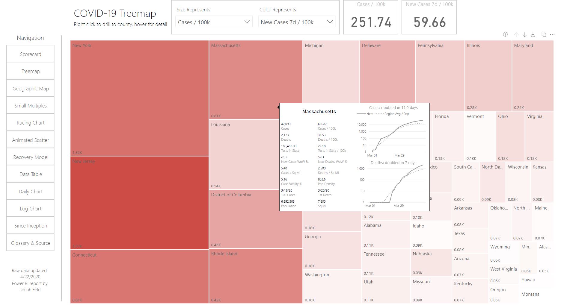
COVID-19 US States & Counties: 11 Interactive Visualizations
Over the past month I learned a ton making these 11 visualizations using Power BI. Tricks applied in this project include dynamic measures, dynamic axis, bookmark controls, 'what-if parameter', custom tooltips, and more.
Source data is The New York Times, US Census, and The Covid Tracking Project. I'm finally happy with it and am ready to share, but feedback is welcome. The Power BI report is embedded at http://covidtrends.us/
eyJrIjoiMjFmYWY5ZDUtN2VmMy00OGI4LTg1ZTgtNGRjNTk3Yzg0MWMxIiwidCI6IjgzNTg2N2Y3LTUzYjYtNDIzZC1hOGYzLTc3YTg2MTkwM2Q2MyIsImMiOjN9
- Mark as New
- Bookmark
- Subscribe
- Mute
- Subscribe to RSS Feed
- Permalink
- Report Inappropriate Content
This is the most clear, most interactive, and aesthetically pleasing Covid tracker I have seen. Nicely done.