- Power BI forums
- Updates
- News & Announcements
- Get Help with Power BI
- Desktop
- Service
- Report Server
- Power Query
- Mobile Apps
- Developer
- DAX Commands and Tips
- Custom Visuals Development Discussion
- Health and Life Sciences
- Power BI Spanish forums
- Translated Spanish Desktop
- Power Platform Integration - Better Together!
- Power Platform Integrations (Read-only)
- Power Platform and Dynamics 365 Integrations (Read-only)
- Training and Consulting
- Instructor Led Training
- Dashboard in a Day for Women, by Women
- Galleries
- Community Connections & How-To Videos
- COVID-19 Data Stories Gallery
- Themes Gallery
- Data Stories Gallery
- R Script Showcase
- Webinars and Video Gallery
- Quick Measures Gallery
- 2021 MSBizAppsSummit Gallery
- 2020 MSBizAppsSummit Gallery
- 2019 MSBizAppsSummit Gallery
- Events
- Ideas
- Custom Visuals Ideas
- Issues
- Issues
- Events
- Upcoming Events
- Community Blog
- Power BI Community Blog
- Custom Visuals Community Blog
- Community Support
- Community Accounts & Registration
- Using the Community
- Community Feedback
Register now to learn Fabric in free live sessions led by the best Microsoft experts. From Apr 16 to May 9, in English and Spanish.
- Subscribe to RSS Feed
- Mark Topic as New
- Mark Topic as Read
- Float this Topic for Current User
- Bookmark
- Subscribe
- Printer Friendly Page
- Mark as New
- Bookmark
- Subscribe
- Mute
- Subscribe to RSS Feed
- Permalink
- Report Inappropriate Content
undefined
How can I create 2 bar chart visuals on "Risk score 1 and Risk score 2" using one slicer on "Status"" Below is table example. Appreciate anyone can help !
Solved! Go to Solution.
- Mark as New
- Bookmark
- Subscribe
- Mute
- Subscribe to RSS Feed
- Permalink
- Report Inappropriate Content
Hello @junsarah3000. I may misunderstand the question, but you should be able to just create the two bar charts and the slicer. The default behavior is for the slicer to filter them both. I created a .PBIX file that is linked here, in case it's helpful.
Additional info:
Part 1, Add visualizations to a Power BI report - Power BI | Microsoft Docs
Slicers in Power BI - Power BI | Microsoft Docs
-Steve
- Mark as New
- Bookmark
- Subscribe
- Mute
- Subscribe to RSS Feed
- Permalink
- Report Inappropriate Content
Hi @junsarah3000 ,
Has @ValtteriN 's solution solved your problem? If yes, please kindly accept it as the solution to help the other members find it more quickly. If not, could you please provide more details about your problem?
Best Regards,
Community Support Team _ kalyj
- Mark as New
- Bookmark
- Subscribe
- Mute
- Subscribe to RSS Feed
- Permalink
- Report Inappropriate Content
Hi,
I am not sure if I understood your question correctly but this seems quite straightforward.
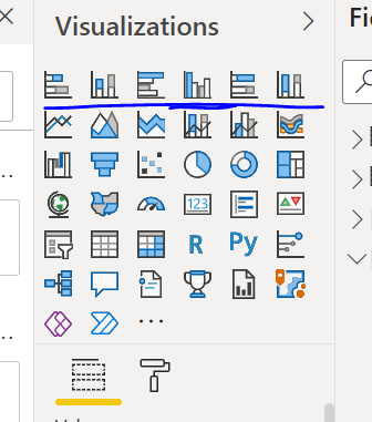
To create visuals select the desired bar chart here:
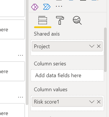
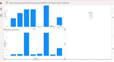
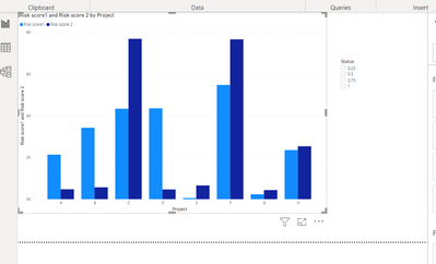
Use Project as Legend and Risk scores as values. I would combine the risk scores into one chart but if you specifically want two just create following charts:
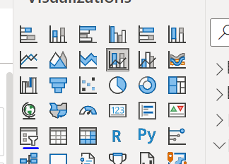
For slicer select slicer visual and use status as value:
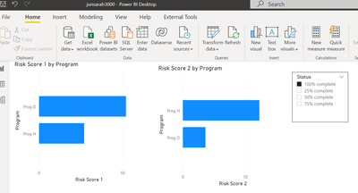
End result (two charts and combined chart):
I hope this helps and if it does consider accepting this as a solution and giving the post a thumbs up!
Did I answer your question? Mark my post as a solution!
Proud to be a Super User!
- Mark as New
- Bookmark
- Subscribe
- Mute
- Subscribe to RSS Feed
- Permalink
- Report Inappropriate Content
Hello @junsarah3000. I may misunderstand the question, but you should be able to just create the two bar charts and the slicer. The default behavior is for the slicer to filter them both. I created a .PBIX file that is linked here, in case it's helpful.
Additional info:
Part 1, Add visualizations to a Power BI report - Power BI | Microsoft Docs
Slicers in Power BI - Power BI | Microsoft Docs
-Steve
Helpful resources

Microsoft Fabric Learn Together
Covering the world! 9:00-10:30 AM Sydney, 4:00-5:30 PM CET (Paris/Berlin), 7:00-8:30 PM Mexico City

Power BI Monthly Update - April 2024
Check out the April 2024 Power BI update to learn about new features.

| User | Count |
|---|---|
| 47 | |
| 24 | |
| 20 | |
| 15 | |
| 13 |
| User | Count |
|---|---|
| 51 | |
| 46 | |
| 39 | |
| 19 | |
| 19 |

