- Power BI forums
- Updates
- News & Announcements
- Get Help with Power BI
- Desktop
- Service
- Report Server
- Power Query
- Mobile Apps
- Developer
- DAX Commands and Tips
- Custom Visuals Development Discussion
- Health and Life Sciences
- Power BI Spanish forums
- Translated Spanish Desktop
- Power Platform Integration - Better Together!
- Power Platform Integrations (Read-only)
- Power Platform and Dynamics 365 Integrations (Read-only)
- Training and Consulting
- Instructor Led Training
- Dashboard in a Day for Women, by Women
- Galleries
- Community Connections & How-To Videos
- COVID-19 Data Stories Gallery
- Themes Gallery
- Data Stories Gallery
- R Script Showcase
- Webinars and Video Gallery
- Quick Measures Gallery
- 2021 MSBizAppsSummit Gallery
- 2020 MSBizAppsSummit Gallery
- 2019 MSBizAppsSummit Gallery
- Events
- Ideas
- Custom Visuals Ideas
- Issues
- Issues
- Events
- Upcoming Events
- Community Blog
- Power BI Community Blog
- Custom Visuals Community Blog
- Community Support
- Community Accounts & Registration
- Using the Community
- Community Feedback
Register now to learn Fabric in free live sessions led by the best Microsoft experts. From Apr 16 to May 9, in English and Spanish.
- Power BI forums
- Forums
- Get Help with Power BI
- DAX Commands and Tips
- Re: stacked color chart with multi value
- Subscribe to RSS Feed
- Mark Topic as New
- Mark Topic as Read
- Float this Topic for Current User
- Bookmark
- Subscribe
- Printer Friendly Page
- Mark as New
- Bookmark
- Subscribe
- Mute
- Subscribe to RSS Feed
- Permalink
- Report Inappropriate Content
stacked color chart with multi value
Hello all,
I need one chart stacked with multi value, it's possible ?
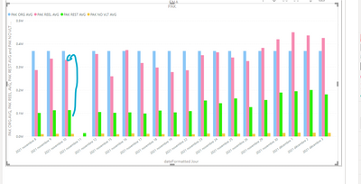
in my example i will need a comparison between the blue bar and another bar which adds the pink and the green, but i need to see in this bar the difference between the yellow and green? Do you have a solution ? thank you very much.
Solved! Go to Solution.
- Mark as New
- Bookmark
- Subscribe
- Mute
- Subscribe to RSS Feed
- Permalink
- Report Inappropriate Content
You may consider these two workarounds.
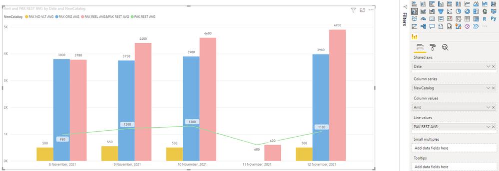
1 Use Line and clustered column chart
Create a Calculated column to re-catalog data
NewCatalog = IF('Table'[Catalog]="PAK REEL AVG"||'Table'[Catalog]="PAK REST AVG","PAK REEL AVG&PAK REST AVG",'Table'[Catalog])
Create a Measure to add values of pink and green
PAK REST AVG = SUMX(FILTER('Table','Table'[Catalog]="PAK REST AVG"),'Table'[Amt])
Then, create visual with them. Chart will look like this:
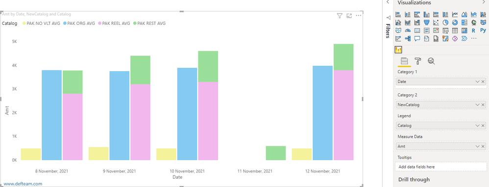
2 Use Clustered Stacked Bar Chart. This chart is provided by third-party and some features may need additional purchase. For more details, please refer Clustered Stacked Bar Chart.
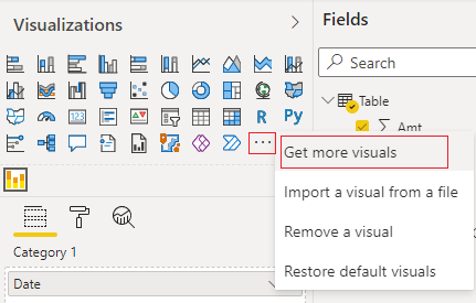
Import Clustered Stacked Bar Chart from AppSource
Create visual with it. Visual should look like this.
For more details, you may refer the attached pbix file.
Best Regards,
Community Support Team _ Caiyun
If this post helps, then please consider Accept it as the solution to help the other members find it more quickly. If you still have problems on it or I misunderstand your needs, please feel free to let us know. Thanks a lot!
- Mark as New
- Bookmark
- Subscribe
- Mute
- Subscribe to RSS Feed
- Permalink
- Report Inappropriate Content
Hello,
I'm sorry but I'm in holliday !
A try to test your solution and I have one error message :
- Mark as New
- Bookmark
- Subscribe
- Mute
- Subscribe to RSS Feed
- Permalink
- Report Inappropriate Content
Can you post sample data as text and expected output?
Not enough information to go on;
please see this post regarding How to Get Your Question Answered Quickly:
https://community.powerbi.com/t5/Community-Blog/How-to-Get-Your-Question-Answered-Quickly/ba-p/38490
The most important parts are:
1. Sample data as text, use the table tool in the editing bar
2. Expected output from sample data
3. Explanation in words of how to get from 1. to 2.
4. Relation between your tables
Appreciate your Kudos!!
LinkedIn:www.linkedin.com/in/vahid-dm/
Helpful resources

Microsoft Fabric Learn Together
Covering the world! 9:00-10:30 AM Sydney, 4:00-5:30 PM CET (Paris/Berlin), 7:00-8:30 PM Mexico City

Power BI Monthly Update - April 2024
Check out the April 2024 Power BI update to learn about new features.

| User | Count |
|---|---|
| 42 | |
| 21 | |
| 21 | |
| 14 | |
| 14 |
| User | Count |
|---|---|
| 43 | |
| 39 | |
| 33 | |
| 18 | |
| 17 |


