- Power BI forums
- Updates
- News & Announcements
- Get Help with Power BI
- Desktop
- Service
- Report Server
- Power Query
- Mobile Apps
- Developer
- DAX Commands and Tips
- Custom Visuals Development Discussion
- Health and Life Sciences
- Power BI Spanish forums
- Translated Spanish Desktop
- Power Platform Integration - Better Together!
- Power Platform Integrations (Read-only)
- Power Platform and Dynamics 365 Integrations (Read-only)
- Training and Consulting
- Instructor Led Training
- Dashboard in a Day for Women, by Women
- Galleries
- Community Connections & How-To Videos
- COVID-19 Data Stories Gallery
- Themes Gallery
- Data Stories Gallery
- R Script Showcase
- Webinars and Video Gallery
- Quick Measures Gallery
- 2021 MSBizAppsSummit Gallery
- 2020 MSBizAppsSummit Gallery
- 2019 MSBizAppsSummit Gallery
- Events
- Ideas
- Custom Visuals Ideas
- Issues
- Issues
- Events
- Upcoming Events
- Community Blog
- Power BI Community Blog
- Custom Visuals Community Blog
- Community Support
- Community Accounts & Registration
- Using the Community
- Community Feedback
Register now to learn Fabric in free live sessions led by the best Microsoft experts. From Apr 16 to May 9, in English and Spanish.
- Power BI forums
- Forums
- Get Help with Power BI
- DAX Commands and Tips
- find percentage of maximum indicator score
- Subscribe to RSS Feed
- Mark Topic as New
- Mark Topic as Read
- Float this Topic for Current User
- Bookmark
- Subscribe
- Printer Friendly Page
- Mark as New
- Bookmark
- Subscribe
- Mute
- Subscribe to RSS Feed
- Permalink
- Report Inappropriate Content
find percentage of maximum indicator score
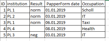
I have a table (YXEMS2):
I created measures (indicators by formulas):
Result_ind = Count(YXEMS2[result]) * 0.1 / COUNT(YXEMS2[ID])
PapperForm_ind = COUNT(YXEMS2[PapperForm date]) * 0.15 / COUNT(YXEMS2[ID])
Occupation_ind = COUNT(YXEMS2[Occupation]) * 0.05 / COUNT(YXEMS2[ID])
my task:
Each indicator has a maximum score:
Result_ind max score = 0.2
PapperForm_ind max score = 0.2
Occupation max score = 0.06
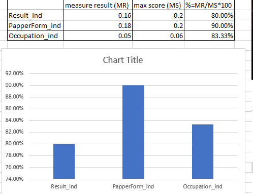
It is necessary to indicate these points somewhere and create a histogram where the x-axis will be indicators, and the y-axis will be % (for each indicator, a maximum score of 100%)
I hope clearly described the task, help 😃
Solved! Go to Solution.
- Mark as New
- Bookmark
- Subscribe
- Mute
- Subscribe to RSS Feed
- Permalink
- Report Inappropriate Content
Mate, on axes you can only place DIMENSION ATTRIBUTES (measures are the values for those attributes and these values are displayed on the other axis; but it's their VALUES that get displayed, not their names). Simple as that. If you want to put the names of measures on the x-axis, then the only logical solution is to have a dimension that stores the names of the measures. Such a table would be disconnected from the model; it would be a parameter table. Once you have it, then you should create a single catch-them-all measure that reacts to what's been selected from the parameter table. This is how you'd build the table/graph you want.
The measure I'm talking about would be of this shape:
[Catch-Them-All Measure] =
var __measureNameSelection = SELECTEDVALUE ( Measures[Measure Name] )
var __value =
	SWITCH(
		__measureNameSelection,
		"Measure 1", [Measure 1],
		"Measure 2", [Measure 2],
		...
	)
return
	__value
Is it clear? If not, please try to read it all over again and ponder over it for a while 🙂
Best
Darek
- Mark as New
- Bookmark
- Subscribe
- Mute
- Subscribe to RSS Feed
- Permalink
- Report Inappropriate Content
Completely unclear what you want...
Are you being surprised you get no answers?
Best
Darek
- Mark as New
- Bookmark
- Subscribe
- Mute
- Subscribe to RSS Feed
- Permalink
- Report Inappropriate Content
@Anonymous wrote:Completely unclear what you want...
Are you being surprised you get no answers?
Best
Darek
Created a demo result.
Look here please,
Considering my table, indicator formulas and maximum points of indicators, how can I create such a histogram in Pover BI?
- Mark as New
- Bookmark
- Subscribe
- Mute
- Subscribe to RSS Feed
- Permalink
- Report Inappropriate Content
I can find the percentage if I create a measure (measure / maximum score). But this will not help me, since the measure cannot be inserted into the histogram as an axis, only as a value.
help me, Please
- Mark as New
- Bookmark
- Subscribe
- Mute
- Subscribe to RSS Feed
- Permalink
- Report Inappropriate Content
Mate, on axes you can only place DIMENSION ATTRIBUTES (measures are the values for those attributes and these values are displayed on the other axis; but it's their VALUES that get displayed, not their names). Simple as that. If you want to put the names of measures on the x-axis, then the only logical solution is to have a dimension that stores the names of the measures. Such a table would be disconnected from the model; it would be a parameter table. Once you have it, then you should create a single catch-them-all measure that reacts to what's been selected from the parameter table. This is how you'd build the table/graph you want.
The measure I'm talking about would be of this shape:
[Catch-Them-All Measure] =
var __measureNameSelection = SELECTEDVALUE ( Measures[Measure Name] )
var __value =
	SWITCH(
		__measureNameSelection,
		"Measure 1", [Measure 1],
		"Measure 2", [Measure 2],
		...
	)
return
	__value
Is it clear? If not, please try to read it all over again and ponder over it for a while 🙂
Best
Darek
- Mark as New
- Bookmark
- Subscribe
- Mute
- Subscribe to RSS Feed
- Permalink
- Report Inappropriate Content
@Anonymous wrote:Mate, on axes you can only place DIMENSION ATTRIBUTES (measures are the values for those attributes and these values are displayed on the other axis; but it's their VALUES that get displayed, not their names). Simple as that. If you want to put the names of measures on the x-axis, then the only logical solution is to have a dimension that stores the names of the measures. Such a table would be disconnected from the model; it would be a parameter table. Once you have it, then you should create a single catch-them-all measure that reacts to what's been selected from the parameter table. This is how you'd build the table/graph you want.
The measure I'm talking about would be of this shape:
[Catch-Them-All Measure] =
var __measureNameSelection = SELECTEDVALUE ( Measures[Measure Name] )
var __value =
	SWITCH(
		__measureNameSelection,
		"Measure 1", [Measure 1],
		"Measure 2", [Measure 2],
		...
	)
return
	__value
Is it clear? If not, please try to read it all over again and ponder over it for a while 🙂
Best
Darek
It works, thanks.
Helpful resources

Microsoft Fabric Learn Together
Covering the world! 9:00-10:30 AM Sydney, 4:00-5:30 PM CET (Paris/Berlin), 7:00-8:30 PM Mexico City

Power BI Monthly Update - April 2024
Check out the April 2024 Power BI update to learn about new features.

| User | Count |
|---|---|
| 39 | |
| 20 | |
| 19 | |
| 16 | |
| 15 |
| User | Count |
|---|---|
| 49 | |
| 26 | |
| 22 | |
| 17 | |
| 16 |


