- Power BI forums
- Updates
- News & Announcements
- Get Help with Power BI
- Desktop
- Service
- Report Server
- Power Query
- Mobile Apps
- Developer
- DAX Commands and Tips
- Custom Visuals Development Discussion
- Health and Life Sciences
- Power BI Spanish forums
- Translated Spanish Desktop
- Power Platform Integration - Better Together!
- Power Platform Integrations (Read-only)
- Power Platform and Dynamics 365 Integrations (Read-only)
- Training and Consulting
- Instructor Led Training
- Dashboard in a Day for Women, by Women
- Galleries
- Community Connections & How-To Videos
- COVID-19 Data Stories Gallery
- Themes Gallery
- Data Stories Gallery
- R Script Showcase
- Webinars and Video Gallery
- Quick Measures Gallery
- 2021 MSBizAppsSummit Gallery
- 2020 MSBizAppsSummit Gallery
- 2019 MSBizAppsSummit Gallery
- Events
- Ideas
- Custom Visuals Ideas
- Issues
- Issues
- Events
- Upcoming Events
- Community Blog
- Power BI Community Blog
- Custom Visuals Community Blog
- Community Support
- Community Accounts & Registration
- Using the Community
- Community Feedback
Register now to learn Fabric in free live sessions led by the best Microsoft experts. From Apr 16 to May 9, in English and Spanish.
- Power BI forums
- Forums
- Get Help with Power BI
- DAX Commands and Tips
- Visualisation of the curve not matching to the ori...
- Subscribe to RSS Feed
- Mark Topic as New
- Mark Topic as Read
- Float this Topic for Current User
- Bookmark
- Subscribe
- Printer Friendly Page
- Mark as New
- Bookmark
- Subscribe
- Mute
- Subscribe to RSS Feed
- Permalink
- Report Inappropriate Content
Visualisation of the curve not matching to the original data in the excel file
Hello all,
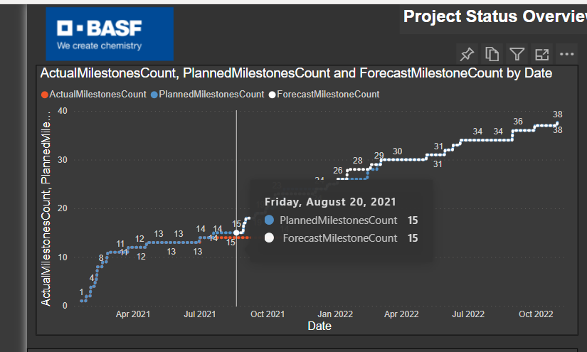
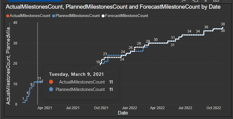
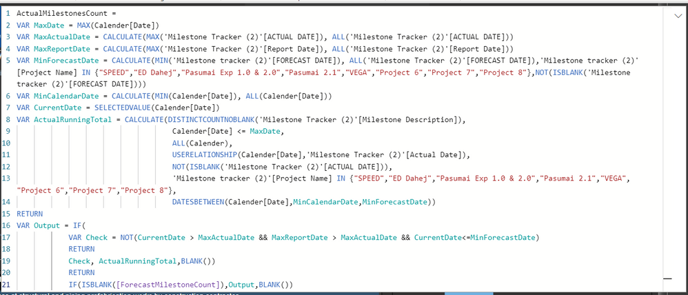
I have created a line graph using dax meausres where there are 3 curves; curve 1: Actual milestone count,curve 2: Forecast milestone count; curve 3:Planned milestone count. I have imported the data from 8 similar excel files with same format for 8 different projects. Files are having column for 1.Project name 2.Milestone description 3.Planned date 4.Actual date 5.Forecast date. 3 Measures are created for 3 curves. Condition is: Curve 1 should be counting the actual milestone achieved until the start of the forecast date in excel file. Suppose ,for a particular project, actual dates column is having dates from 1st Jan,2021 to 3rd March,2021 & Forecast date is from 10th April,2021 to 6th Jun,2021.So actual milestone count curve should continue till 9th April ,after that forecast curve should start. But for all the projects the curve is coming as required except for one in which, though there are no actual values in the excel file but in the graph ,the curve 1 is continued visually even after forecast curve is started I am attaching here code I used. when I am selecting other projects from slicer its working fine ,though data in the excel files are also right but only for one particular project its showing like this. Can you please suggest what can be the issue? Inspite of not having data in excel file,why the graph continued though when I hovered the mouse over the extended part ,its not showing values.How can it be resolved! If you please help! Please find the attached screenshot.As you can see on 20th Aug ,actual milestone count is not shown (Which is true as per the data in excel) but still actual milestone count curve continued beyond that point (orange curve) curve).
- Mark as New
- Bookmark
- Subscribe
- Mute
- Subscribe to RSS Feed
- Permalink
- Report Inappropriate Content
Hi @aparnasaha2196 ,
Try this:
In the filter pane of this visual, apply Advanced Filtering on this Actualvalue measure....."Is not blank", or "Is not 0 "
I hope this helps!
If I answered your question please mark this as a solution. Kudos are always appreciated.
Thanks!
- Mark as New
- Bookmark
- Subscribe
- Mute
- Subscribe to RSS Feed
- Permalink
- Report Inappropriate Content
Hi @Tanushree_Kapse ,
Thanks for your reply. I have tried this but still its the same. Infact forecast milestonecount curve has gone when I applied it.But actual count vurve is still the same.
- Mark as New
- Bookmark
- Subscribe
- Mute
- Subscribe to RSS Feed
- Permalink
- Report Inappropriate Content
Hi @aparnasaha2196 ,
Can you check this one small thing.
Go to visual formatting-> X- Axis -> Type: See whether it is categorical or continuous. ....Keep this categorical and check.
Helpful resources

Microsoft Fabric Learn Together
Covering the world! 9:00-10:30 AM Sydney, 4:00-5:30 PM CET (Paris/Berlin), 7:00-8:30 PM Mexico City

Power BI Monthly Update - April 2024
Check out the April 2024 Power BI update to learn about new features.

| User | Count |
|---|---|
| 42 | |
| 21 | |
| 21 | |
| 14 | |
| 13 |
| User | Count |
|---|---|
| 43 | |
| 39 | |
| 33 | |
| 18 | |
| 17 |


